
The 30 Worst Kitchen Trends That Make Your Home Look Dated
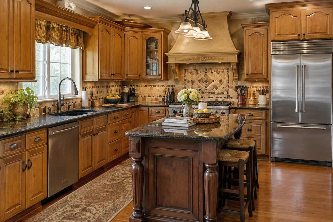
If you have lived in a few kitchens over the years, you know how it goes. The cabinets, counters and light fixtures that looked brand new on move-in day slowly start to belong to a certain decade, and one day a visitor or a real estate agent says the word nobody wants to hear: dated.
Kitchens date faster than any other room because so much of them is built in. Paint and pillows are easy to swap. Cabinets, countertops, backsplashes and floors tend to stay put for twenty or thirty years.
Here are 30 kitchen trends that designers and home buyers most often point to as dated, from honey oak cabinets to the fake ivy on top of them, along with a simple, budget-friendly fix for each one. If you enjoyed our list of decorating trends that make a home look older, think of this as the kitchen edition.
1. Cherry-stained cabinets
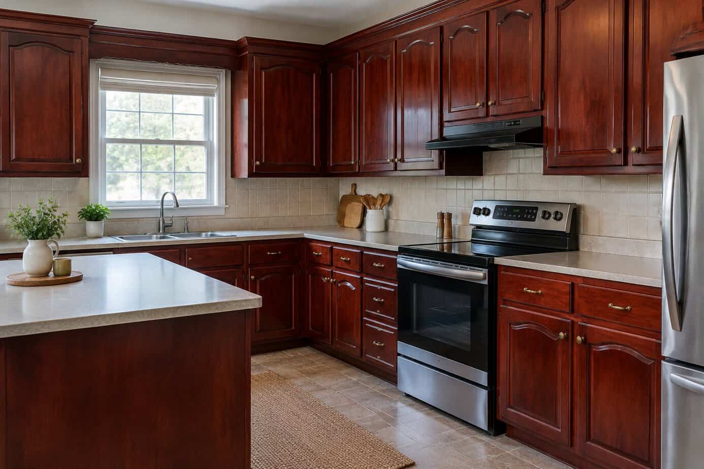
If you remodeled a kitchen in the 1990s or early 2000s, there is a good chance you chose cherry. Reddish-brown cabinets with granite counters were the look of a “nice” kitchen back then. They felt rich and traditional, and they told guests the house was well kept.
Today, designers and home buyers often call cherry-stained cabinets dated. The red tones can feel heavy, especially in a smaller kitchen or one that doesn’t get much daylight, and cherry naturally darkens with age, so cabinets that started out a medium tone may be quite deep red by now. They also fight with the softer, lighter neutrals most people choose today.
You don’t have to replace anything to freshen the look. Painting the cabinets a soft cream, warm greige or muted sage is one of the most budget-friendly updates you can make. If you would rather keep the wood, give it a good cleaning, swap the old pulls for simple new ones and lighten the walls around it. Brighter bulbs help too, so the stain stops making the room feel closed in.
2. Rooster and country-themed kitchen decor
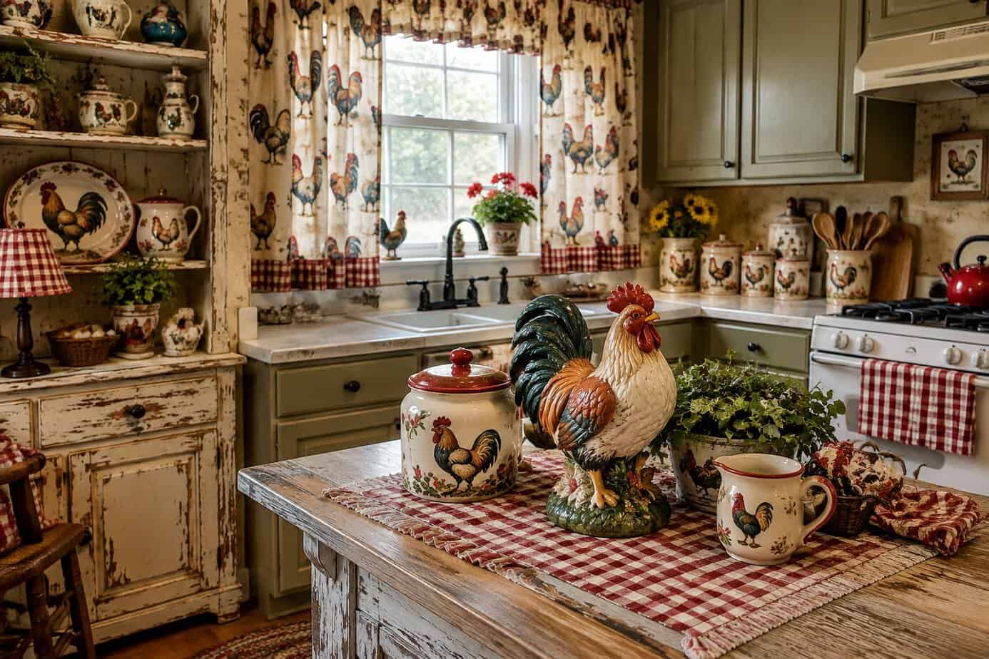
If your kitchen once had a rooster on nearly every surface, you were in good company. Country decor was a staple from the late 1970s into the early 2000s. It felt cozy and welcoming, and it was easy to build a little at a time with gifts, craft fair finds and a few cheerful pieces from the department store.
The look usually meant rooster canisters, painted plates, gingham curtains, a wooden fruit bowl and a matching cookie jar. Geese in bonnets, cows and apples had their turns too. Each piece was sweet on its own. The trouble is the repetition. When one theme covers every surface, the room feels crowded and firmly stuck in one decade, and buyers notice it the minute they walk in.
The fix costs almost nothing. Pack up most of the collection and keep one or two favorites, such as a handsome pitcher or a vintage plate, where they can stand out on a clear counter. Swap the gingham for plain cotton panels or a simple shade. You keep the warmth without the theme.
3. High-gloss cabinet fronts everywhere
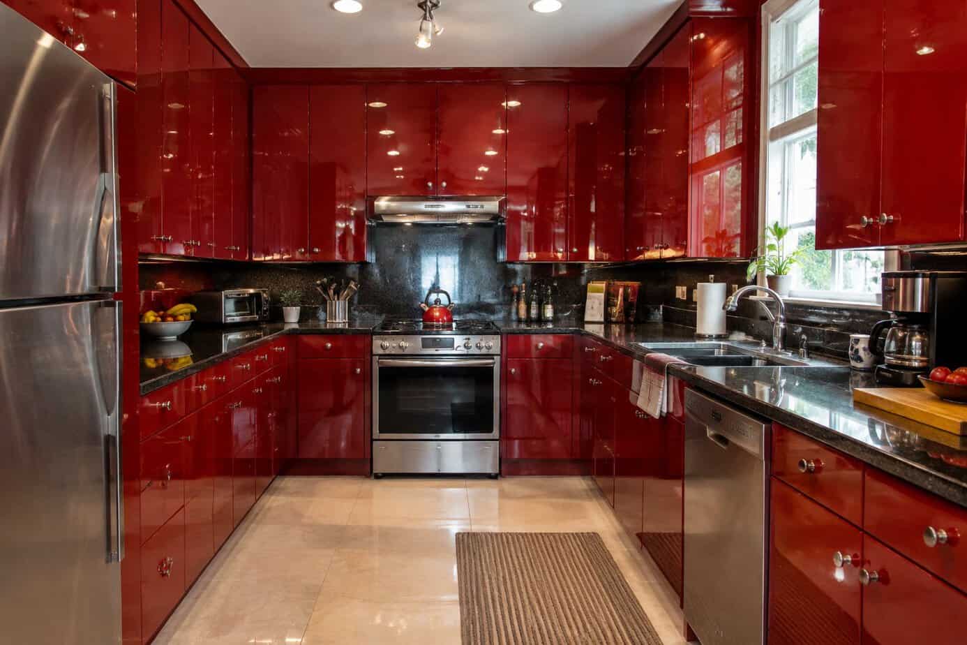
Glossy cabinet fronts have come around more than once. Shiny lacquered European-style kitchens were the height of modern in the 1980s, and high-gloss fronts came back in the 2000s and 2010s in magazines and showrooms. The shine reflected light, made small rooms feel brighter and looked very clean and sleek.
These days, a whole kitchen of high gloss tends to look dated. Fingerprints, smudges and water spots show up fast, so you may find yourself wiping the doors all day. Large expanses of shine can also feel cold and showroom-like, which is the opposite of the warm, lived-in kitchen many buyers want now. Bright colors, like the cherry-red gloss that had its moment, date even faster.
If you are tired of the glare, there is an easy, lower-cost option. Lightly scuff-sand the doors, use a bonding primer and repaint them with a good cabinet paint in a satin finish. A soft color like warm cream, sage or greige calms the whole room, and simple new pulls finish the job.
4. Cathedral-arch cabinet doors
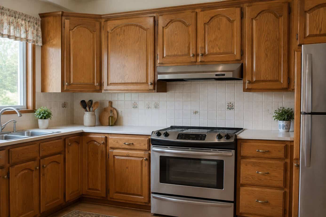
If your cabinet doors have a curved or pointed arch across the top of the center panel, you have what many people call cathedral doors. They were especially common from the late 1980s through the early 2000s, usually in oak or cherry. Builders liked them because they gave a standard kitchen a touch of traditional character for very little extra money.
Today, many designers and home buyers see that arch as a marker of the era. Tastes have moved to simple flat or Shaker-style doors with clean lines, and a wall of arches can make a kitchen look busy. The deep grooves around the arch also collect grease and dust, which you already know if you have ever cleaned them with an old toothbrush.
Replacing the doors is the only way to lose the arch completely, and it can be costly. A gentler start is a thorough degreasing, a coat of cabinet paint in a soft white or warm neutral, and plain new pulls. Paint won’t remove the curve, but an even, calm color makes it stand out far less.
5. Honey oak cabinets with an orange tint
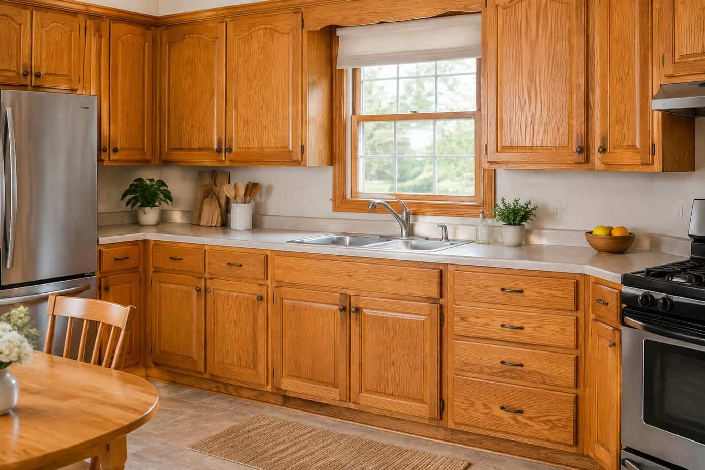
If you built or remodeled a home between the late 1980s and early 2000s, you remember honey oak. It was everywhere. Builders loved it because oak was affordable and durable, and the golden finish felt warm and traditional.
Over the years, the clear finish on those cabinets often ambers, deepening to an orange or yellow cast. Combined with oak’s bold grain, the look now reads as dated to many designers and buyers. The orange tone can also clash with gray paint, white appliances and newer fixtures, which makes the kitchen look as if it belongs to a different decade than the rest of the house.
You don’t need to replace everything. Start with the walls. Designers often suggest colors that calm orange undertones, like a soft green, a warm greige or a creamy white, rather than a cool gray. You can also paint just the island or the lower cabinets and leave the rest. Simple new hardware helps, and if the cabinet boxes are in good shape, a little color goes a long way.
6. Dark espresso cabinets paired with beige granite
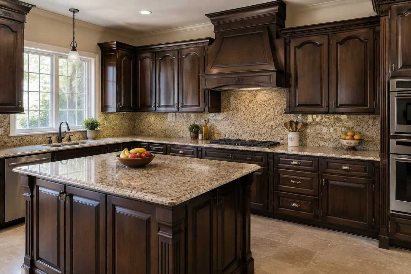
If you remodeled in the 2000s, you may remember how fashionable this pairing felt. Espresso-stained cabinets with beige or tan granite looked rich and polished, and they showed up in builder-grade homes and mid-range remodels across the country. Many people liked that the dark finish looked formal and hid scuffs.
Today, the combination can read as heavy. Dark cabinets next to mid-tone stone soak up light, so the kitchen may feel smaller and gloomier than it really is. Designers also describe the all-brown palette as flat, since cabinets and counters blur into one muddy tone. And dust and fingerprints show on a dark finish more than you might expect.
You don’t need a full remodel. Painting the cabinets a warm white, muted green or soft gray is a budget-friendly change that brings the room back to life. Keep the granite, add simple new hardware and brighter bulbs, and the counters suddenly look like a choice instead of a leftover.
7. Track lighting on the kitchen ceiling
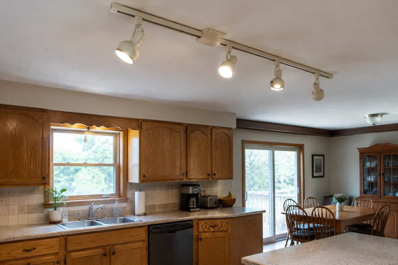
If you remember a row of metal cans on a long rail across the kitchen ceiling, you remember the track lighting boom. It was especially popular in the 1970s and 1980s and hung on into the 1990s, when homeowners wanted a flexible, affordable way to add light without cutting holes in the ceiling.
Today, it tends to look dated for a few reasons. The bulky rail and heads sit in plain view, and the beams often land on the floor or the fronts of your cabinets instead of on the counter. That leaves shadows right where you chop and stir. The cans also collect dust and kitchen grease, and older halogen heads run hot.
The budget-friendly fix is simple. Swap the old heads for slim new ones with warm LED bulbs and aim them at your work surfaces. If the rail itself bothers you, an electrician can usually replace it with one clean ceiling fixture, and under-cabinet lights will do more for your counters than any track ever did.
8. Laminate countertops with faux-stone patterns
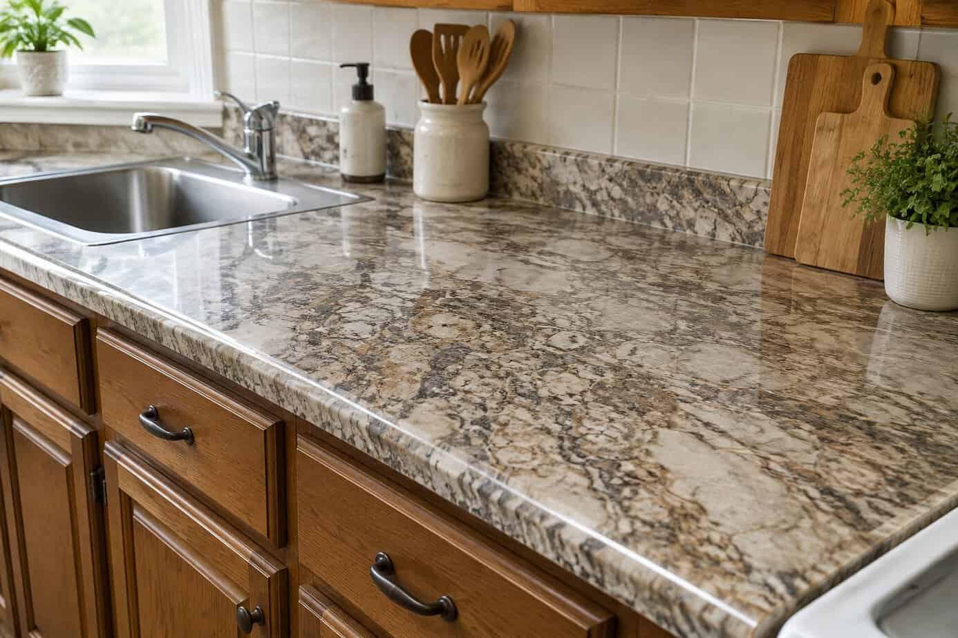
When real stone was out of reach for most budgets, laminate printed to look like granite or marble seemed like a smart compromise. It was everywhere in the 1990s and 2000s, and it gave you the look for a fraction of the price.
Today, designers often point to these patterns as the giveaway of an older kitchen. The printed speckles and veining repeat in a way real stone never does, so the surface reads as imitation from across the room. Older laminate also shows its age, with seams that lift, edges that chip and pale rings where a hot pot was set down.
You don’t have to spend a fortune. Replacing old laminate with new laminate is one of the cheapest counter updates there is, and today’s plain solid colors and soft matte patterns look much cleaner than the old faux granite. If the counters are still sound, a countertop refinishing kit can cover the pattern for even less, as long as you give it the full curing time.
9. The 4-inch granite backsplash lip
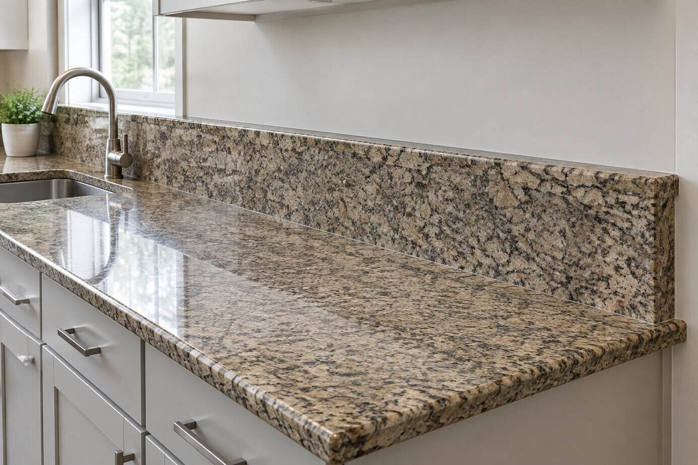
If your granite counter came with a short strip of the same stone running a few inches up the wall, you have the classic 4-inch backsplash. It was standard from the 1990s through the 2000s, and many fabricators included it automatically with a new slab.
It made sense. The strip protected the wall from splashes, covered the gap between the counter and the wall and cost much less than tiling. Today, though, it often looks unfinished. Designers and buyers tend to see it as a leftover from an earlier remodeling era, and the bare painted wall above it can look as if something was skipped. The little ledge on top also catches crumbs and grease.
Here is a budget-friendly fix. Leave the granite strip in place and add tile, beadboard or a coat of scrubbable paint above it, all the way up to the cabinets. If you love tile, a good installer can also remove the strip and run a new backsplash right down to the counter, which looks the most current.
10. Glass mosaic tile strips in the backsplash
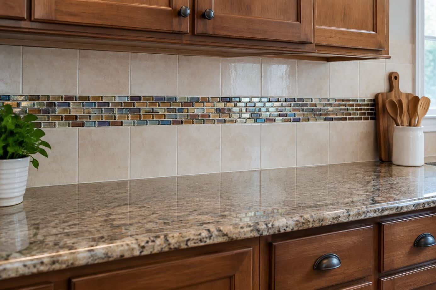
If you remodeled in the 2000s, you may remember the narrow band of glass mosaic tile running across the backsplash. It was usually a stripe a few inches tall set into plain tile, often in blues, greens or browns.
The look took off because glass tile felt new and a little luxurious. It caught the light, and a single strip added color without the cost of covering the whole wall in glass. Today, designers tend to call it dated. The stripe can look like an afterthought on an otherwise plain wall, the small glossy pieces feel busy, and the colors often clash with newer counters and paint.
You don’t have to rip it out. If the rest of the tile is plain, choose a wall color that blends with the band so it stops shouting. If you are ready for a change, a new simple backsplash can replace the whole wall without touching the counters, and many people find a plain tile wall looks better than they expected once the stripe is gone.
11. Tuscan-style travertine backsplashes
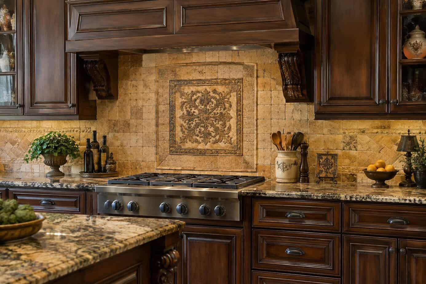
Tuscan style ruled the late 1990s and 2000s. Travertine tile in warm beige and tan showed up on backsplashes everywhere, often set on the diagonal with small dark accent squares and paired with dark cabinets and wrought iron.
It took off because homeowners wanted a cozy Old World feel, and travertine seemed earthy and upscale. Today, designers and real estate agents often point to it as a sign of a kitchen from that era. The yellow-beige color can clash with cooler paint and newer fixtures. Travertine is also porous, so behind the stove it soaks up grease, and the grout and little pits in the stone can look grimy over time.
The simplest fix is paint. Fresher, lighter walls and cabinets can make the tile look calmer and more intentional. Have the stone deep-cleaned and sealed so it looks its best. If you can’t live with it, a new backsplash can usually go up without disturbing the counters.
12. Decorative tile murals behind the range
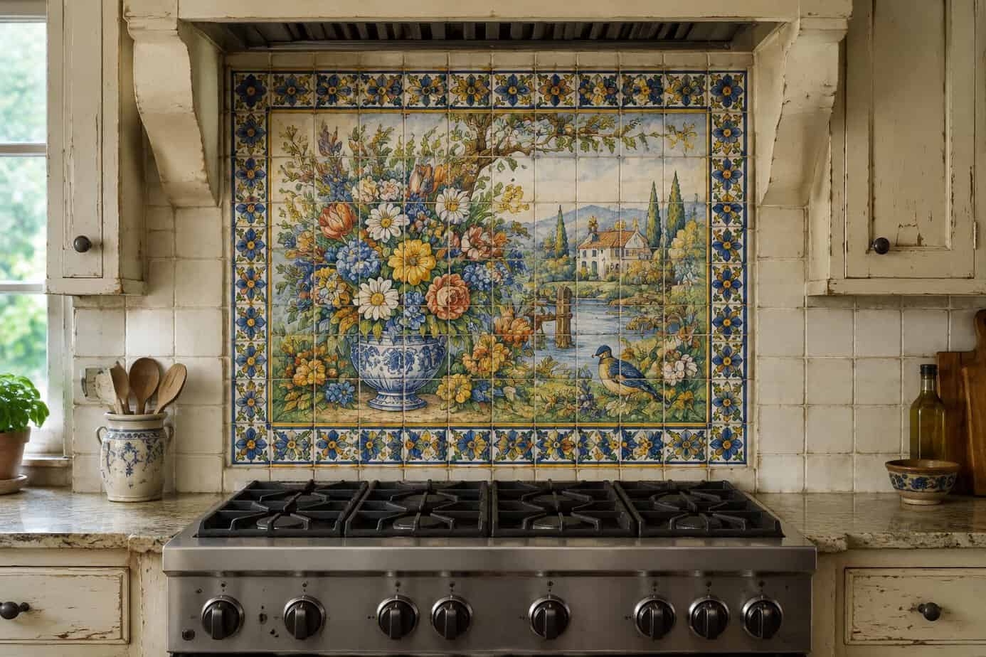
If you cooked in a kitchen in the 1990s or 2000s, you probably remember the tile mural above the stove. Tuscan villages, grapevines, bowls of lemons and, yes, more roosters were everywhere, often framed by a border of small tiles.
The murals took off during the Tuscan and country craze. They felt like a way to add art to a hardworking spot, and they were often sold as a special custom touch. Today, they tend to look dated because the subjects are so tied to one era. A big picture also pulls every eye straight to the stove, which makes the whole kitchen feel frozen in time, and buyers often name it as one of the first things they would replace.
The budget-friendly fix is to deal with just the mural. A stainless or glass splash panel can be mounted over it, or that one section can be retiled in something simple. If the rest of your backsplash is plain, that single change can update the whole wall.
13. Over-the-range microwaves
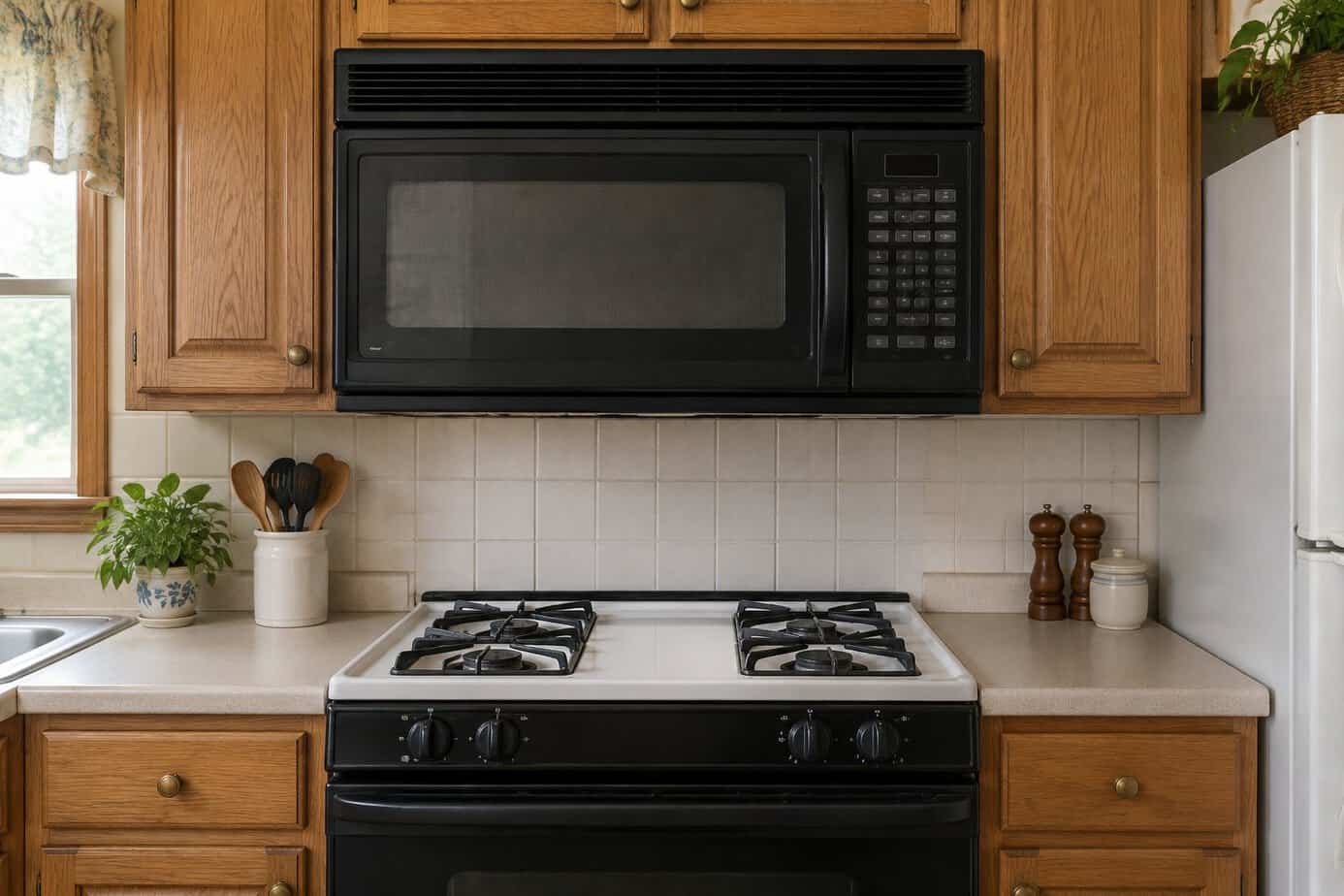
Over-the-range microwaves became a builder favorite in the 1990s and 2000s. They freed up counter space, tucked a vent fan underneath and fit neatly above the stove in a tight layout. In many new homes they still come standard.
Many designers now see that big black or stainless box as the sign of a builder-grade kitchen. It sits right in the middle of the wall, covering the spot where a pretty backsplash or a range hood could be the focal point. The vent underneath is usually weaker than a dedicated hood, and reaching up over hot burners to lift out a heavy dish is awkward, especially if you are on the shorter side.
A simple fix is to move the microwave to a lower shelf, a pantry nook or a spot on the counter, then put a slim hood above the range. If you rely on that microwave where it is, at least match it to your other appliances so it blends in instead of standing out.
14. Fluorescent light boxes in the ceiling
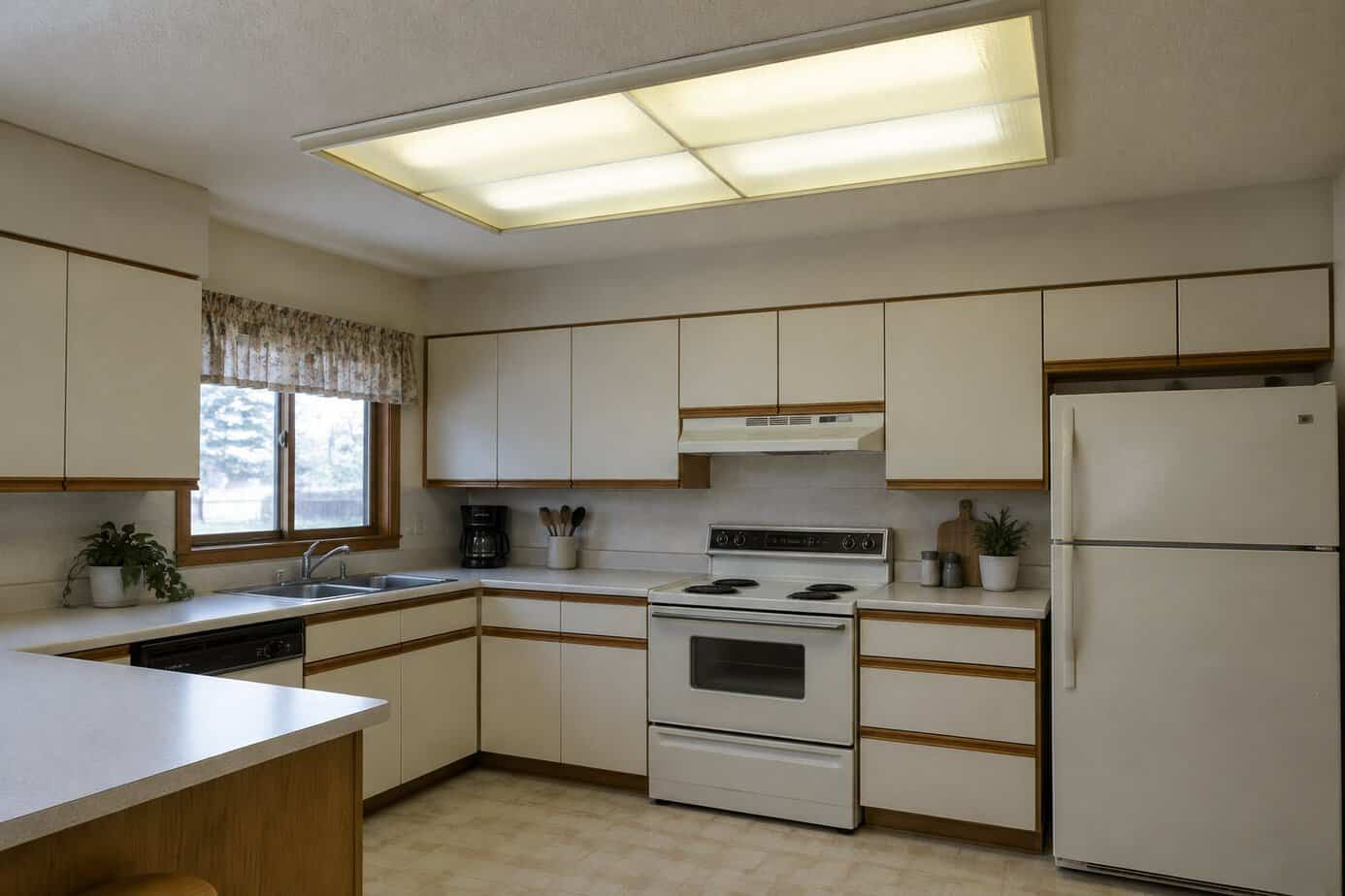
If your house was built in the 1970s or 1980s, you may know the glowing rectangle in the middle of the kitchen ceiling. A recessed box with a plastic diffuser panel, often framed in wood, was a standard way to light a kitchen back then.
It took off because it was inexpensive, used less electricity than incandescent bulbs and lit the whole room from one spot. Today, it tends to look dated. The light is flat and a bit harsh, the plastic panel yellows and collects dead bugs, and the tubes can buzz or flicker as the fixture ages. The big frame also draws your eye up to the one thing in the room that feels stuck in another decade.
The cleanest fix is to remove the box and have an electrician put in recessed LED lights or a slim LED fixture. If you’d rather keep it for now, replace the yellowed panel and switch to LED tubes in a warmer color. Old fluorescent tubes contain a small amount of mercury, so take them to a recycling drop-off instead of the trash.
15. Soffits above the upper cabinets
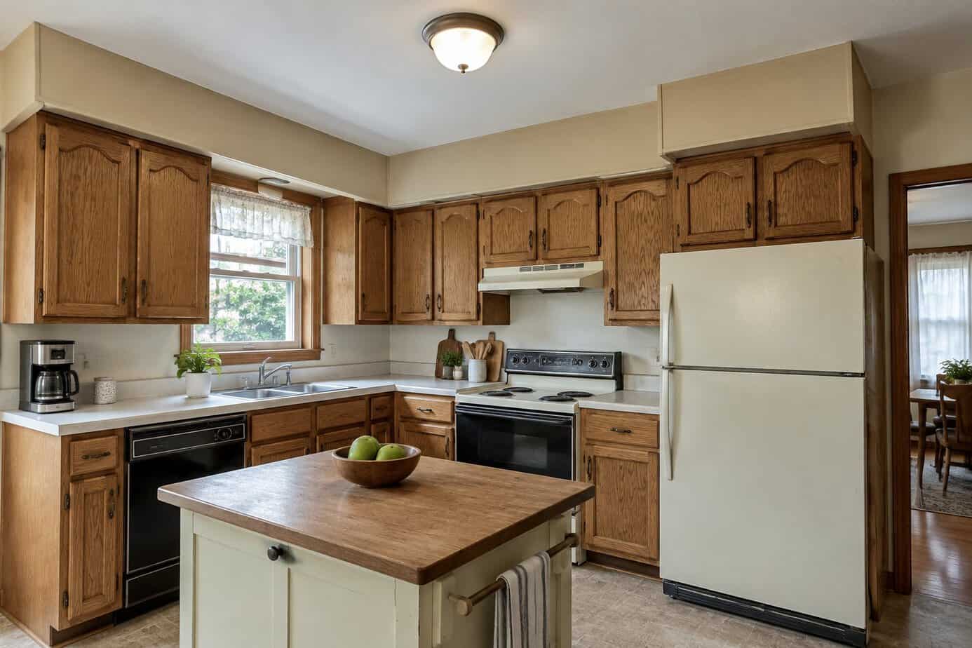
If your kitchen has a boxed-in section between the top of the cabinets and the ceiling, that is a soffit. Soffits were common for decades, especially in homes built from the 1960s through the 1980s.
They were practical. A soffit closed off the hard-to-reach gap above the cabinets, where dust and grease collect, and it hid ductwork, vent pipes and wiring. Today, many designers describe soffits as dated. They make the ceiling feel lower, chop the wall into stripes and make the room feel boxed in, while newer kitchens run the cabinets up toward the ceiling.
The cheapest fix is to make the soffit look intentional. Paint it the same color as your cabinets and run crown molding along the top so cabinet and soffit read as one tall piece. Before anyone removes one, have a contractor check what is inside, since a duct or pipe may be hiding there. And if your home was built before 1978, older paint may contain lead, so any sanding or demolition should follow the EPA’s lead-safe work rules.
16. Hanging pot racks over the island
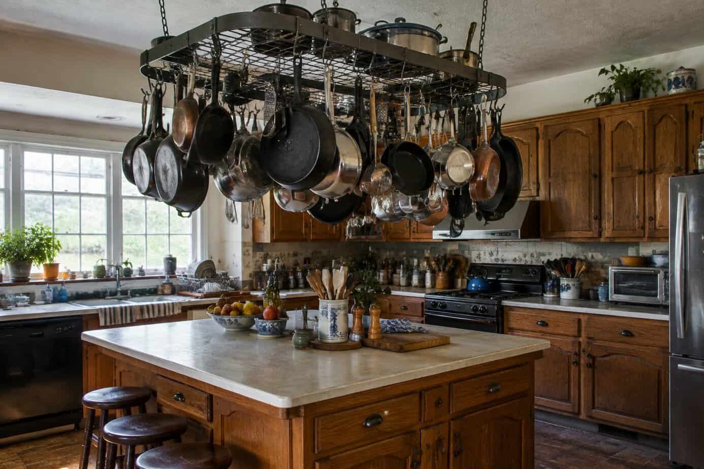
In the 1990s and 2000s, a pot rack over the island said you were a serious cook. It freed up cabinet space and made a home kitchen look like a working chef’s kitchen. Copper pots and cast iron pans on display felt cozy and welcoming.
Today, designers and buyers tend to see them as dated. A ceiling full of cookware makes the room feel busy and heavy, and pans that aren’t used every day collect dust and a film of cooking grease. A low rack can also block the view across the island or catch your head when you lean in to wipe the counter.
The fix starts with taking the rack down and patching the hook holes with spackle and paint. Move your pots into deep drawers, or add an inexpensive pull-out organizer in a lower cabinet. If you love the look of a few favorite pieces, hang one or two on a rail near the stove instead.
17. Almond and bisque appliances
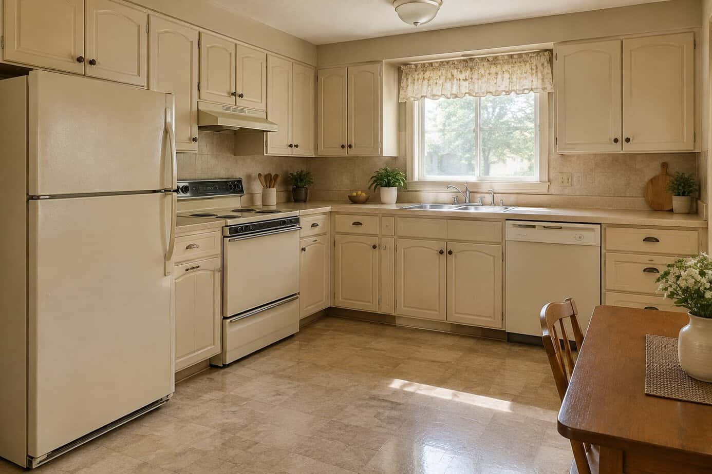
Almond appliances arrived in the late 1970s as harvest gold and avocado green faded, and almond and its cousin bisque stayed popular through the 1990s. The soft cream shades matched oak cabinets and beige counters, and many kitchens had a full matching set.
Today, those appliances tend to look dated. The finish can yellow unevenly, so a fridge and dishwasher that once matched may now look like two different colors. Stainless steel, white and black took over, so almond stands out the moment you walk in. And if your fridge is old enough to be almond, it is likely using more electricity than a new one. According to Energy Star, recycling an old refrigerator and replacing it with a certified model can save about $150 over the new one’s 12-year life.
Replacing everything at once is expensive, so start with the appliance you use most. Appliance epoxy paint can refresh an old fridge or dishwasher for much less than a new one. Then replace pieces one at a time as they wear out, sticking to one finish so the kitchen comes together.
18. Wallpaper borders near the ceiling
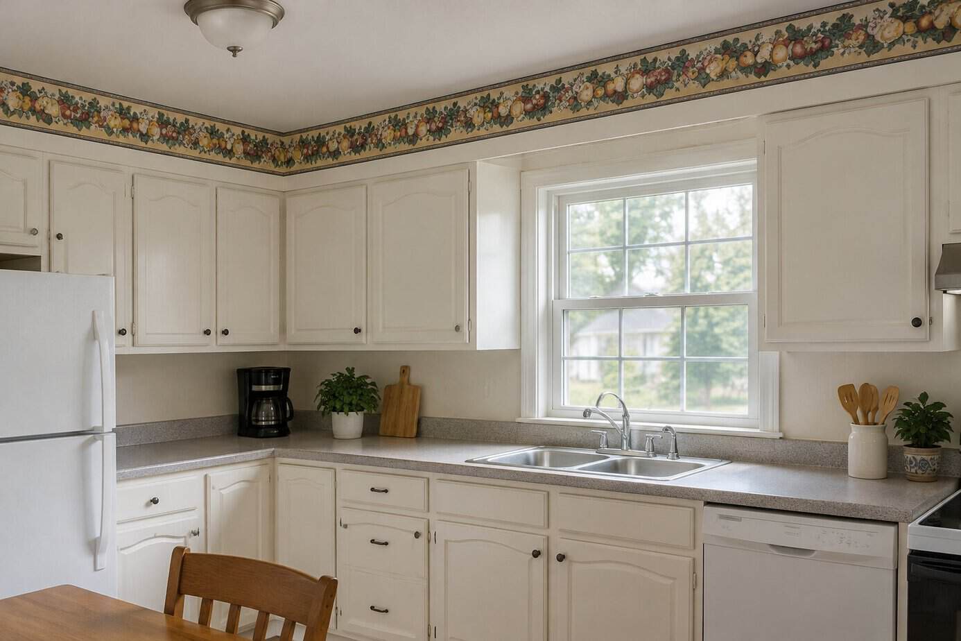
If you decorated a kitchen in the late 1980s or 1990s, you probably hung a wallpaper border. It ran in a neat strip near the ceiling or at chair-rail height, often showing fruit, ivy, teapots or country hearts. Borders were an inexpensive way to add color without papering whole walls.
Today, they are one of the quickest giveaways of an older kitchen. The thin band of pattern can look skimpy against a large wall, and the busy designs often clash with newer finishes. Home buyers and designers often mention borders when they describe a room that hasn’t been touched in years, and in a steamy kitchen the edges start to peel.
The fix is simple and cheap. Soften the border with a wallpaper steamer, or score it and spray it with warm water mixed with a little fabric softener, then peel it off and wash away the leftover paste. Patch any nicks, prime and repaint. You’ll be surprised how much taller and fresher the room feels.
19. Built-in kitchen desks
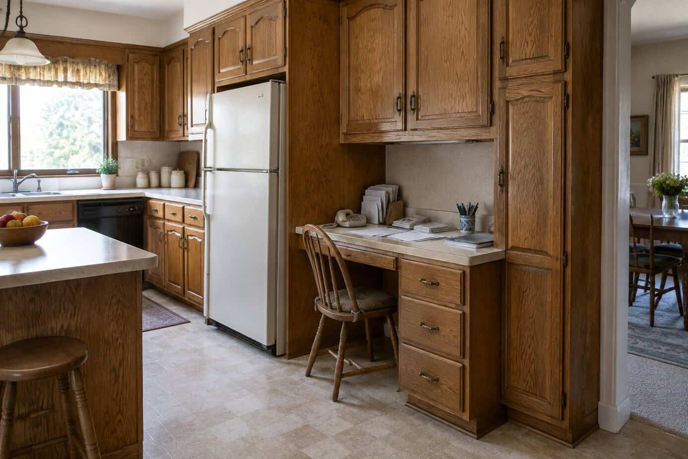
In the 1990s and 2000s, builders tucked a little desk into the end of the kitchen cabinet run in house after house. It made sense at the time. The kitchen was where the family gathered, and a spot for the phone, the mail, the calendar and the bills seemed practical.
Today, most people handle bills, school forms and shopping on a phone or laptop from anywhere in the house. That leaves the desk with little to do, and it often becomes a pile of mail, chargers and takeout menus. Buyers tend to see it as wasted space, and the knee opening and shallow drawers make it hard to use for anything else.
The budget-friendly fix is to change what the desk does. Have a base cabinet or a set of drawers fitted under the top, or simply use it as a coffee station or a landing spot for keys and bags. A coat of paint and new pulls that match the rest of the kitchen help it look planned.
20. Shiny polished brass hardware and lights
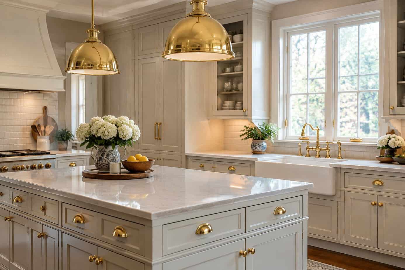
In the 1980s and early 1990s, gleaming brass seemed to be on everything. Cabinet pulls, faucets, chandeliers and ceiling fans all had that bright, mirror-like gold finish. It looked rich and traditional, and builders used it in new homes everywhere.
Today, that high-shine yellow finish tends to read as dated. It is bright and flat, it shows every fingerprint, and the clear coating on cheaper pieces often wears through and leaves dark spots. By the late 1990s, many homeowners were already switching to silver-toned finishes, which is why polished brass now dates a room to a very specific time.
Here is a simple fix. Replace the cabinet knobs and pulls first, which is quick and affordable. Light fixtures can be swapped one at a time or refreshed with a spray paint made for metal. Choose one finish that goes with your faucet and stick with it across the room so everything looks planned.
21. Glass block walls and windows
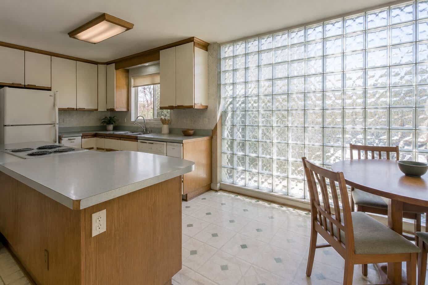
Glass block first caught on in the 1930s, then had a big comeback in the 1980s and early 1990s. You saw it in showers, entryways and kitchen walls, and it was a clever way to bring in light while keeping some privacy.
Today, glass block can make a kitchen look dated. The thick, wavy glass blurs the view, so a window that once felt clever now feels closed off. The grout lines between the blocks are hard to keep clean, and the chunky grid clashes with simpler, newer designs.
You don’t need to knock out a wall to soften it. A light linen curtain or a few small plants on the sill can make it feel gentler, and a fresh coat of paint on the wall around it helps it blend in. If the blocks fill a window opening, replacing them with a regular window in frosted or textured glass is a common middle-ground project that keeps your privacy and lets you see the sky again.
22. Appliance garages
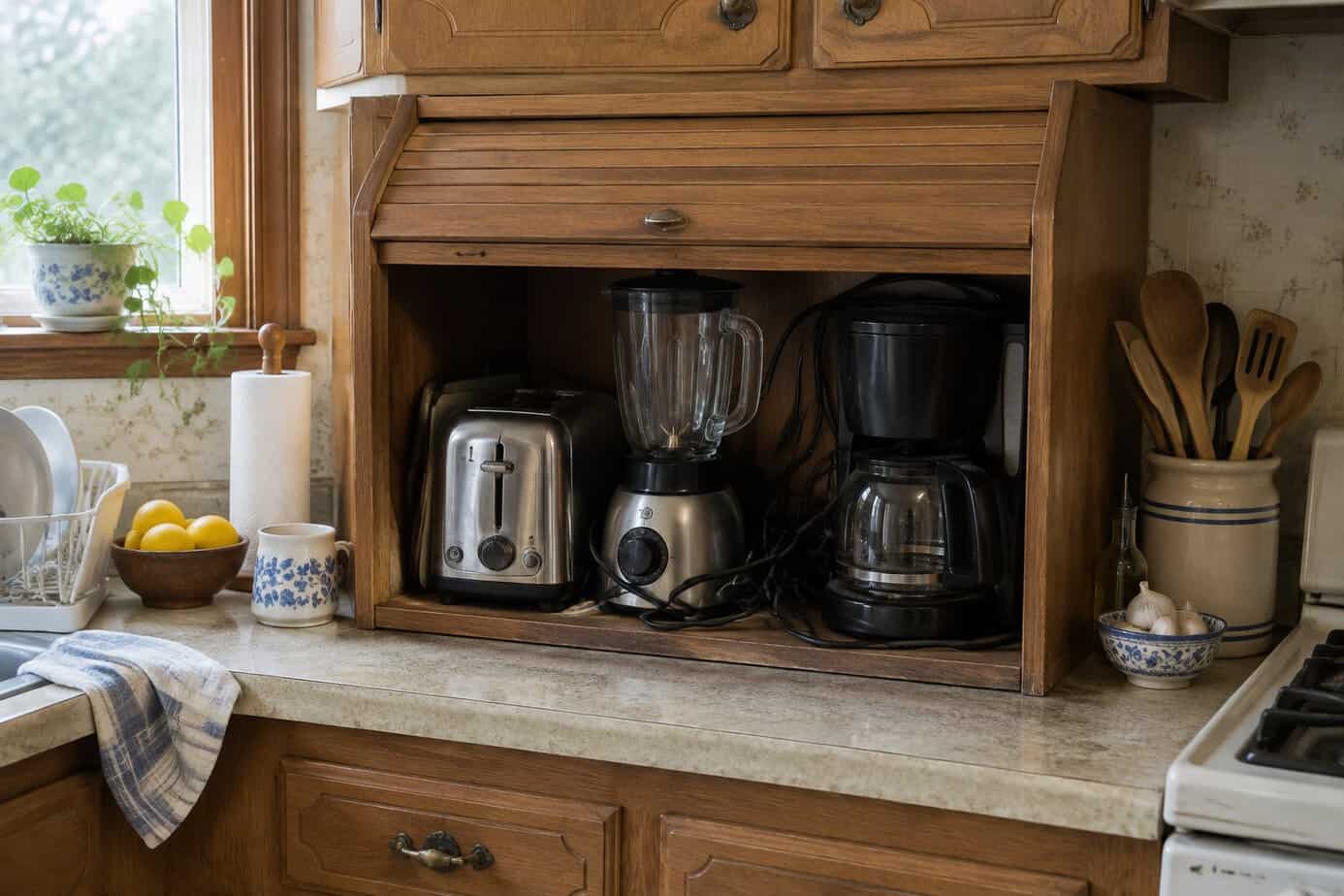
Appliance garages, those little cabinets with a roll-up or hinged door sitting right on the counter, were a staple in kitchens from the 1980s into the early 2000s. They promised a tidy spot for the toaster and coffee maker, and plenty of us had one tucked into a corner.
Today, they often look dated. The bulky box eats into your counter, the roll-up doors tend to stick or jump their track, and the back corners collect crumbs that are hard to reach. Many buyers would rather see a clean run of counter, or a pull-out shelf inside a lower cabinet that does the same job out of sight.
A budget-friendly fix is to take the door off and paint the inside a fresh color, turning it into an open nook for the coffee maker or a few cookbooks. If you don’t need it at all, a carpenter can usually remove the unit, and you gain back that whole corner of counter.
23. Fake ivy and grapevines on top of the cabinets
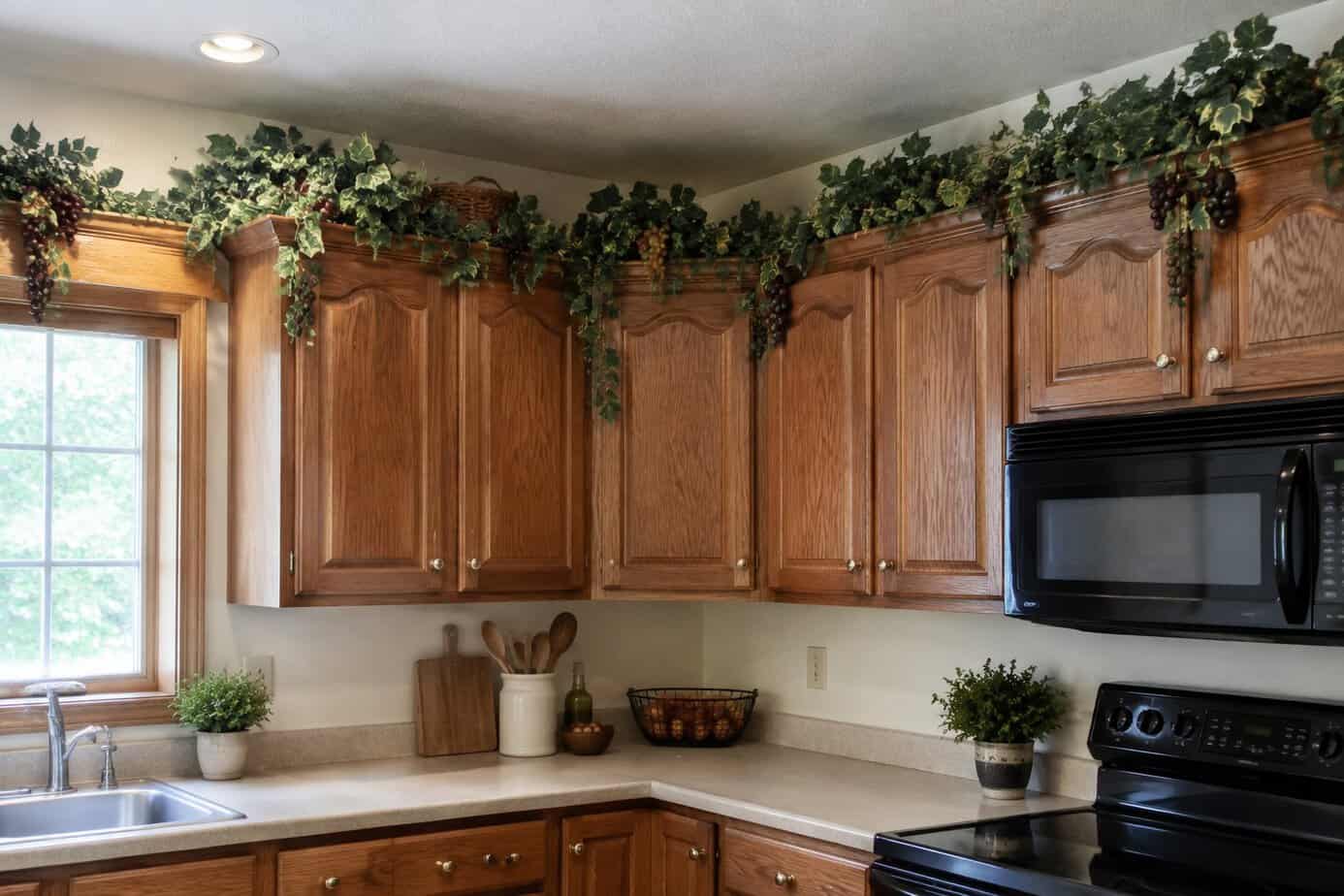
In the 1990s and early 2000s, the tops of kitchen cabinets filled up with greenery. Trailing silk ivy, plastic grapevines, wicker baskets and the occasional ceramic rooster lined the space between the cabinets and the ceiling in homes everywhere.
Today, designers and buyers commonly describe this look as dated. The faux leaves collect dust and a sticky film of cooking grease, and the colors fade to a washed-out plastic shade. The clutter also makes the ceiling feel lower and the kitchen busier than it needs to be.
This is the easiest fix on the list, and it costs nothing. Take everything down, wipe the cabinet tops clean and enjoy the cleaner lines. If the space looks bare, one or two larger pieces, such as a big crock or a pair of matching baskets, look far more current than a long row of small things.
24. Vinyl sheet flooring with faux tile patterns
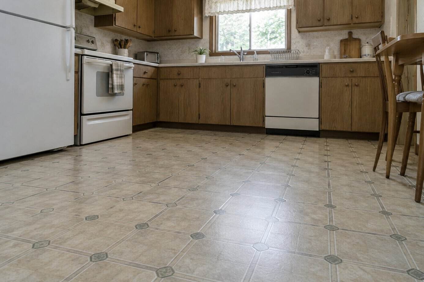
Vinyl sheet flooring printed to look like ceramic tile, often with fake grout lines, covered kitchen floors from the 1970s through the 1990s. It was inexpensive, soft underfoot and easy to mop, and it came in wide rolls with few seams for water to get into.
Today, the printed pattern is what gives it away. Repeating squares, swirly marbling and painted-on grout look flat next to real tile or modern plank floors, and worn spots, yellowing and curling seams only add to the dated feel.
A popular budget-friendly fix is click-together vinyl plank, which can often go right over an old floor that is flat and sound. One important caution: older vinyl flooring and the glue under it may contain asbestos. Don’t sand, scrape or tear it up yourself. The EPA’s asbestos advice for families explains why material in good shape is often best left alone, and why covering it is usually safer than ripping it out.
25. Furniture-style cabinetry with heavy corbels
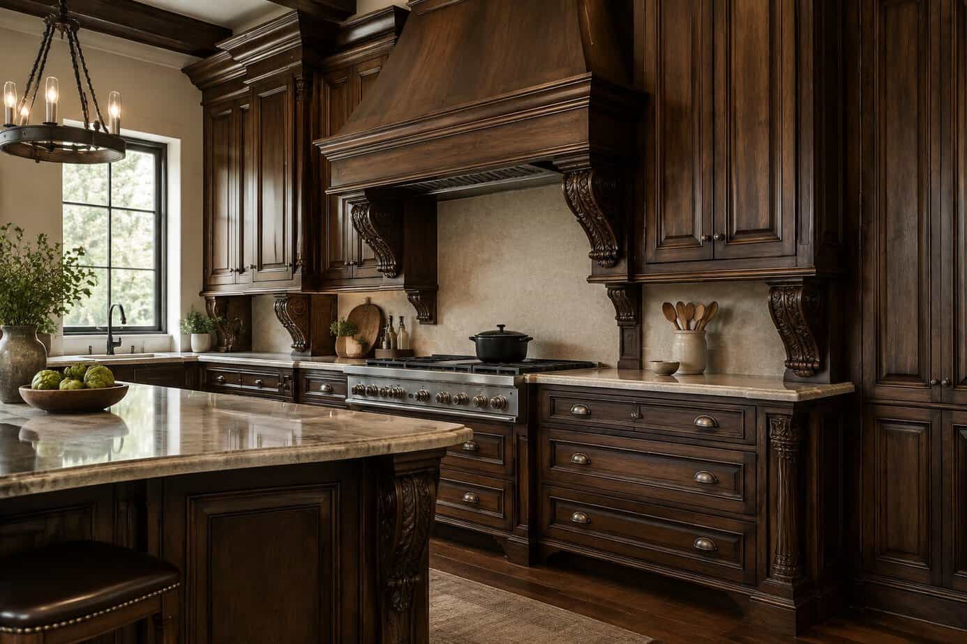
In the late 1990s and 2000s, many upscale kitchens were built to look like a room full of antique furniture. Cabinets had carved feet, chunky corbels under the counter overhangs, thick crown molding and sometimes a big carved hood over the range.
The style took off with the Tuscan and Old World craze, when big decorative brackets suggested fine craftsmanship. Today, designers and buyers tend to describe it as heavy and fussy. All that detail collects dust and grease, and it can make a kitchen feel smaller and darker than it is. Simple, streamlined cabinets are what most people want now.
You don’t need new cabinets to lighten things up. Many corbels are attached with screws and glue, so a handy person can often remove the purely decorative ones, fill the holes and touch up the finish. Check first that a corbel isn’t actually holding up a countertop overhang. Paint and simpler hardware will do the rest.
26. Decorative wine racks built into cabinets
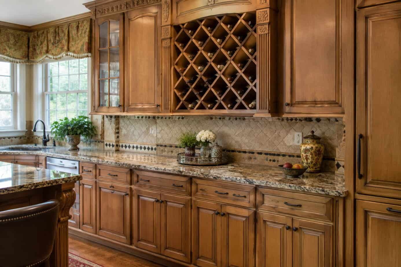
Between the late 1990s and the 2000s, the built-in wine rack became a kitchen must-have. It was usually a diamond lattice above the refrigerator or a cubby at the end of a cabinet run, and it suggested a home that was always ready to entertain.
Today, those racks tend to look like a dated detail. Many hold only a handful of bottles, and the angled wood grid feels fussy next to cleaner cabinet lines. Wine experts also point out that a kitchen is a poor place to store wine for long, since the warm air above a refrigerator or near the stove isn’t kind to it.
A simple fix is to fill the space with something more useful. A cabinet maker can fit a plain door to match the rest of your kitchen, or you can add a shelf for cookbooks, trays or a few serving pieces. A coat of paint helps it blend right in.
27. Curved breakfast bars with raised counters
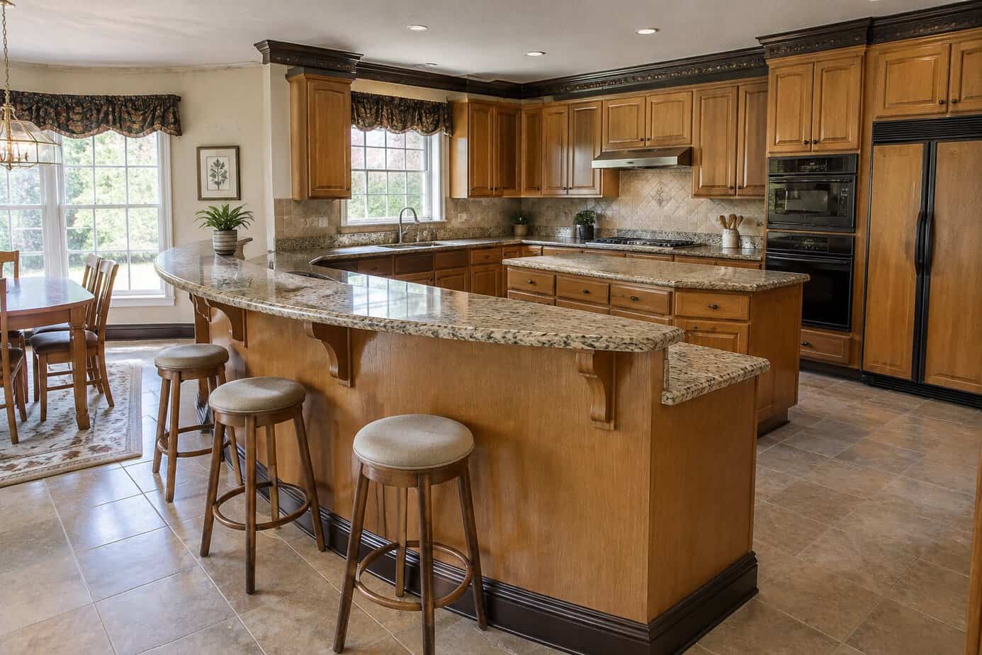
Curved breakfast bars with a raised counter ledge were everywhere from the late 1980s through the early 2000s. They added seating without a table, and the rounded edge made a small kitchen feel friendly. You probably remember the stools lined up along that bar for homework, snacks and morning coffee.
Today, many designers and buyers describe the look as dated. The raised ledge hides counter clutter, but it also chops the room into zones and blocks your view. The curve eats into walkway space, and bar-height stools are hard to climb onto and leave your legs dangling, which isn’t much fun for anyone with tired knees.
A budget-friendly start is to refresh what you have. Trade heavy old stools for slimmer ones with backs, and paint or restain the face of the bar in a calmer color. If the raised ledge really bothers you, a carpenter and a countertop shop can often lower it to one flat surface for far less than a whole new kitchen.
28. Granite tile countertops with visible grout
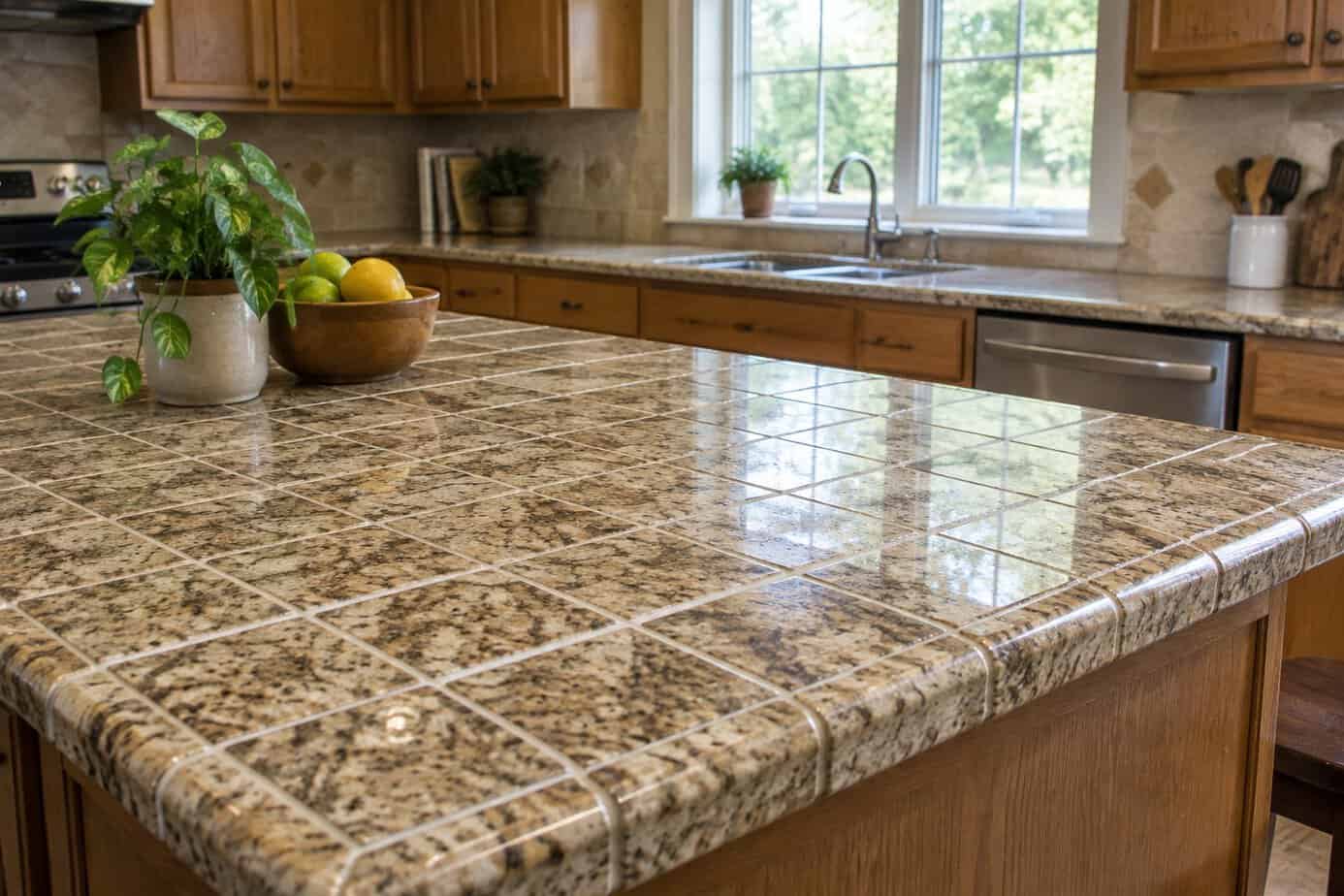
Granite slabs were expensive, so in the 1990s and 2000s many homeowners chose 12-inch granite tiles instead. You got real stone at a friendlier price, and plenty of people installed them themselves over a weekend.
Today, those counters tend to look dated. The grout lines break up the surface, and a seamless slab is what buyers expect to see. The grout also collects crumbs and stains, it needs regular sealing, and the slight lips between tiles make wiping the counter or rolling out pie dough more of a chore.
You don’t have to start over. Have the grout deep-cleaned and sealed, or use a grout colorant in a shade close to the stone so the grid fades. If the counters are due for replacing anyway, laminate in a plain solid color is often cheaper than you’d think and looks cleaner than the old tiles.
29. Small square floor tiles with dark grout
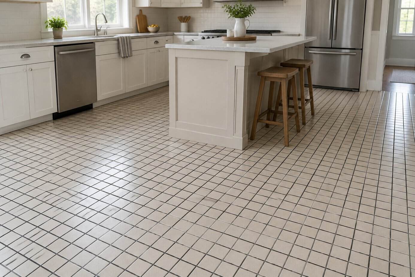
Small square floor tiles with contrasting grout were a common kitchen choice for years. The tile was affordable and easy to find, and dark grout seemed practical because it hid spills and footprints.
Today, the look tends to read as dated. All those grout lines turn the floor into a busy grid, which can make a kitchen feel smaller and chopped up. Dark grout against light tile also looks heavy next to the larger tiles and wood-look floors that are popular now. And narrow grout lines collect dirt, while old grout cracks and stains over time.
A budget-friendly fix is to clean the grout thoroughly and recolor it with a grout colorant in a shade close to the tile. The grid softens and the floor looks calmer, often in a weekend for the cost of a few bottles and a small brush.
30. Upper cabinets hanging over the peninsula
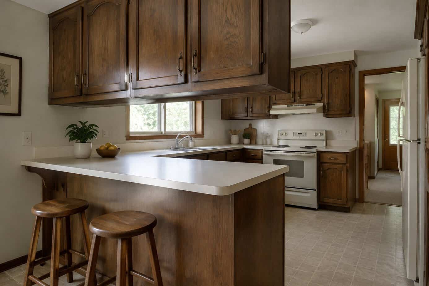
If your kitchen has cabinets dropping down from the ceiling over a peninsula, you know this look from the 1970s, 1980s and 1990s. The hanging cabinets added storage and set the kitchen apart from the dining area or family room.
Today, they tend to make a kitchen feel closed off. They block the view across the room, cut down on light and make it harder to talk with family while you cook. Many designers and buyers call them bulky, and they often make a kitchen look older than it is. Reaching into them from the peninsula side isn’t easy either.
A budget-friendly fix is to remove the cabinets and patch and paint the ceiling. Check first for wiring, since some have lights mounted underneath. If you need the storage, add a slim cabinet or shelf on a nearby wall. The open view alone can make the kitchen feel twice as big.
Why Kitchens Look Dated So Quickly
Most rooms in your house can be updated with paint and a few new pillows. A kitchen is different. Cabinets, counters, backsplashes, floors and lighting are built in and usually chosen all at once, so the whole room carries the date of its last remodel. When one piece goes out of style, its partners usually go with it.
That is why so many items on this list come in pairs, like cherry cabinets with granite, honey oak with almond appliances, or travertine with a tile mural. The good news is that changing one big surface, usually the cabinet color, breaks up the set and makes everything around it look newer.
Where to Start If Your Kitchen Feels Dated
Start with the changes that cost the least and do the most: clear off the cabinet tops and counters, take down the wallpaper border, swap the pulls and change the light bulbs. Next come paint and lighting. Bigger projects like counters, floors and appliances can wait until something actually wears out.
Before you sand, scrape or tear anything out of an older home, think about what may be underneath. Old paint, flooring and glue can contain lead or asbestos, and a simple test or a call to a pro is money well spent.
Keep What You Love
A kitchen doesn’t have to follow every trend to feel good. If you love your cherry cabinets or your grandmother’s rooster pitcher, keep them and update what is around them. A clean, well-kept kitchen with a few pieces you treasure never really looks dated. And if your drawers are full of things you never use, you may enjoy the worst kitchen gadgets shoppers say weren’t worth it.


