
29 Home Decor Trends That Are Quietly Going Out of Style
If you have decorated a few homes over the years, you know how trends work. A look shows up in magazines, then in every store, then in every house on the street, and one day it simply starts to feel tired.
Some of the styles on this list are only a few years old, and some are ones you may have lived with for decades. None of them are mistakes. They just aren’t what designers and showrooms are reaching for anymore.
Here are 29 home decor trends that are quietly going out of style, why people loved them, and what is taking their place, so you can decide what to keep, what to freshen up and what to let go.
1. Boho macrame wall hangings and woven everything
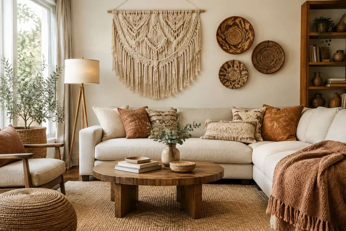
Macrame wall hangings were everywhere for the past several years. These knotted cotton pieces, often hung from a driftwood rod with fringe and wooden beads, gave plain walls some texture. You may remember macrame from the 1970s, so this revival probably felt familiar.
People loved them for good reasons. They were handmade, soft, and easy to hang in a bedroom, nursery, or living room. Woven baskets, rattan trays, and fringed tapestries joined them, and soon whole rooms had that relaxed, earthy look.
Now the look is fading. Many designers say the style became so common that it started to feel like a template. Dust also collects in all those knots and fringes, which makes upkeep a chore.
What is taking their place? Framed art, original paintings, and simple mirrors are showing up on walls again. If you like texture, one handmade basket or a linen throw looks more personal.
2. Sliding barn doors on bedrooms and bathrooms
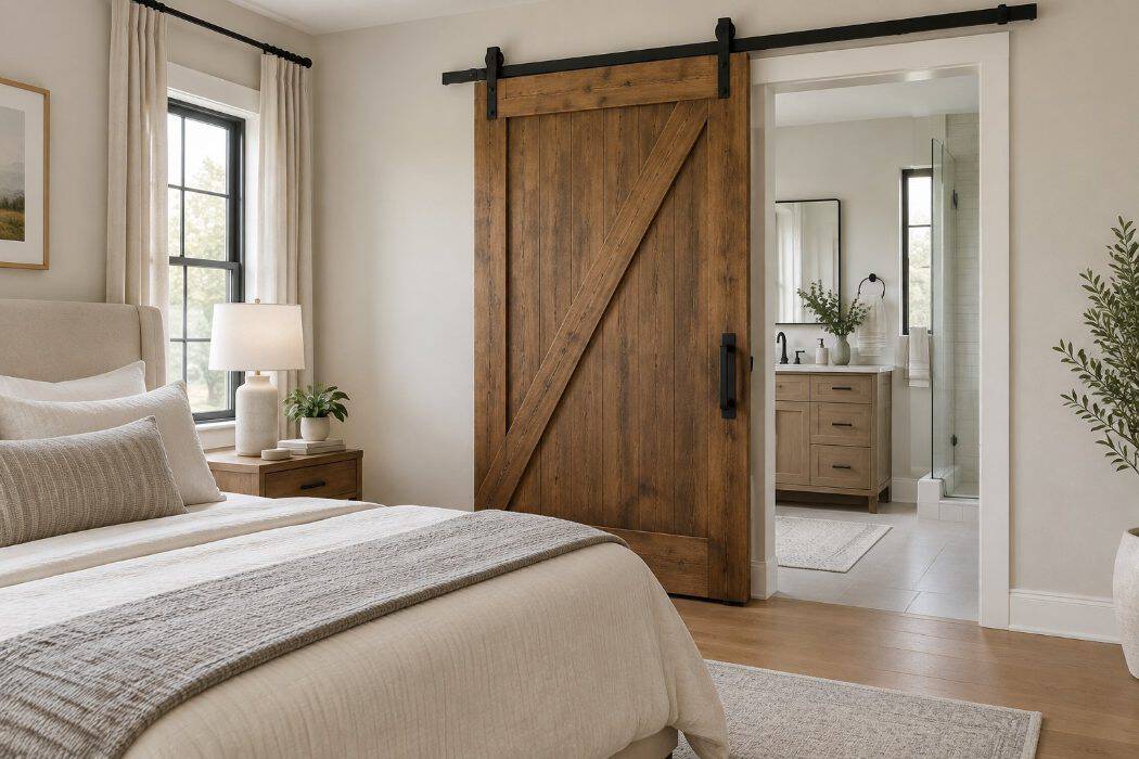
Sliding barn doors took off in the 2010s, and you probably remember seeing them everywhere. A plank door hung on a black metal track looked fresh, and it felt like a clever way to bring a little farmhouse charm indoors.
People loved them for good reasons. They swing out of the way, so you don’t lose floor space to a door arc, and they made a plain hallway look more interesting.
On bedrooms and bathrooms, though, the shine has worn off. A barn door hangs slightly off the wall, which leaves gaps at the sides and bottom. Sound, light, and smells slip through, and that matters when you want real privacy.
Designers are now steering toward solid-core hinged doors, which close tightly and feel more substantial. Pocket doors are a popular pick when space is tight, since they slide into the wall and seal better. Many homeowners are also choosing classic paneled doors in soft, painted finishes.
3. Matte-black fixtures used throughout the entire home
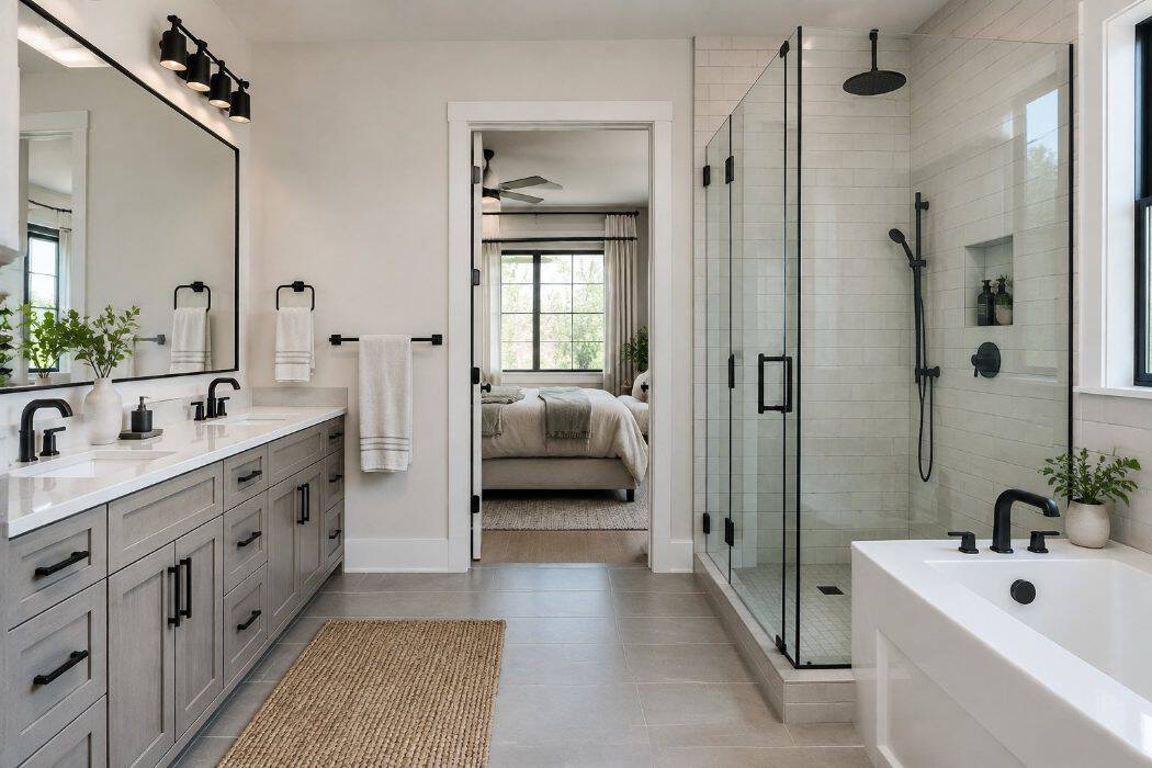
Matte-black faucets, cabinet pulls, light fixtures, and door hardware took off in the late 2010s. You may remember seeing them in nearly every renovation photo.
The appeal was easy to understand. Black gave kitchens and bathrooms a crisp, graphic look, and it felt like a fresh break from the polished chrome and brushed nickel that had dominated for years.
Now, designers say the look is cooling off, especially when it appears in every room. A home with black on every faucet, handle, and light can start to feel heavy and repetitive. Matte black also shows water spots and fingerprints, which can make upkeep more work than you expected.
What’s taking its place is warmer and more varied. Warm bronze, satin finishes and classic polished nickel are showing up more often, and many people mix two finishes instead of committing to one.
A few black accents still look good, so keep them where they work.
4. Open kitchen shelves that are mostly for show
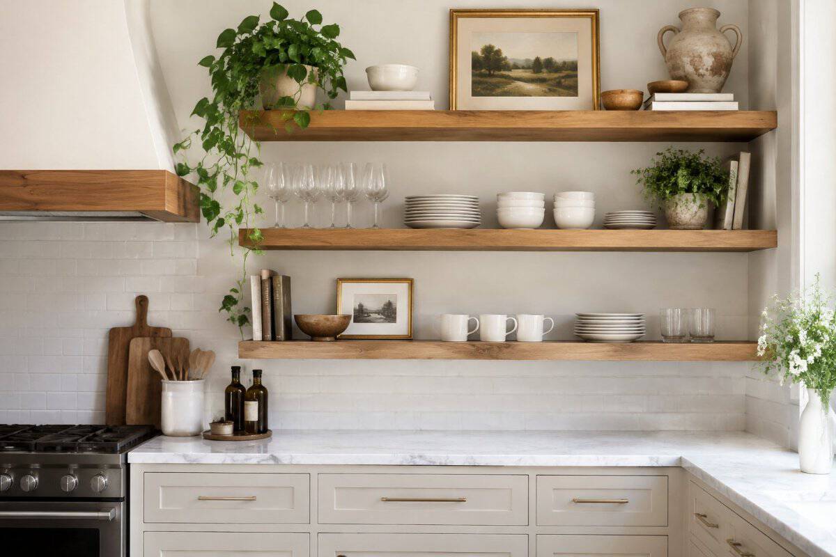
Open shelving took off in the 2010s, when many kitchens traded upper cabinets for floating wood planks lined with white dishes, glass jars, and a small potted plant. It photographed beautifully, and you probably saw it in magazines and on television renovation shows.
People loved it for good reasons. The look felt airy and relaxed, it made small kitchens seem bigger, and it let you show off pieces you were proud of.
Now many homeowners and designers are moving away from shelves meant mostly for show. Dishes left in the open collect grease and dust, and styled arrangements take steady upkeep.
What’s taking their place is a more practical mix. You’ll see closed upper cabinets paired with one or two short shelves, often placed near the stove or coffee area for items you actually reach for daily. Glass-front cabinets are also popular, since they give you a peek at your favorite pieces while keeping dust off.
5. One bold accent wall in an otherwise plain room
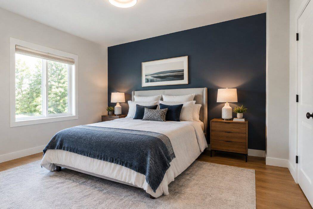
You probably remember when painting a single wall in a deep red, navy, or teal was the quickest way to freshen up a room. Magazines and home shows promoted it heavily from the late 1990s through the early 2010s. It cost little and took a weekend.
The idea made sense at the time. One strong wall gave the eye a place to land and made a plain room feel like it had a focal point.
These days, many designers say the look can feel disconnected. A single dark wall can make a room seem chopped up, especially when the other walls stay plain white or beige.
What is replacing it is color used more evenly. Designers now lean toward painting all four walls in one soft shade, or wrapping a room in a single rich color. Wallpaper, paneling, and painted trim are also popular ways to add interest without singling out one wall.
6. Bouclé upholstery on every chair and sofa
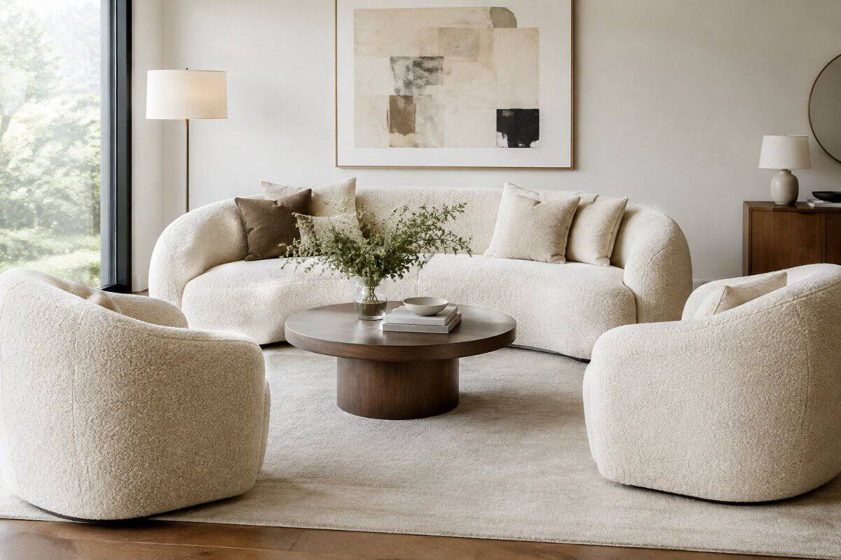
Bouclé is a fabric made from looped yarn that gives a nubby, cloud-like surface. Over the past several years, you probably noticed it everywhere, from curved cream sofas to matching accent chairs in nearly every showroom and magazine spread.
It’s easy to see why people loved it. The texture feels soft and cozy, and it pairs well with rounded shapes that make a room feel relaxed.
Lately, though, designers say the look has been overdone. When the same white or cream bouclé shows up on every seat in a room, the space can feel flat and a bit like everyone else’s home.
Light-colored loops also tend to show wear and stains, which matters if you have grandchildren or pets visiting.
What’s taking its place is variety. You’ll see designers mixing textures, using bouclé on a single armchair or a headboard, and choosing richer colors, leather, velvet, or nubby wovens for the larger pieces.
7. Fluted furniture and wall panels used everywhere
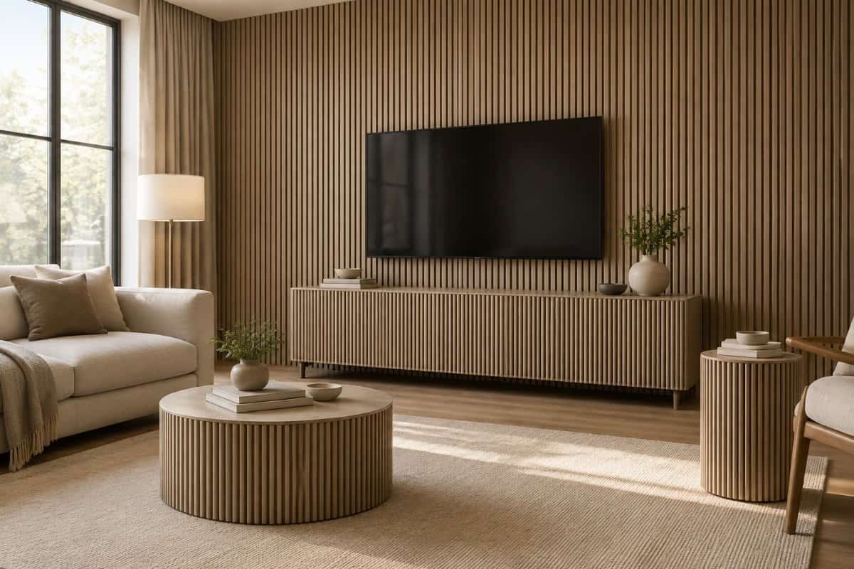
Fluted detailing is made up of narrow, rounded grooves that run vertically along a surface. You have probably seen it on cabinet doors, kitchen islands, dresser fronts, coffee table bases, and wall paneling.
People loved it because it added texture without adding color. The grooves create soft shadow lines, and a plain piece suddenly looks more tailored.
Lately, though, the look has started to feel overdone. When nearly every console, headboard, and vanity has the same ribbed finish, it stops feeling special and begins to feel like a passing fashion. Some designers are also noting that the grooves collect dust and can be a chore to wipe clean.
What is taking its place? Designers are leaning toward smooth, simple surfaces paired with a single standout detail, such as a carved edge, natural wood grain, or classic raised panels. If you already own a fluted piece you love, there is no need to rush it out the door.
8. Scalloped edges on mirrors, lamps, and furniture
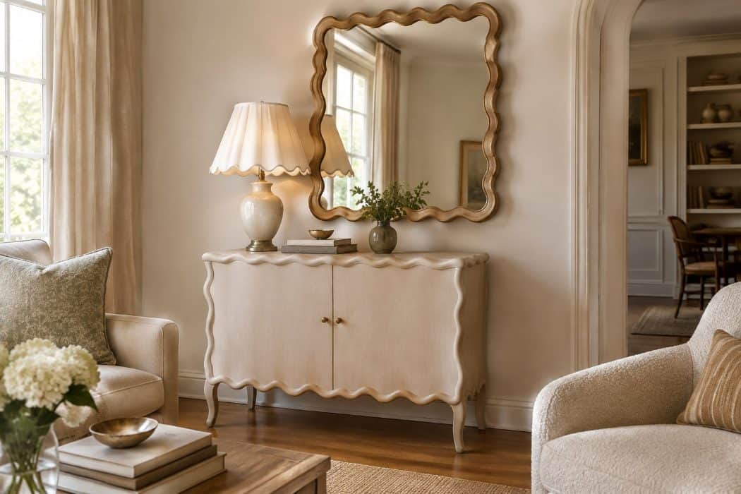
Scalloped edges are repeating curved arcs that run along the rim of a mirror, the base of a lampshade, or the top of a dresser. You may remember similar details from decades past, which is part of why they felt familiar when they returned in recent years.
People loved them because they softened a room. A wavy edge on a mirror or a table feels gentle and a little playful, and it worked well in coastal, cottage, and grandmillennial styles.
Lately, though, the look has been showing up everywhere, from big-box stores to online shops. When a detail becomes that common, it can start to feel dated quickly, and some designers now describe it as slightly overdone.
A piece you love can stay as long as it makes you smile.
What many designers are leaning toward instead is cleaner shapes with quiet character. Think simple arched mirrors, straight-edged wood furniture with visible grain, and lamps with plain, tailored shades.
9. Rattan pendant lights in every room
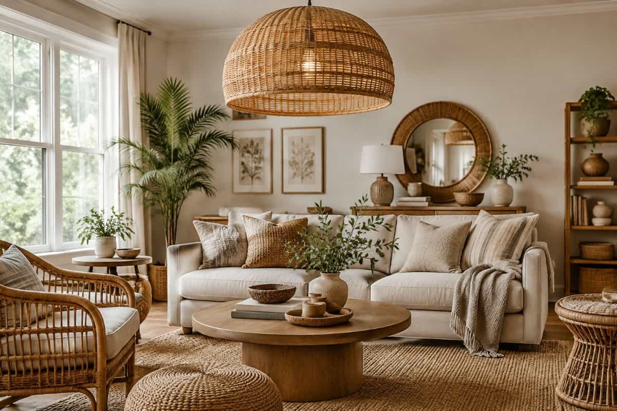
Rattan pendants showed up over kitchen islands, dining tables, bedrooms, and even bathrooms over the past several years. You may have noticed that nearly every home tour featured the same woven dome swaying overhead.
It’s easy to see why you or your neighbors liked them. The woven texture softened plain ceilings, and the light that filtered through felt warm and gentle. They also suited coastal, boho, and relaxed farmhouse looks, so they fit almost anywhere.
The trouble is that a good thing repeated in every room starts to feel dated. Designers now say the look has become so common that it reads as a trend rather than a choice. Some homeowners also find that the weave collects dust and needs regular care.
What’s taking its place is more variety. Designers are mixing a single woven fixture with other materials, such as blown glass, aged brass, plaster, and painted metal.
10. Unlacquered brass hardware as the default finish
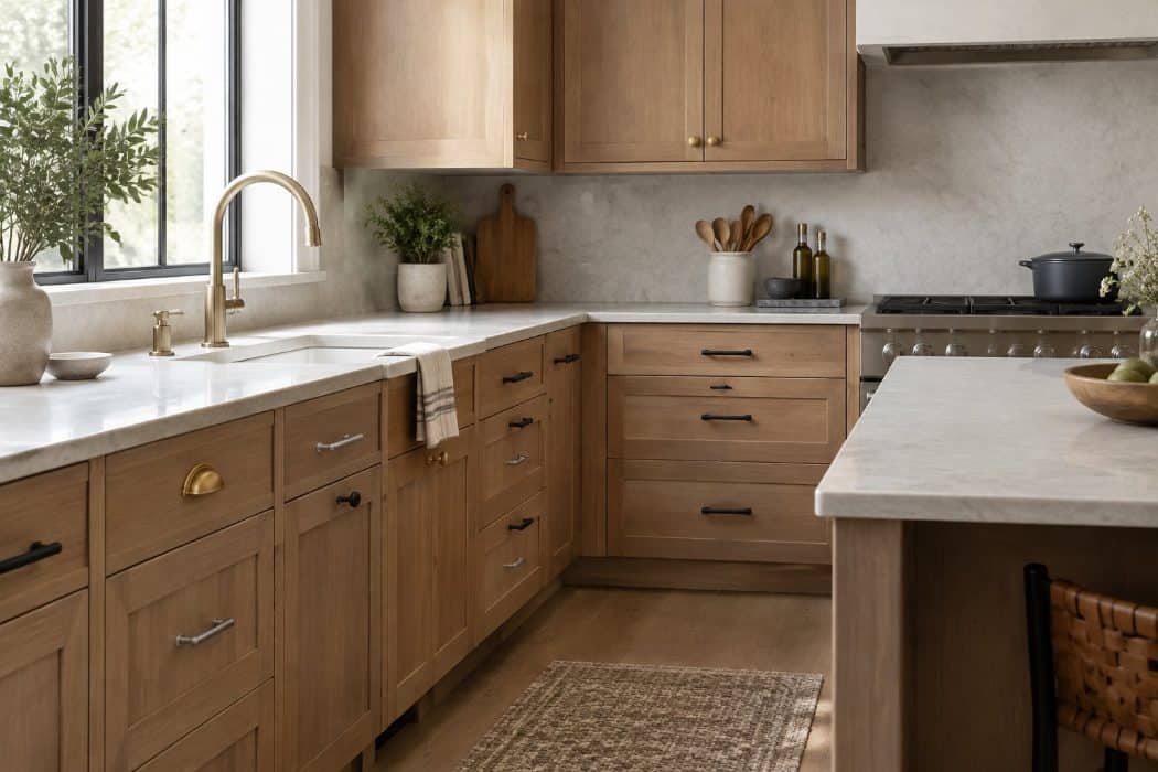
Over the past few years, unlacquered brass became the finish many people reached for first. You likely saw it on cabinet pulls, faucets, and door handles in nearly every home tour and showroom. It has no protective coating, so it darkens and softens with use.
People loved it for good reasons. The warm tone feels welcoming, and the changing patina gives a piece a lived-in look that many found charming.
Now, some designers and homeowners are pulling back from making it the automatic choice. When every handle and fixture in a house is the same brass, the look can start to feel predictable. The uneven aging can also bother those who prefer a tidy, consistent finish, and it takes regular wiping to keep it looking even.
What is taking its place is a more mixed approach. You will see satin nickel, oil-rubbed bronze and polished nickel used alongside a little brass, so the metal becomes an accent rather than the whole story.
11. White subway tile on every backsplash
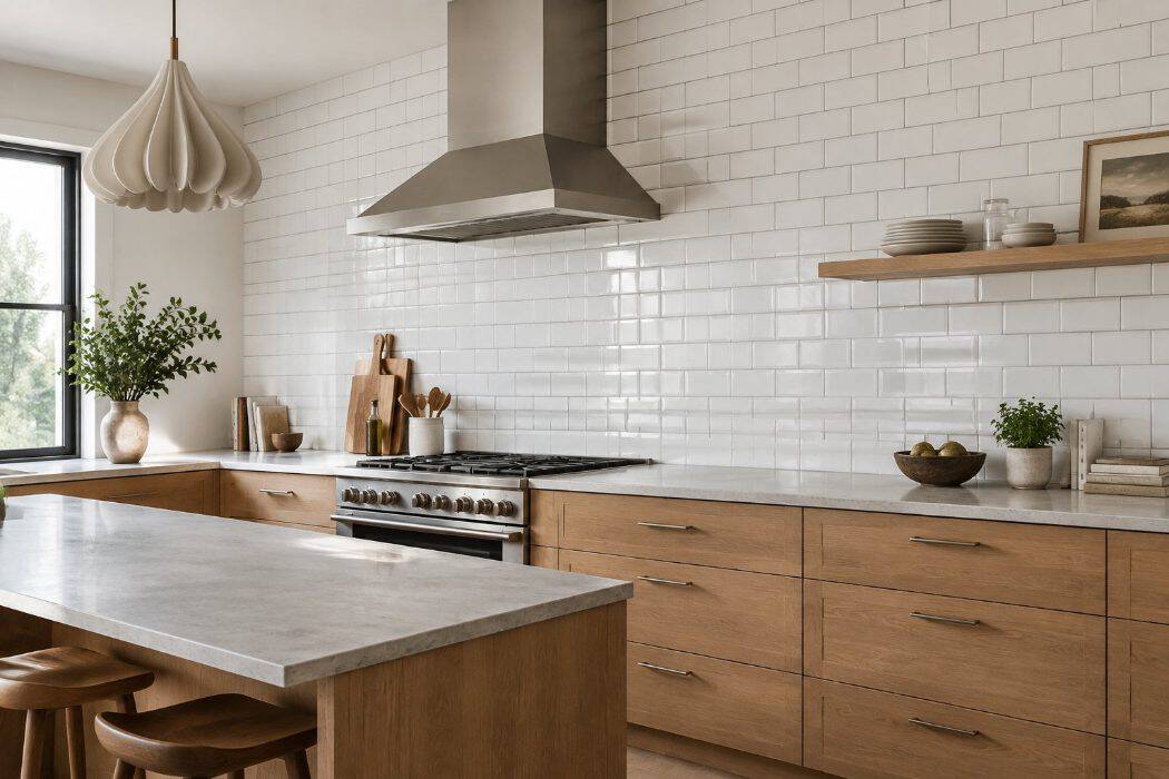
You probably remember when white subway tile became the go-to choice for kitchen backsplashes. The classic 3-by-6-inch rectangle, laid in a brick pattern, goes back to the New York City subway stations that opened in 1904. Over the last decade it showed up in nearly every renovated kitchen.
It’s easy to see why you or your friends may have loved it. The tile looks clean, goes with almost any cabinet color, and fit right in with the all-white and modern farmhouse styles that were everywhere.
Now many designers and homeowners are quietly moving on. After so many years, the look can feel like a builder’s default instead of a personal choice, especially when the kitchen has no other character.
What’s taking its place? People are choosing handmade-look tiles, colored ceramics, textured finishes, and patterns like herringbone. If you love your subway tile, you don’t need to rip it out, since fresh colors or layouts can update the look.
12. Bare Edison bulbs in every light fixture
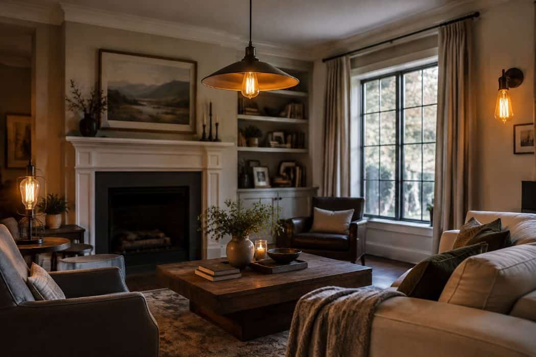
You may remember when exposed filament bulbs showed up everywhere, from kitchen pendants to restaurant ceilings. The look took off in the late 2000s and stayed popular through the 2010s. The bulbs themselves were a throwback, since the Department of Energy points out that incandescent bulb technology is more than 130 years old. Most “Edison” bulbs sold now are LEDs made to look like the originals. It fit the industrial and farmhouse styles that many people were decorating with at the time.
It’s easy to see why you or your friends might have loved it. The amber glow felt cozy, and the vintage shape gave a plain room some personality.
Now designers say the look has worn out its welcome. A bare bulb with no shade can throw glare straight into your eyes, and the light can feel harsh and uneven.
What’s taking its place are fixtures with shades or glass, warm dimmable bulbs around 2700 to 3000K, and lighting layered at different heights.
13. Faux plants used as a substitute for greenery
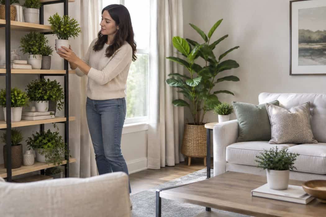
For years, artificial plants were a practical answer to a common problem. A fiddle leaf fig or a tall palm in the corner gave a room that finished look without any watering, pruning, or worry about whether the spot got enough light.
You may have loved them for good reason. They stayed green all year, worked in dark rooms, and never made a mess on the floor.
Lately, though, many designers say faux plants feel less appealing, especially when they stand in for real greenery in every room. Some describe them as flat and lifeless, and they tend to collect dust that needs regular wiping to keep them looking fresh.
Many homeowners now choose a lighter mix instead. A few hardy real plants, such as snake plants or pothos, are easy to keep alive and add real life to a space. Cut branches in a vase work well too. If you still like faux greenery, a single well-made piece used sparingly tends to look best.
14. Stark minimalism with little texture or personality
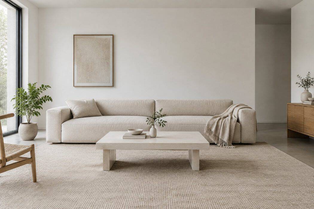
Stark minimalism means bare surfaces, white or gray walls, clean lines, and very few objects on display. You may remember how fresh it looked a few years ago, when magazines showed empty countertops and sofas with no pillows.
People loved it for good reasons. A clutter-free room is easy to clean, and the calm look appealed to anyone tired of crowded shelves and busy patterns.
Designers are now saying these rooms can feel cold and impersonal, almost like a showroom. Without texture or personal touches, a space can feel more like a place to pass through than a place to live.
What’s replacing it is warmer and softer. Think nubby wool throws, linen curtains, rounded furniture, and wood tones with some depth.
Books, framed art, family photos, and lamps at different heights are back too. You can keep the tidiness you enjoy while letting your home show who you are.
15. Open-concept layouts without distinct zones
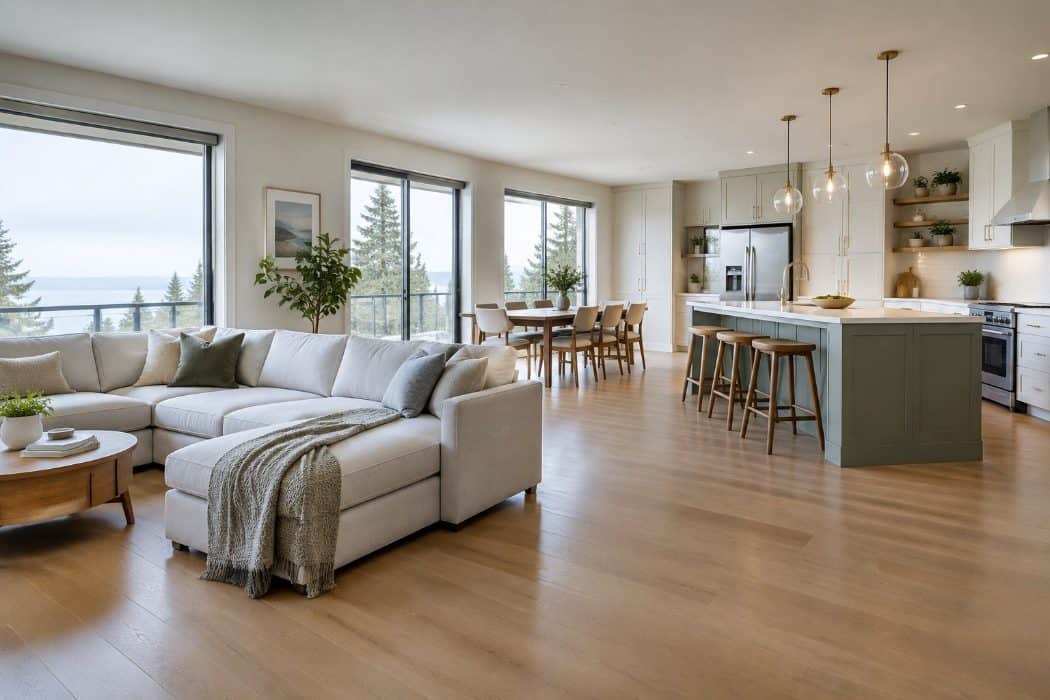
Open-concept layouts took off in the 1990s and 2000s, when walls between the kitchen, dining area, and living room were removed to create one large, continuous space. You may remember how fresh and modern it felt compared with the closed-off rooms many of us grew up with.
People loved it for good reasons. The cook could chat with guests, and the whole house felt bigger and brighter.
Over time, though, many homeowners noticed the downsides. Cooking smells and noise travel everywhere, the television competes with conversation, and it is hard to find a quiet corner for reading or a phone call. When many people started working from home in 2020, the lack of doors became hard to ignore.
Designers are now suggesting a middle path. Instead of knocking down every wall, they define areas within a space using rugs, furniture groupings, lighting, or partial walls and wide doorways.
16. Chevron stripes on rugs, pillows and curtains
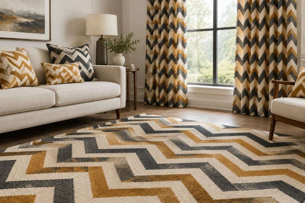
Chevron is the zigzag pattern made of repeating V-shapes, and you probably remember it showing up everywhere in the 2010s. It appeared on area rugs, throw pillows, shower curtains and drapery panels, often in gray and white, navy, or bright coral.
It’s easy to see why you or your friends may have liked it. The pattern felt fresh and energetic, and it added movement to a room without needing much else. It also worked well in a simple, neutral space where you wanted one bold touch.
These days, designers say chevron has been used so often that it reads as a marker of a particular decade. When the same zigzag appears on several items in one room, the space can feel dated rather than collected.
Many homeowners are now choosing softer, more varied patterns instead. Subtle checks, hand-drawn stripes, textured weaves and simple solids in natural fibers are taking its place. If you still love a chevron piece, one small pillow is usually enough.
17. Brushed nickel on every faucet and handle
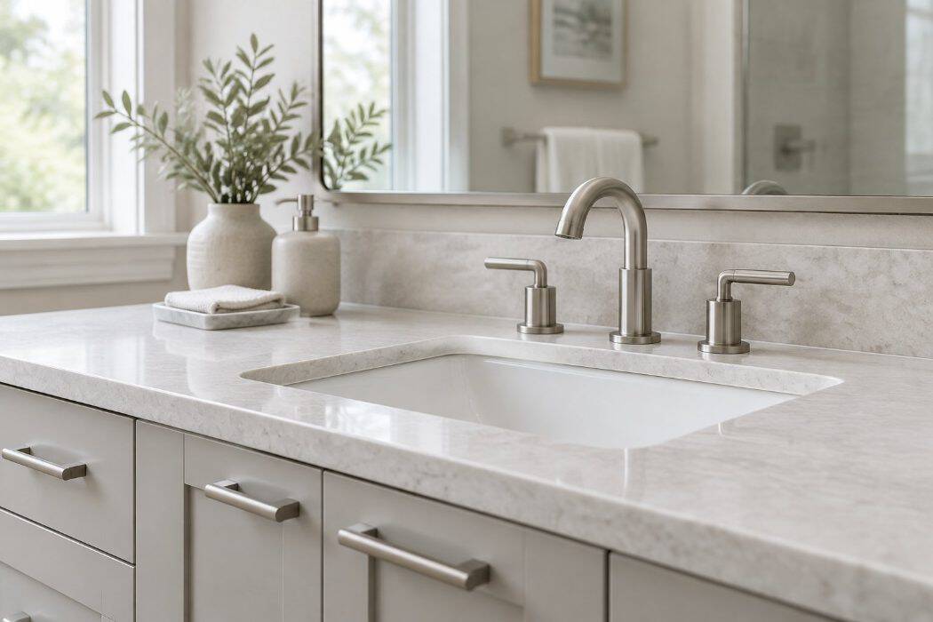
For roughly two decades, brushed nickel was the finish of choice for kitchens and bathrooms. You may remember choosing it for your faucets, cabinet pulls, towel bars, and even your light fixtures, all in one matching set.
It was easy to love. The soft, muted sheen looked tidy, went with almost any color scheme, and hid fingerprints and water spots better than shiny chrome did.
Lately, though, designers describe the all-brushed-nickel look as a bit dated, especially when every single fixture in a room matches. The finish can read as builder-grade, and its flat, cool tone sometimes feels dull next to warmer materials.
Brushed nickel isn’t disappearing, and it still works well in many homes. But people are mixing it up now.
Warmer metals like champagne bronze and oil-rubbed bronze are popular replacements, as is polished nickel for a little more shine. Many homeowners also blend two finishes, such as a bronze faucet with polished nickel cabinet pulls, for a more collected look.
18. Speckled granite countertops
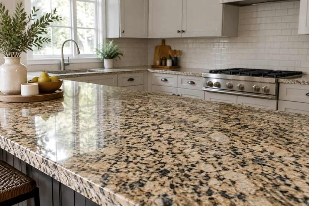
If you remodeled a kitchen in the 1990s or 2000s, chances are you chose granite with a busy, speckled pattern. Browns, tans, and blacks flecked together in a look that felt rich and sturdy.
There were good reasons you loved it. Granite stands up to heat, hides crumbs and spills, and lasts for decades with a little care. It also made a kitchen feel like a step up from laminate.
These days, designers say the heavy speckling feels dated.
Newer kitchens lean toward lighter, calmer surfaces. Quartz in soft whites and warm neutrals is popular, as is quartzite or marble-look stone with gentle veining.
You may also remember news stories around 2008 about radon in granite. The EPA says there isn’t enough evidence that the granite types common in countertops raise indoor radon levels in any significant way, so that worry is no reason to tear yours out. If you still have granite, there’s no need to rush.
19. Industrial pipe shelving used as a default feature
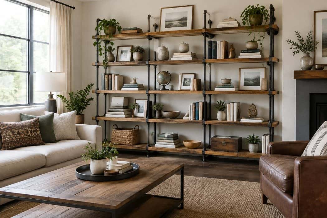
Industrial pipe shelving, made from black iron or galvanized plumbing pipe paired with thick wooden boards, was everywhere for a while. You may have seen it in cafes, loft apartments, and living rooms across the country.
People liked it for good reasons. It felt sturdy and casual, it suited the raw brick and open-plan look that was popular, and it was easy to build yourself with parts from a hardware store.
The trouble is how often it appeared without much thought. When the same pipe shelf goes into every room, the look can feel like a template rather than a choice.
What’s taking its place is softer and more personal. Think solid wood floating shelves, built-in cabinetry with open sections, and shelves finished in warm paint colors. These options still hold your favorite books and keepsakes, but they blend into your home rather than standing apart from it.
20. Vessel sinks that sit on top of the counter
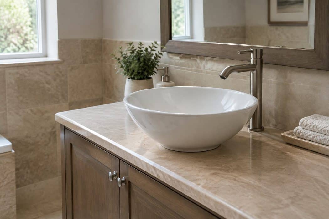
A vessel sink is a bowl that rests on top of the countertop instead of being set into it. You probably remember when these showed up in powder rooms and guest baths, often in glass, stone, or hammered copper.
People loved them because they felt like a small piece of art. A beautiful bowl on a simple vanity made an ordinary bathroom look special, and guests noticed it right away.
The trouble shows up with daily use. The raised rim means water splashes onto the counter, and the gap around the base collects soap and grime that you have to wipe out often. Tall bowls can also be awkward to lean over, especially if your hands or back are sensitive.
Many designers now lean toward undermount sinks and integrated basins, where the sink and counter flow together. Wall-mounted faucets and wide, shallow basins are also popular. They give you a clean look, and the counter wipes down in one pass.
21. Rose gold and copper accents
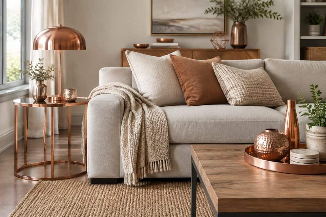
Rose gold and copper had a long run in home decor, especially through the 2010s. You probably remember the blush-toned lamps, copper-colored kettles, and pink-metallic picture frames that showed up in nearly every home store.
People loved these finishes because they felt softer and warmer than chrome or brass. They paired nicely with gray walls, which were everywhere at the time, and they gave a room a gentle glow without feeling harsh.
Lately, designers say the look has started to feel tied to a specific era. When a finish is so closely linked to one decade, it can make a room seem dated even if everything else is in good shape.
Many homeowners are switching to warmer, more natural metals instead. Antique bronze, pewter, and soft iron finishes are showing up in lighting, cabinet pulls, and faucets, and they tend to blend well with wood and stone.
If you still love your copper pieces, a few well-chosen ones can sit comfortably alongside these newer finishes.
22. Gallery walls arranged with identical frames and spacing
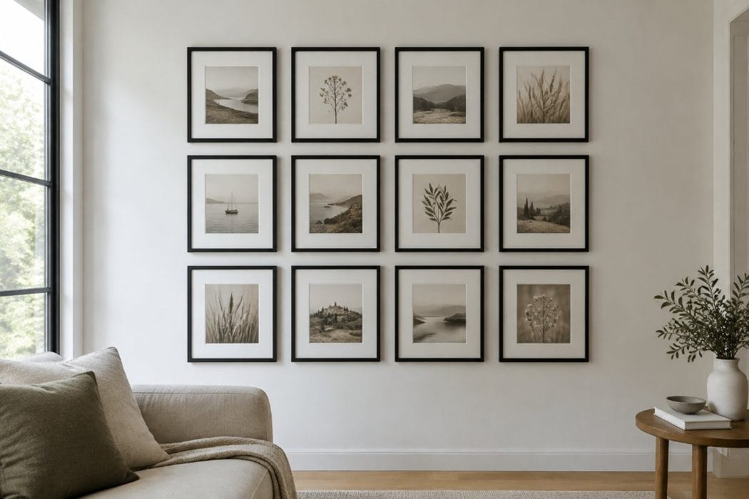
You probably remember when this look was everywhere. A grid of matching black or white frames, all the same size, hung with exactly two inches between each one. It looked tidy, and it made a wall of family photos feel organized.
People loved it for good reason. Matching frames took the guesswork out of hanging, and the result suited almost any room. You could fill a wall without worrying that something clashed.
Lately, though, designers have been steering away from the perfectly uniform version. It can read as a little stiff, like something pulled from a showroom rather than a home where people actually live.
What’s taking its place is looser and more personal. Think a mix of frame styles, finishes, and sizes, with some pieces layered or leaning on a shelf.
The spacing is relaxed too, and the wall grows slowly over time. It feels collected rather than installed, which suits a home you’ve lived in for years.
23. Quatrefoil and Moroccan trellis patterns
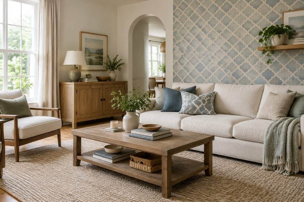
You probably remember the quatrefoil, that four-lobed, clover-like shape repeated across a surface. It is an old shape, borrowed from the window tracery of Gothic architecture. Paired with the Moroccan trellis, an interlocking lattice, it showed up on rugs, drapes, throw pillows, wallpaper through the 2000s and 2010s.
It’s easy to see why you may have loved it. The pattern felt tidy and a little worldly, and it worked in nearly any color.
Lately, though, designers and homeowners are drifting away from it. The pattern has been repeated so widely that it can make a room look dated or like it came from a single shopping trip.
What’s taking its place is often softer and less rigid. Think solid-colored textured rugs, organic motifs like leaves and botanicals, loose stripes, and hand-woven pieces with an irregular, handmade look.
Using it in one spot, like a single pillow, keeps its charm without letting it take over.
24. All-black window frames regardless of the home’s style
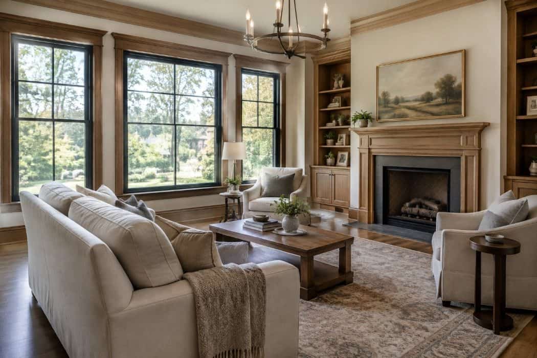
Black window frames became a favorite in recent years. They gave modern farmhouses, new builds, and renovated ranch homes a crisp, graphic look, with thin dark lines framing the view outside.
You may have liked the contrast against white walls and the way the frames seemed to turn a window into a picture.
The pull away from the look is happening in homes where it was applied without much thought. A black frame on a traditional cottage or a soft colonial can clash with the character the house already had. Dark frames can also show dust, fading, and heat more than lighter ones, depending on the finish.
Many designers now suggest choosing frame colors that suit the architecture. Warm whites, soft bronze, deep greens, and natural wood tones are showing up more often. These options keep the clean lines you may have enjoyed while feeling friendlier and a little more personal.
25. Fiddle-leaf fig trees in every corner
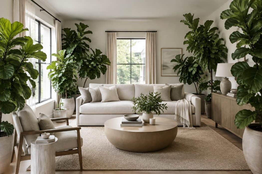
For about a decade, the fiddle-leaf fig was the houseplant to own. You probably spotted its large, violin-shaped leaves in magazine spreads, showrooms, and friends’ living rooms. A tall one in a woven basket became a standard way to fill an empty corner.
It’s easy to see why you may have liked it. The tree added height and a sculptural shape, and it made a room feel more lived in without much else needed.
Lately, designers and homeowners have been moving on. The tree turned up in so many homes that it started to feel like a formula instead of a personal choice. It is also known for being fussy about light, watering, and drafts, and many people grew tired of the browning leaves.
What’s taking its place is more variety. Olive trees, rubber plants, and mixed groupings of different plants in varied sizes feel more relaxed and personal. If you still enjoy your fiddle-leaf fig, there’s no reason to part with it.
26. Waterfall countertops used without regard to proportion
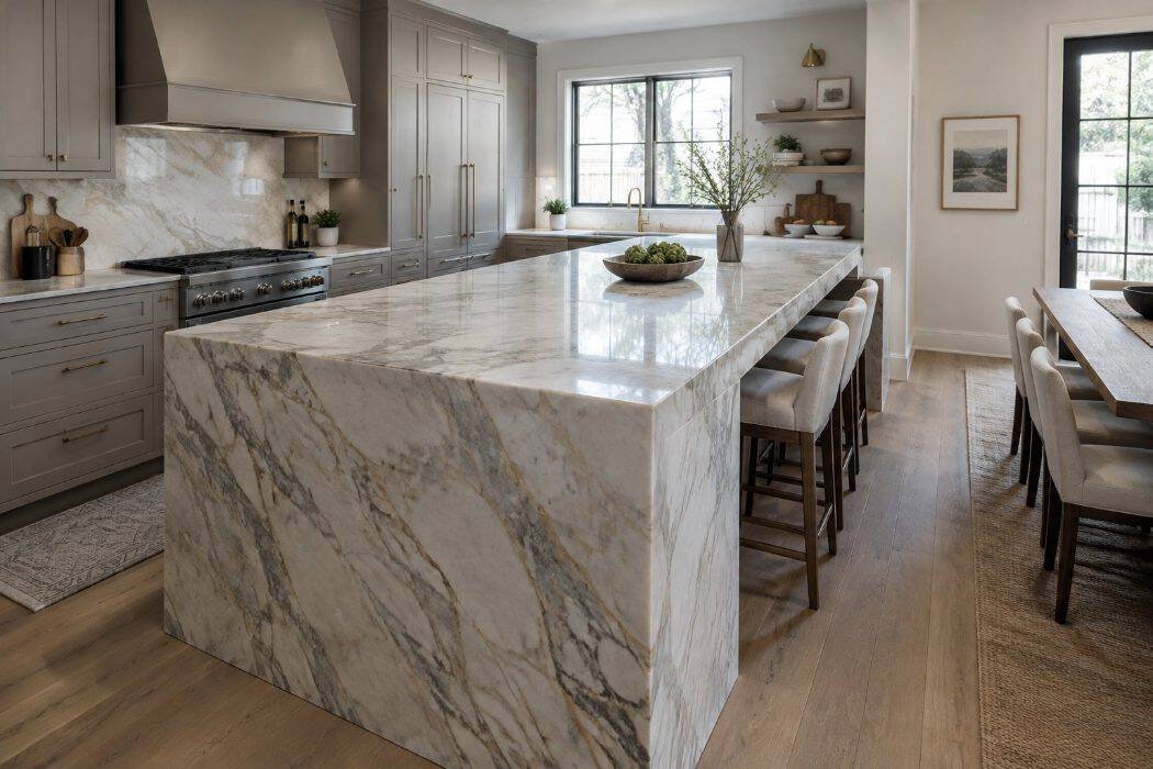
A waterfall countertop continues past the edge of the cabinets and runs straight down the side to the floor. For years, you probably saw it on kitchen islands in magazines and home tours.
People loved it for good reasons. It looked clean and sculptural, and it showed off a beautiful slab of quartz or marble from top to bottom.
The trouble comes when the look is applied everywhere, whether or not the room can carry it. A heavy waterfall panel on a small island, or on both ends of a narrow one, can crowd the space and make the kitchen feel boxy. It can also overwhelm the cabinets around it.
Some designers now say the style has been overused, though others still like it in the right setting. Many homeowners are choosing a single waterfall end on a generously sized island, or skipping it for a simple eased edge. Warm wood panels and furniture-style island bases with legs are taking its place.
27. Kitchen islands too big to walk around comfortably
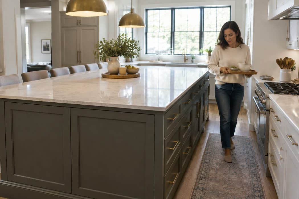
For years, the bigger the island, the better. Many of us watched home shows where a huge slab of stone sat in the middle of the kitchen, promising room for cooking, homework, and entertaining all at once.
You may have loved the idea of gathering everyone around one generous surface. It felt like the heart of the home, and it made a kitchen look impressive.
Lately, though, designers and homeowners are noticing the downsides. An oversized island can crowd the room, leaving narrow walkways between the counters and the island. Opening the dishwasher or oven can block traffic.
What’s replacing it is a more measured approach. Many people now choose a slightly smaller island, or one with curved or softened corners that make it easier to move past. Others are skipping the island altogether in favor of a table or a movable cart, leaving a little more breathing room to cook and chat comfortably.
28. Blush pink on walls, sofas and accessories
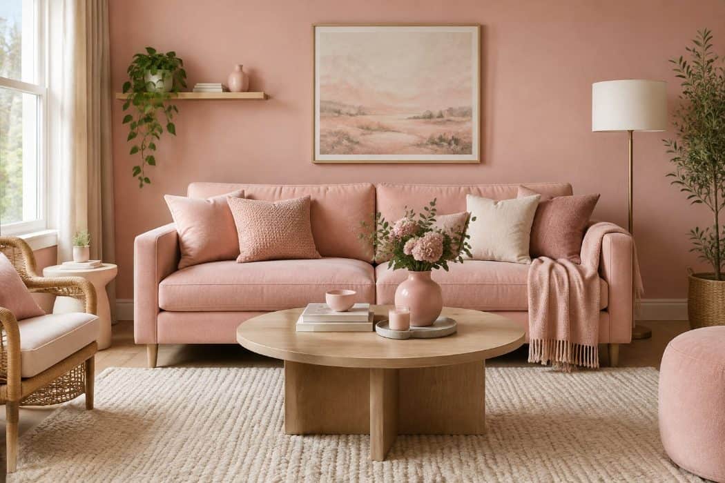
Blush pink, often called millennial pink, spread through homes in the mid-2010s. Pantone even named Rose Quartz a Color of the Year for 2016, sharing the title with a pale blue called Serenity. You may have seen it on painted walls, velvet sofas, throw pillows, and even kitchen accents. It felt soft and gentle, and it worked as a neutral that still had some personality.
People loved it because it flattered skin tones and made a room feel calm. It paired easily with brass, white, and gray, which were also popular at the time.
Now designers say the look has been used so widely that it can feel dated, especially when the pink is cool, sugary, and paired with gray. Some pink is still around, but it is shifting toward warmer, deeper shades like dusty rose, terracotta, and clay.
If your rooms lean pink, you don’t need to start over. Swapping a few accessories for earthier tones can give the space a fresher feel.
29. Freestanding tubs placed in impractical bathroom layouts
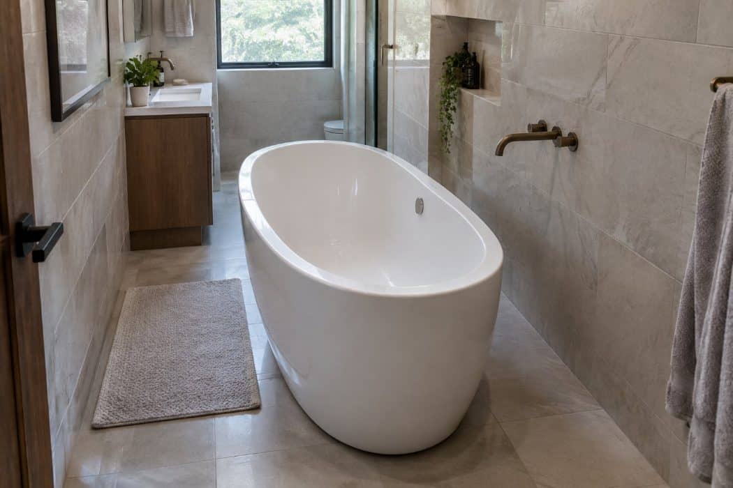
A freestanding tub set out in the middle of the room became one of the most photographed bathroom looks of the past decade. It promised a spa feel, and it looked like a piece of sculpture sitting on the floor.
You may have admired the idea yourself.
The trouble shows up in everyday use. Many bathrooms are not large enough to give a tub clear space on every side, so cleaning behind it becomes a chore. Floor-mounted faucets and wide gaps around the tub can mean more splashing and more puddles. Getting in and out can also be harder than with a built-in tub, which matters if you are thinking about comfort for years to come.
Designers are now choosing tubs that suit the actual room. Many place a freestanding tub against a wall or in an alcove, and some skip the tub in favor of a roomy walk-in shower with a good bench.
You might also enjoy The 30 Worst Decorating Trends That Make Your Home Look Older and 29 Outdated Home Features You Can Fix Yourself for Under $100.
A Trend Fading Doesn’t Mean You Chose Wrong
Most trends fade for the same reason: they got popular. Once the same sofa, light or tile shows up in every store and every home tour, it stops feeling special, even if there was nothing wrong with it.
Trends also come back around. Macrame had its first big run in the 1970s, brass has gone in and out of favor more than once, and the scalloped edges and rattan of the last few years were borrowed from decades many of us remember well. Something that looks dated today may look charming again in twenty years.
How to Decide What Stays
A good test is to ask whether you chose a piece because you loved it or because it was everywhere at the time. If you would still pick it today, it belongs in your home, whatever the magazines say.
It also helps to keep the big, costly things simple and well made, like the sofa, the countertops and the flooring, and let the small things carry the trends. Pillows, lamps, frames and a can of paint can change the feel of a room in an afternoon, and they are easy to swap again when the next look comes along.
Small Changes That Make the Biggest Difference
If a room feels a little stuck in time, start with what you see and touch every day. New cabinet pulls, a warmer light bulb, a fresh lampshade or new pillow covers cost little and change a room right away.
Most of all, keep what you love. A home filled with pieces that mean something to you never really goes out of style.