
The 30 Worst Decorating Trends That Make Your Home Look Older Than It Is
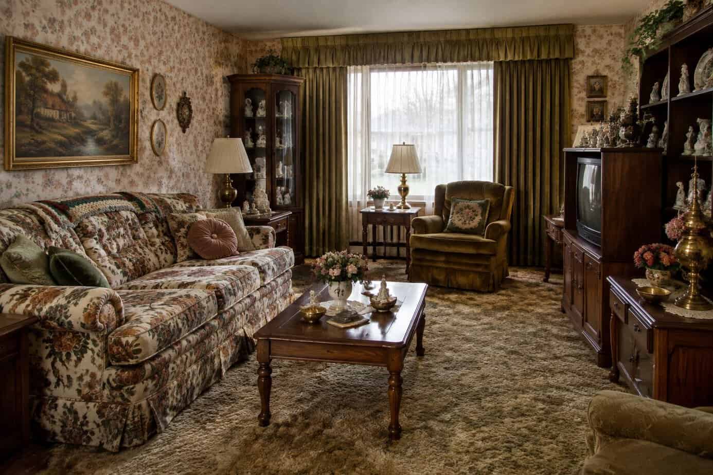
Home decor trends shift constantly, and what looked modern a decade ago can now date a space quickly. Certain choices in color, materials, and layout tend to signal a specific era rather than lasting style.
Recognizing these outdated elements can help you update your home and maintain its value over time. Some trends fade quietly, while others become obvious the moment a new style takes over. Knowing the difference allows you to make informed choices when renovating or redecorating.
This list walks through common decorating missteps that can make a home feel older than it is. You will find practical insight into what to avoid and why these choices no longer hold up.
1. Overusing gray-on-gray color schemes
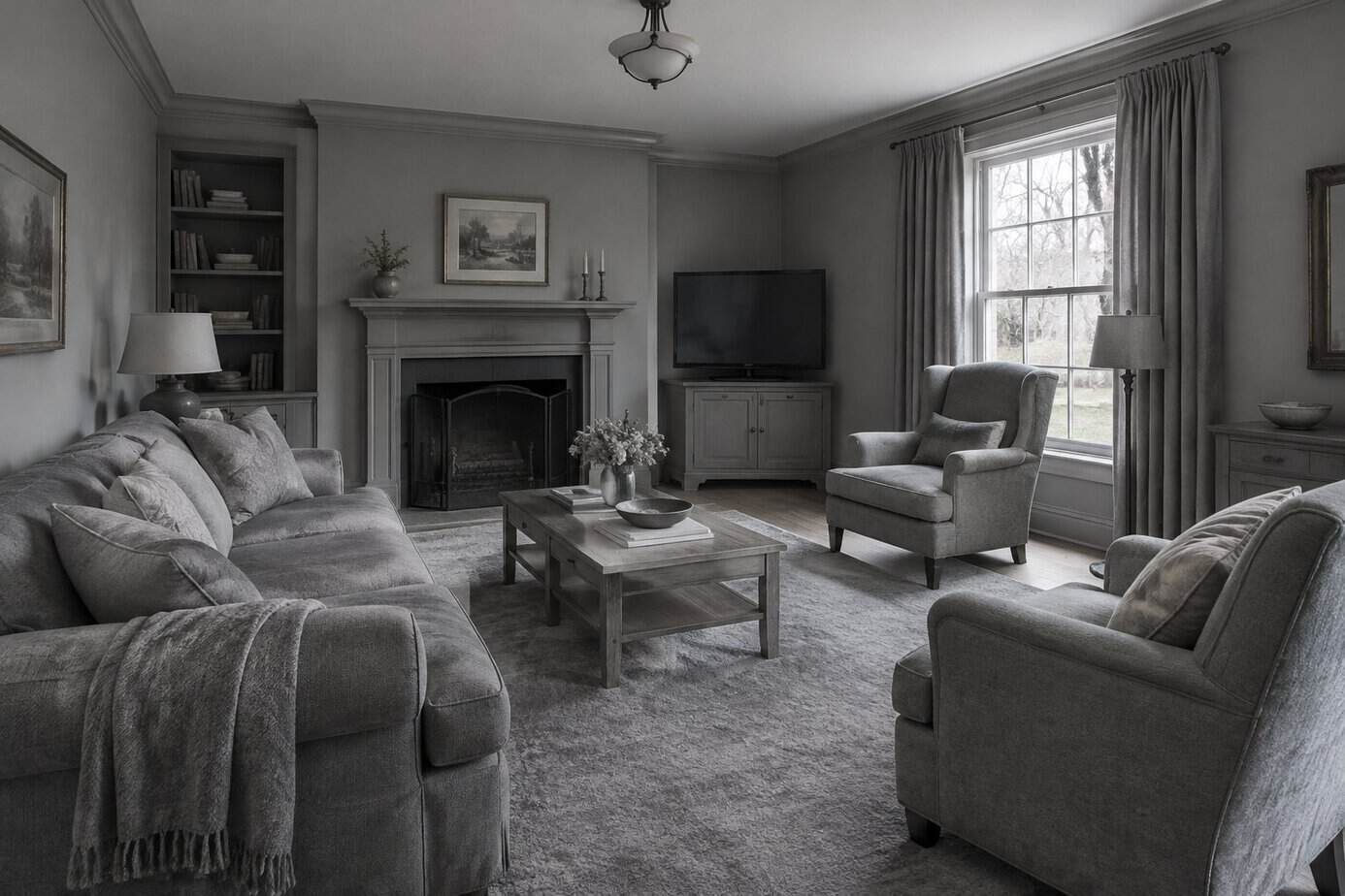
Gray dominated living rooms for over a decade. Walls, sofas, rugs, and even decorative accessories all matched in the same cool tone, creating a flat and monotonous look.
This palette once signaled a modern, updated home. Now it reads as dated and impersonal, lacking warmth or depth.
You can spot this mistake in rooms where every surface blends together with no contrast. Without variation, the space feels sterile rather than sophisticated.
Designers are moving toward warmer neutrals like taupe, cream, and soft browns instead. These tones pair well with wood finishes and natural materials, giving your home a more current and inviting feel.
If your space leans heavily on gray, consider introducing contrast through color, texture, or pattern. A single accent wall, patterned textile, or warm-toned wood piece can break up the monotony and keep your home from feeling stuck in the past.
2. Painting every room stark white
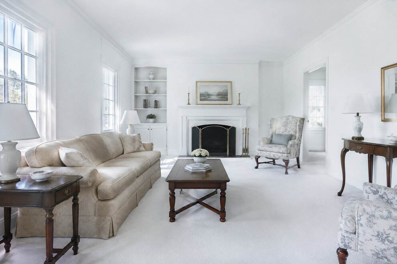
Stark white walls once signaled a clean, updated home. Now they read as cold and unfinished, especially without layers of texture or warmth to balance them.
Designers point out that bright white can feel sterile in rooms meant for comfort, like living rooms and bedrooms. The shift toward spending more time at home has made people want spaces that feel personal, not clinical.
Flat white also shows every scuff, shadow, and imperfection in your trim and walls. In certain lighting, it can look stark rather than crisp.
If your home still has all-white walls throughout, you’re working against current preferences. Buyers and visitors alike associate it with builder-grade finishes rather than intentional design.
Warmer neutrals, soft off-whites, or deeper tones in key rooms give your space more depth. They also hide wear better than pure white ever could.
3. Choosing all-white kitchens with no contrast
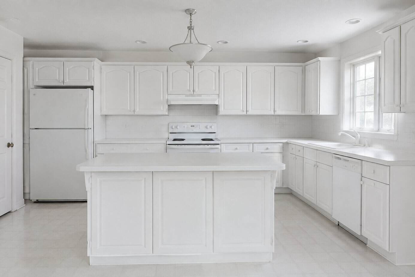
White kitchens were the default choice for years. Now they can read as flat and dated, especially when every surface matches with no variation.
The problem isn’t white itself. It’s the lack of contrast. When your cabinets, countertops, backsplash, and walls are all the same shade of white, the space loses depth and can feel sterile instead of clean.
Designers are moving toward layered palettes that pair white with warmer tones, wood accents, or deeper colors on an island or lower cabinets. This creates visual interest without sacrificing brightness.
If your kitchen is all one white, consider adding contrast through hardware, open shelving, or a different finish on your island. Even small changes break up the monotony and make the space feel current rather than like a builder-grade kitchen from a decade ago.
4. Installing distressed gray wood flooring
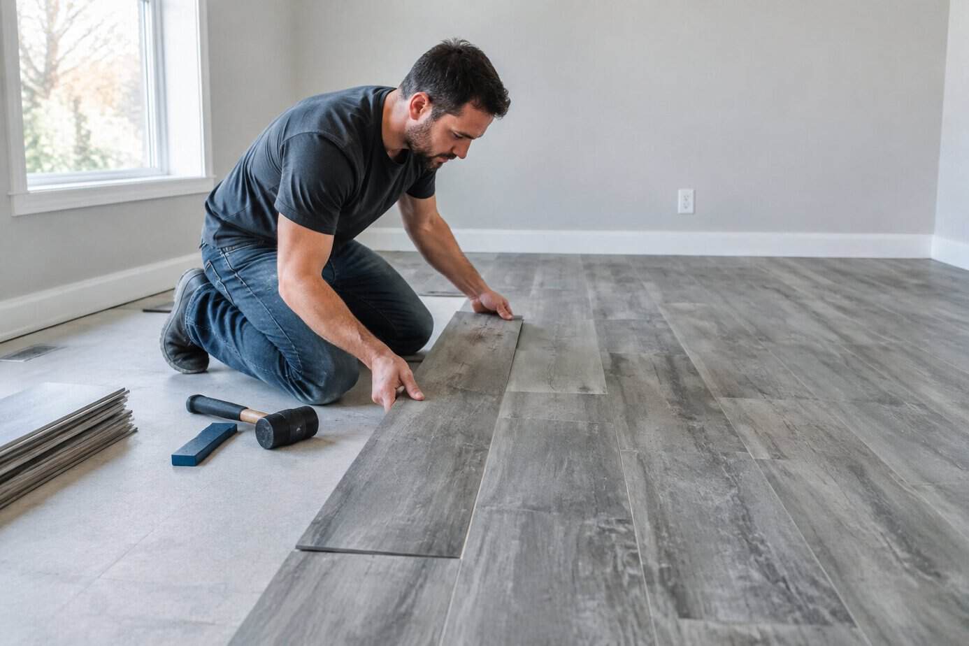
Gray distressed wood flooring had a strong run over the past decade. The weathered, matte finish once read as modern and intentional.
Now it signals a specific era rather than a timeless choice. The cool, washed-out tone can make rooms feel flat and sterile instead of warm.
You’ll also find gray harder to coordinate with furniture, trim, and wall colors than natural wood tones. Many homeowners end up fighting their own floor when they try to update other elements of a room.
If you’re considering new flooring, look toward natural oak tones or warmer wood species with visible grain. These options tend to pair well with a wider range of styles and hold up better over time, aesthetically speaking.
Swapping out flooring isn’t cheap, so this is one trend worth skipping if you’re planning ahead rather than chasing what’s current.
5. Using matching furniture sets throughout a room
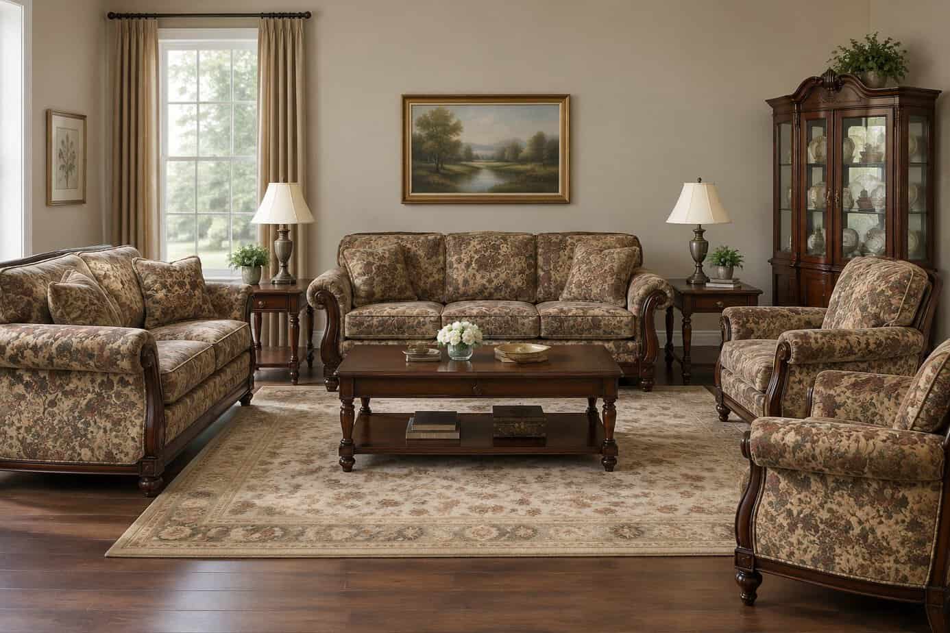
Buying a sofa, loveseat, and armchair in the same fabric might seem like the safest choice. It isn’t.
Matching sets read as a package deal, and that signals budget furniture rather than curated design. Your living room ends up looking like a showroom display instead of a space you actually chose piece by piece.
This approach also flattens the room. Without variation in texture, shape, or finish, there’s nothing for your eye to focus on.
Designers now favor mixing. Pair a neutral sofa with an armchair in a different material, or combine wood tones instead of matching every surface exactly.
If you already own a matching set, you don’t need to replace everything. Swap one piece, add contrasting throw pillows, or introduce a rug that pulls in a new color to break up the uniformity.
6. Covering every wall with shiplap
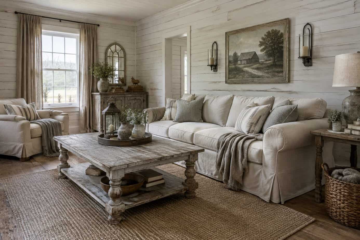
Shiplap took off after Fixer Upper made it the default choice for farmhouse style. For years, builders and homeowners added it to kitchens, bathrooms, and living rooms without much restriction.
The problem now is overexposure. When every accent wall uses the same horizontal planks, your home reads as a product of one specific decade rather than a space with its own character.
Shiplap itself isn’t the issue—using it everywhere is. Covering multiple walls or entire rooms locks you into a coastal or farmhouse aesthetic that limits how you can update your decor later.
If you want texture without dating your space, consider alternatives like real wood paneling, mineral plaster, or fabric wall treatments. These options offer similar depth without the association with a specific design era.
7. Adding faux brick or stone panels
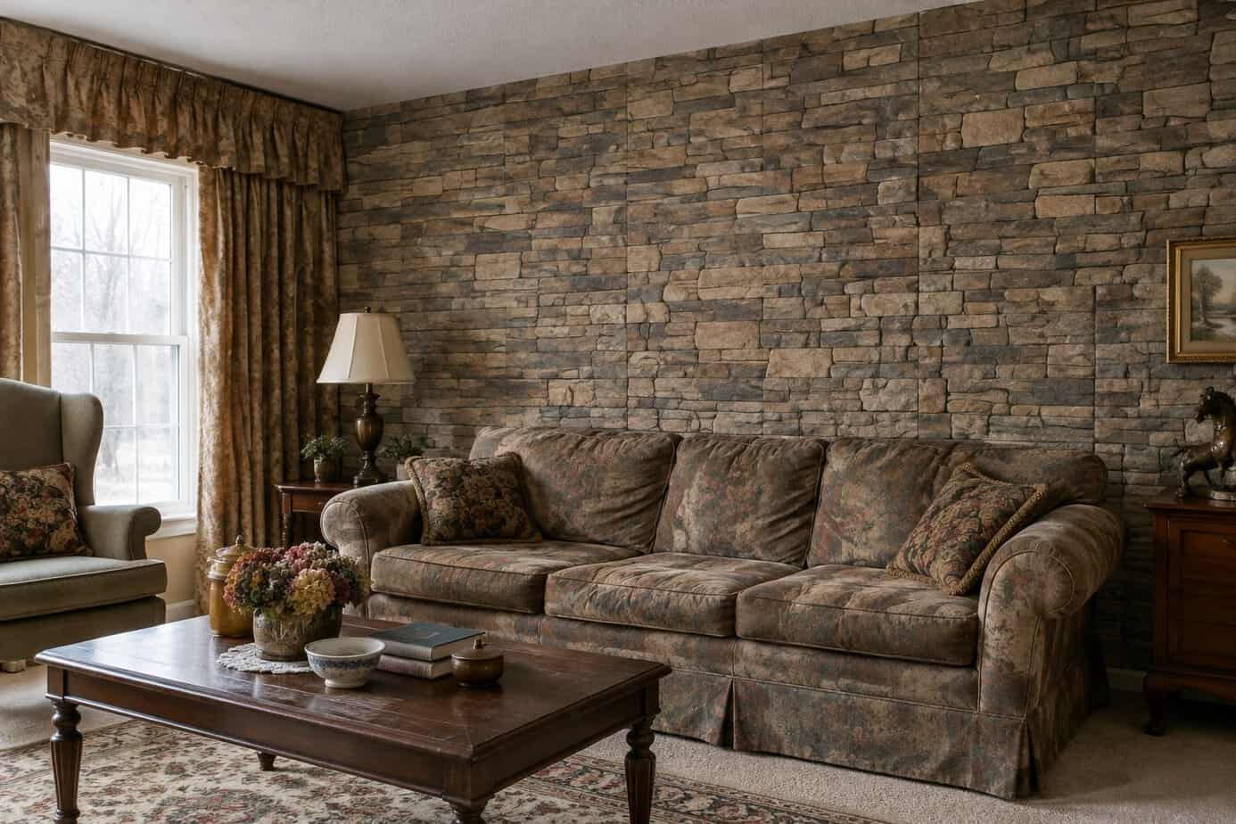
Faux brick and stone panels were marketed as an easy way to add texture and warmth to accent walls. The problem is that most versions look synthetic up close, with repeating patterns and uniform coloring that real masonry never has.
You’ll often find these panels on fireplace surrounds or kitchen backsplashes from the 2000s and early 2010s. Over time, the lightweight material tends to look flat under natural light, and edges can start to peel or show seams.
If you want texture without the dated look, consider thin natural stone veneer or limewash paint instead. Both options read as authentic and age more gracefully than molded plastic or foam panels.
Removing faux panels can also increase your home’s resale value, since buyers often associate them with budget renovations rather than quality craftsmanship.
8. Applying sponge-painted or rag-rolled finishes
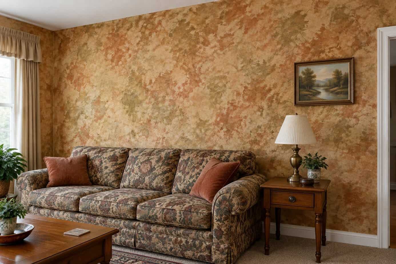
Sponge painting and rag rolling peaked in the 1990s and early 2000s. These techniques used layered colors and textured tools to create a mottled, uneven effect on walls.
If your walls still show this finish, it likely signals an outdated renovation. Modern design favors flat, smooth walls or clean textures like limewash and venetian plaster, not faux patterns.
The mottled look can also make rooms feel busier and smaller than they are. Solid colors or subtle, intentional textures read as more current and give you better control over how a space feels.
Removing a rag-rolled finish usually means sanding, priming, and repainting. It takes effort, but it updates your walls significantly and removes an obvious marker of an older renovation.
9. Using heavy faux-finish techniques
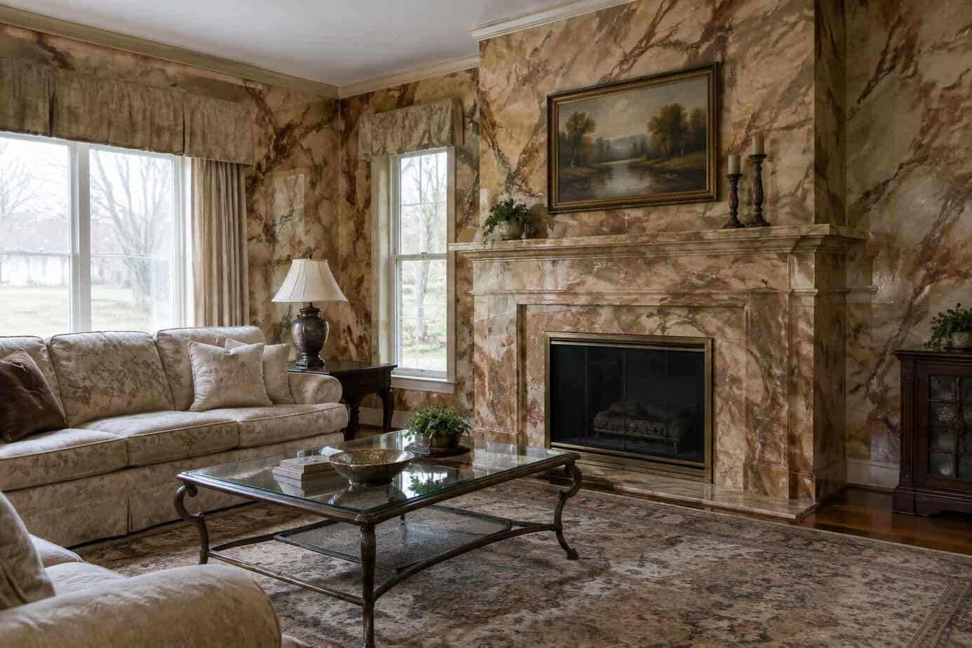
Sponge-painted walls, rag-rolled texture, and dramatic color-washing were everywhere in the late 1990s and early 2000s. These techniques took hours to apply and were meant to mimic expensive plaster or stone finishes.
Today, these faux finishes read as dated rather than luxurious. The mottled texture and uneven color patterns immediately signal a specific decade rather than a timeless look.
If your walls still carry this treatment, you’ll likely notice it clashes with more current furniture and decor. Faux finishes also tend to trap dust and grime in their textured surfaces, making them harder to clean.
A flat or eggshell paint in a solid color gives you a cleaner, more current backdrop. If you want texture, limewash or a subtle plaster finish offers a similar depth without the busy, uneven pattern that dates a room so quickly.
10. Hanging generic word-art signs
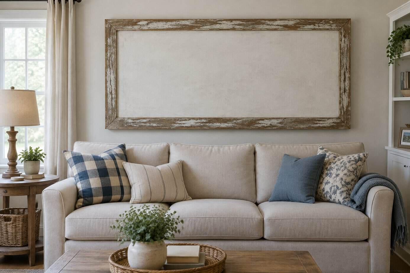
Signs reading “Family,” “Love,” or “Live Laugh Love” were everywhere a decade ago. Now they read as a shortcut rather than a design choice.
The issue isn’t the sentiment. It’s that mass-produced phrases on reclaimed-looking wood or canvas have been in so many homes that they no longer say anything specific about yours.
These pieces also tend to clash with more current design directions. Spaces today lean toward layered textures, original artwork, and personal photography rather than text-based decor bought off a shelf.
If you have word art hanging now, consider swapping it for something that reflects your actual taste. A piece of art you chose because you like it, not because it was trending, will age better.
Your walls say more about your home’s era than almost anything else in the room.
11. Displaying mass-produced motivational quotes
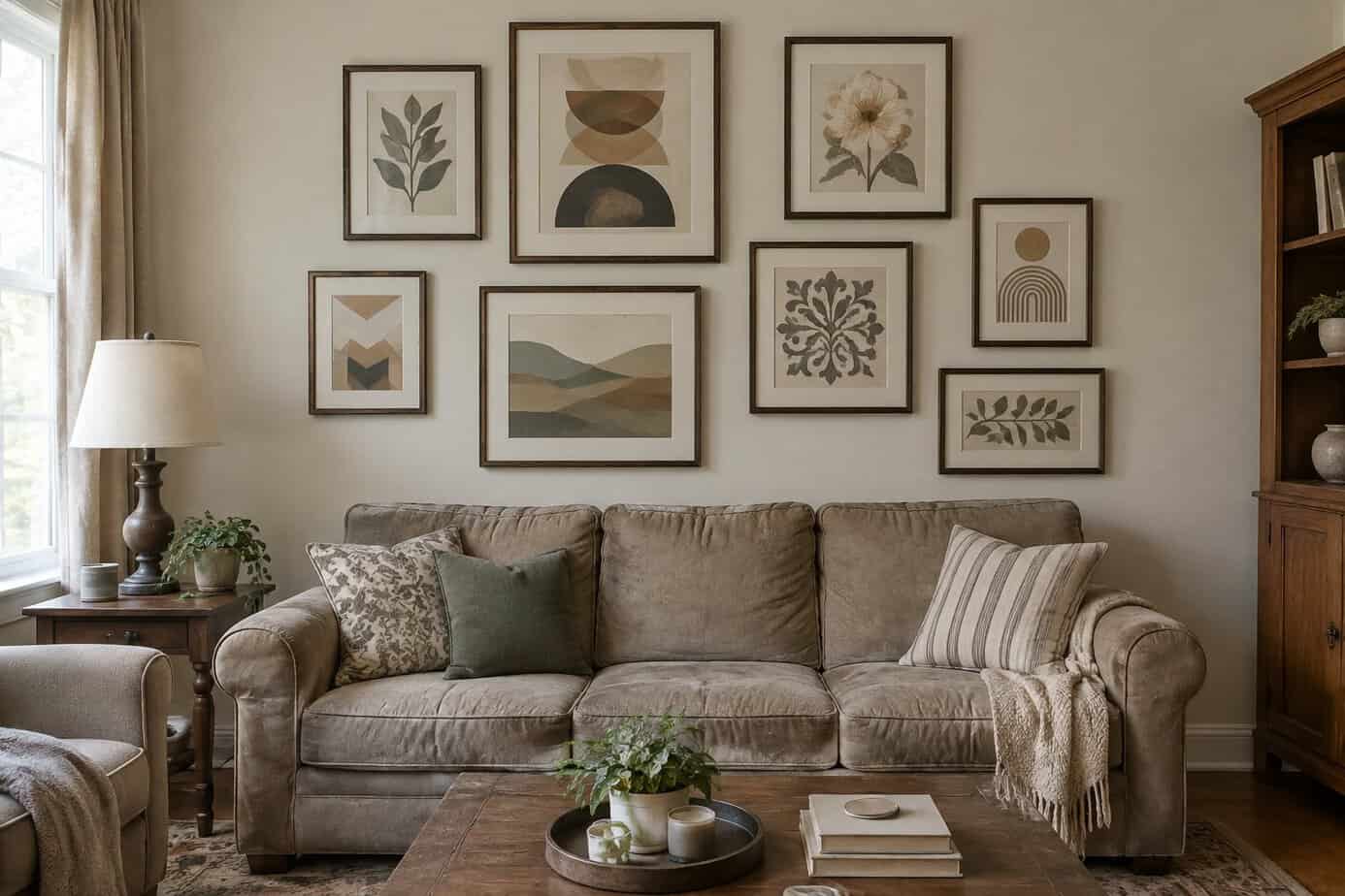
Those “Live, Laugh, Love” signs and kitchen wall decals telling you to “Eat” or “Gather” have become a shorthand for dated decor. You’ve likely seen the same phrases repeated in countless homes, which strips them of any personal meaning.
Your guests already know they’re standing in your kitchen or living room. A sign announcing the obvious doesn’t add character, it just signals that you shopped from the same big-box clearance aisle as everyone else.
These items were everywhere in the 2010s, often in farmhouse-style script fonts paired with distressed wood frames. That specific combination now reads as a clear marker of a particular decade rather than a timeless choice.
If you want text in your space, consider something more specific to you, like a meaningful quote in your own handwriting or a piece of art with actual historical or personal value.
12. Filling rooms with oversized farmhouse signs
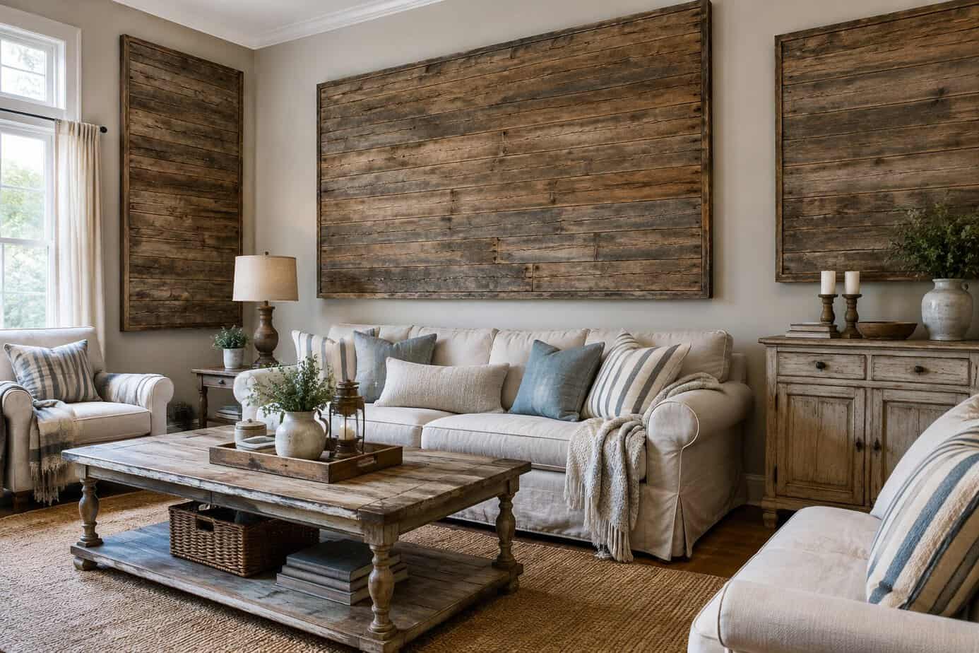
Large wooden signs with phrases like “Gather” or “Blessed” were a defining feature of farmhouse decor for years. If you still have several of these displayed throughout your home, they can make your space feel stuck in a specific decorating phase rather than reflecting your current style.
The issue isn’t the sentiment behind the words. It’s the repetition and scale. Multiple oversized signs in one room compete for attention and leave little room for anything else.
Consider removing all but one piece, or swap text-based decor for art that doesn’t rely on words. Photography, abstract prints, or simple framed pieces tend to feel more current.
If you want to keep a sign, choose a smaller one and let it share space with other decor elements instead of dominating the wall. Balance matters more than the message itself.
13. Overusing distressed furniture
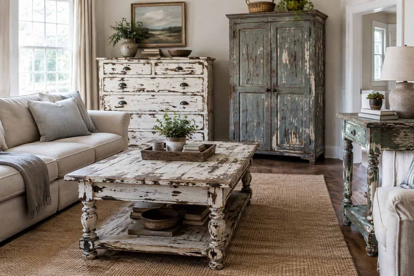
Distressed furniture had a strong run through the farmhouse and shabby chic era. If your home still features multiple pieces with intentionally chipped paint, sanded edges, and fake wear marks, it likely reads as dated rather than curated.
The trend worked when used sparingly as an accent. Filling a room with distressed dressers, tables, and chairs all at once creates a cluttered, mismatched look instead of the cozy farmhouse feel it was meant to achieve.
Current design favors clean lines and furniture that shows authentic age rather than manufactured imperfections. If you have genuine antiques with real wear, those still hold value.
Consider replacing artificially distressed pieces with simpler, well-made furniture. A few authentic vintage finds will serve you better than a room full of factory-distressed items trying to look old.
14. Decorating exclusively with farmhouse motifs
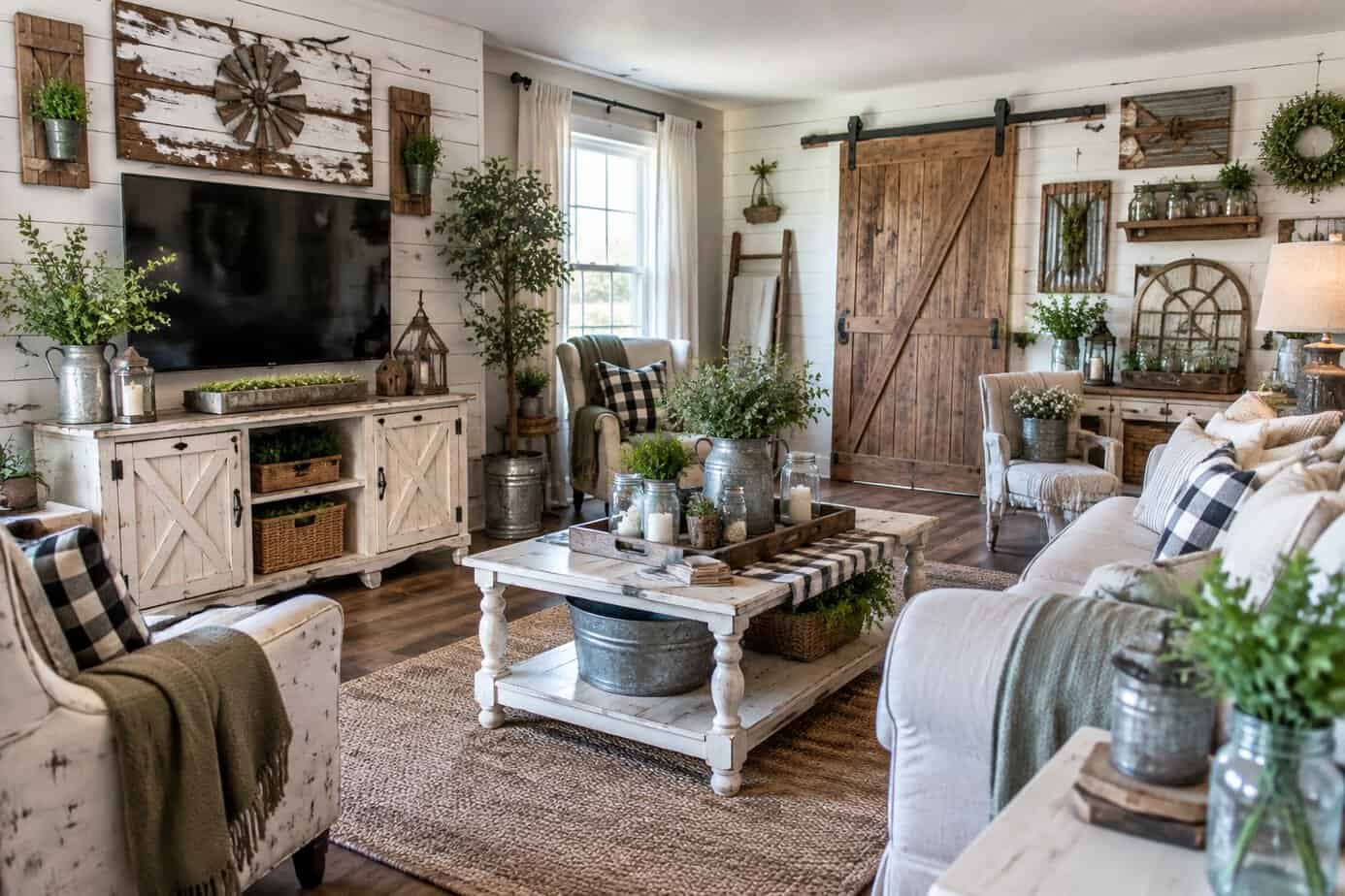
Shiplap, barn doors, and mason jar everything once defined fresh, approachable design. Now these elements signal a specific era rather than timeless style.
When every surface in your home follows the same farmhouse formula, the look stops feeling curated. It starts feeling like a theme park version of rustic living.
Mixing in other design languages keeps your space from reading as dated. Pair a few farmhouse pieces with modern lines, varied textures, or contemporary lighting instead of layering distressed wood and rustic signage throughout every room.
Faux-aged furniture is particularly easy to spot now. Chips and scratches manufactured to mimic decades of wear read as artificial rather than authentic.
Your home benefits from variety. A single farmhouse accent chair or one reclaimed wood shelf can work well, but an entire house built around this one aesthetic limits your rooms to a narrow, recognizable formula that feels increasingly tied to a passing trend.
15. Using too many mason-jar accents
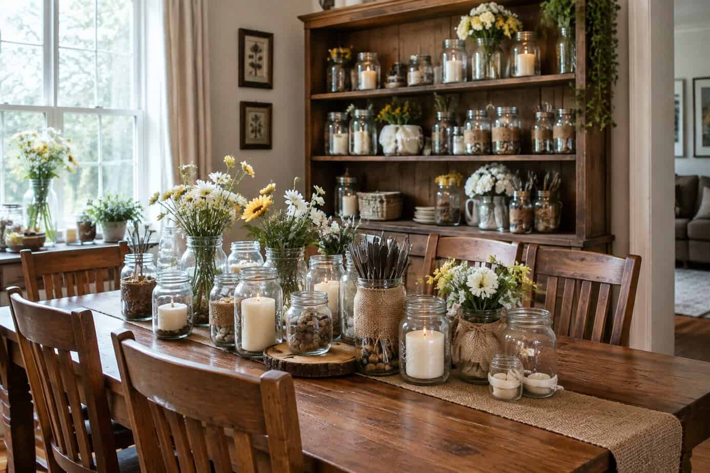
Mason jars had a long run as light fixtures, vases, soap dispensers, and storage containers. That trend peaked during the DIY craft boom of the mid-2010s, and it’s stuck around in a lot of homes since then.
If you’ve got mason jars doing double duty as pendant lights over your kitchen island, that’s one of the clearest signs of this era. The same goes for jars lined up on shelves holding everything from cotton balls to pasta.
Mason jars work fine for actual canning and food storage. Beyond that, using them everywhere signals a specific decorating phase rather than a timeless choice.
Swap them out for simple glass or ceramic containers instead. You’ll get the same function without dating your space to one particular trend cycle.
16. Choosing ornate faux-antique furniture
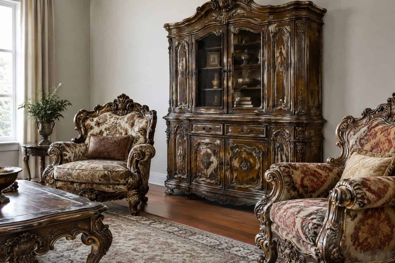
Mass-produced furniture with carved details, distressed finishes, and gold leaf accents tries to imitate real antiques but rarely succeeds. The materials and craftsmanship don’t hold up, and the heavy, fussy look reads as dated rather than elegant.
These pieces were especially popular in the 1990s and early 2000s, so they now signal a specific era rather than timeless style. Ornate scrollwork, cabriole legs, and faux-aged paint finishes can make a room feel stuck in the past.
If you want an antique look, consider sourcing real vintage or secondhand pieces instead. They tend to have better construction and a more authentic character than reproductions.
When mixing styles, pair one or two statement antique pieces with simpler, more contemporary furniture. This balance keeps your space looking current while still giving it depth and history.
17. Installing bulky dark wood cabinets
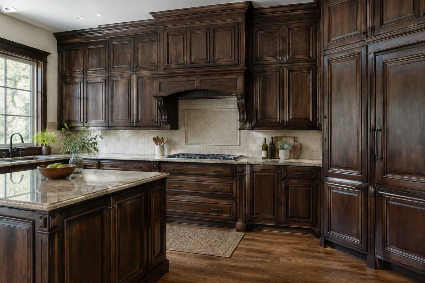
Dark wood cabinets with heavy frames and ornate detailing were a staple in kitchens built decades ago. Now they tend to make a space feel smaller and dimmer than it actually is.
If your kitchen still has this look, you may notice it absorbs light rather than reflecting it. This can make even a well-lit room feel closed in.
Bulky cabinet doors with raised panels or heavy molding also read as dated compared to the simpler profiles used today. Current cabinetry favors cleaner lines and lighter finishes that open up the room visually.
You don’t necessarily need a full replacement to address this. Repainting cabinets in a lighter shade or swapping out hardware can shift the look significantly. Removing excess trim or replacing doors with flat-panel styles updates the cabinetry without a full teardown.
18. Using heavy, dark floral wallpaper
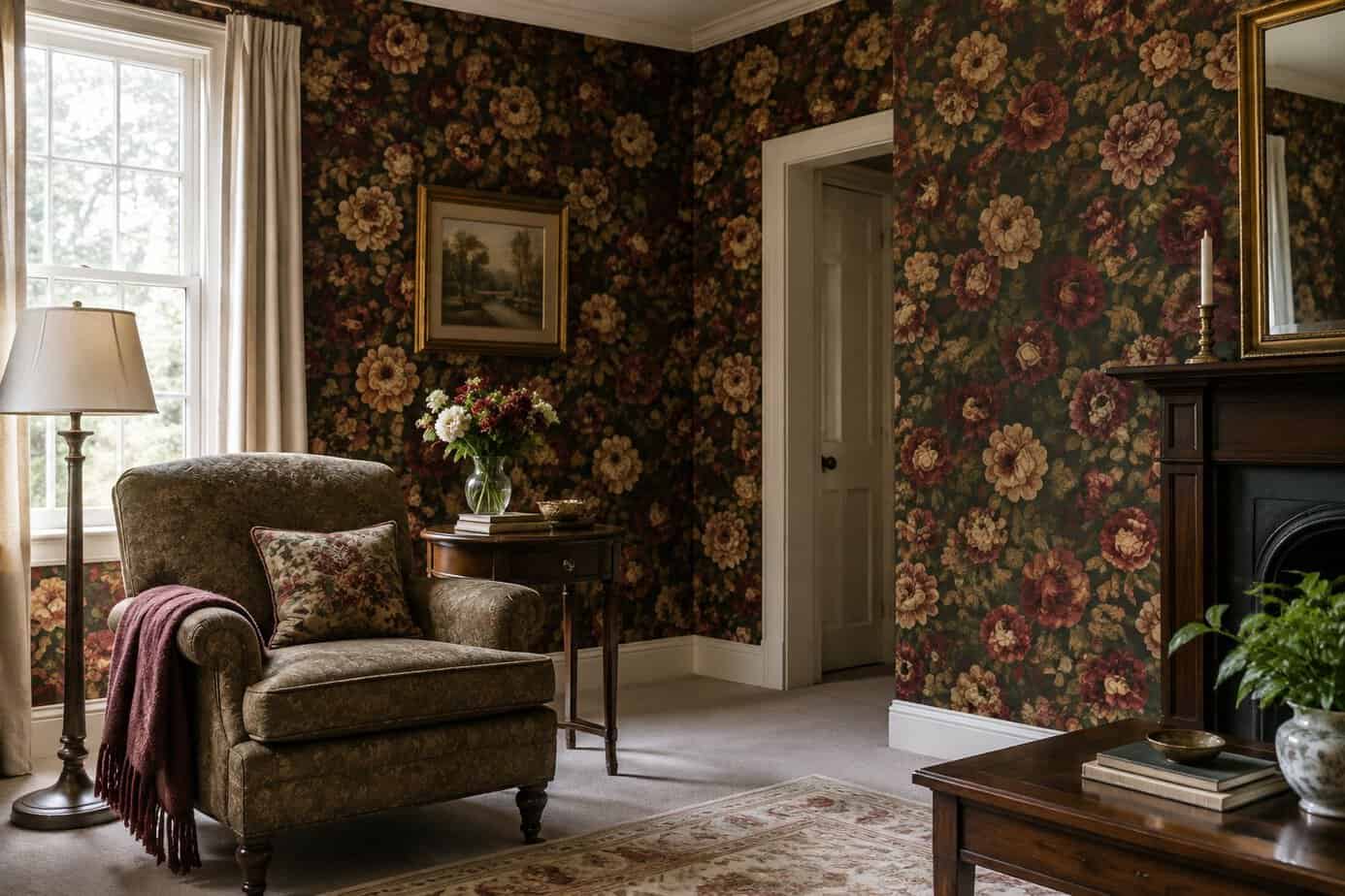
Dark floral wallpaper with oversized blooms can make your rooms feel smaller and heavier than they actually are. The deep burgundies, forest greens, and navy backgrounds that were popular years ago tend to absorb light rather than reflect it.
If your walls are covered in this style, you may notice your space reads as dim even during the day. Large-scale floral patterns can also compete with furniture and decor, leaving rooms looking cluttered.
This look often signals an older design era rather than a current one. Replacing it with lighter patterns, solid colors, or subtle textures can open up a room immediately.
You don’t need to go completely neutral, but choosing smaller-scale prints or muted tones will keep your space feeling current without losing personality.
19. Pairing busy wallpaper with bold patterns everywhere
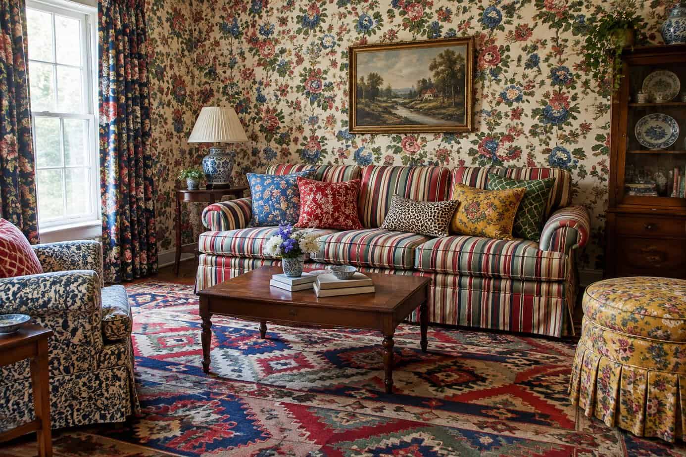
Mixing a heavily patterned wallpaper with equally busy textiles creates visual competition in a room. Your eye doesn’t know where to land when floral walls meet geometric rugs and striped curtains in the same space.
This layering approach was popular in past decades, but it reads as cluttered today. Too many patterns fighting for attention make a room feel smaller and more chaotic than it actually is.
If you love pattern, choose one dominant print and let it anchor the space. Keep upholstery, rugs, and other textiles in solid colors or subtle textures instead.
This balance lets your wallpaper stand out as a feature rather than one element in a crowded mix. Designers often recommend this restraint specifically to prevent a room from feeling dated or overwhelming.
20. Hanging short curtains above windows
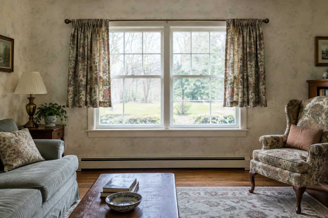
Curtains that stop short of the floor create a gap between the fabric and the ground. This gap draws the eye and makes the window look smaller than it actually is.
Rods placed too close to the window frame have the same effect. They cut off height and make ceilings feel lower than they are.
This trend was common for years because it saved on fabric costs. Shorter panels require less material, which made them a budget-friendly choice for many homeowners.
Today, this look reads as outdated and unfinished. Modern window treatments extend closer to the floor and use rods mounted higher above the frame.
If your curtains hover above the ground, you’re working with an older styling approach. Updating the length and rod placement can change how the entire room feels.
21. Using dated valances and swag curtains
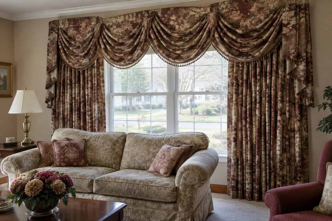
Valances and swag curtains were once a staple of traditional decorating. Today, they tend to make a room feel stuck in the past.
These layered fabric toppers often collect dust and block natural light. They add visual clutter without serving much practical purpose.
Many designers now favor clean, simple window treatments instead. Floor-length curtains in solid colors or simple linens create a more current look.
If you want texture, consider a single layer of flowing fabric rather than multiple tiers. Roman shades or woven wood blinds also work well for a streamlined finish.
Removing a swag or valance is one of the easiest updates you can make. It requires minimal cost but can immediately modernize a room’s appearance.
When choosing new treatments, aim for simplicity and let your windows highlight the room’s architecture rather than compete with it.
22. Choosing shiny metallic finishes throughout
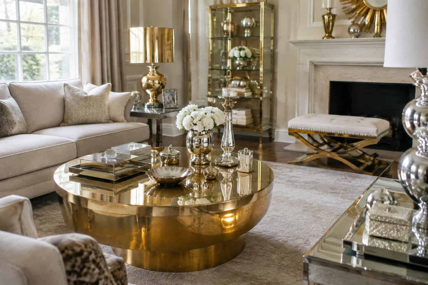
Polished chrome, bright brass, and mirror-finish fixtures were everywhere in certain eras, and using them throughout your home signals a specific time period right away. Matching every faucet, handle, and light fixture in the same shiny metal tends to look dated rather than cohesive.
Highly reflective finishes also show fingerprints and water spots quickly, so they require more upkeep than you might expect. This maintenance issue adds to their dated feel, since newer finishes handle daily use more gracefully.
If you want metal accents, consider mixing finishes or choosing matte and brushed options instead. Brushed nickel, matte black, and unlacquered brass age more naturally and hide wear better over time. Limiting shiny metals to one or two accent pieces, rather than using them throughout your space, keeps your home looking current.
23. Overusing mirrored furniture
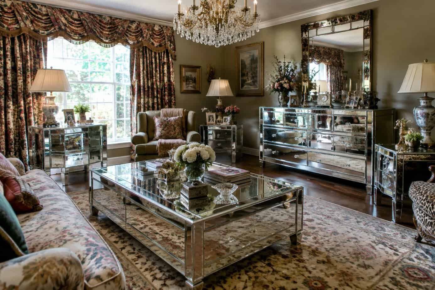
Mirrored dressers, nightstands, and accent tables had a long run in home decor, but the style has started to feel dated. The glossy surfaces reflect every fingerprint, dust speck, and streak, which means you’re wiping them down constantly just to keep them looking decent.
When you fill a room with multiple mirrored pieces, the space can start to feel more like a hotel lobby than a home. The repetitive shine competes for attention instead of letting your other decor stand out.
If you have one mirrored piece, consider keeping it as a single accent rather than a theme. Pair it with wood, matte metal, or upholstered furniture to balance the reflective surface. This keeps the room from feeling stuck in a specific design era and gives your space a more current, lived-in feel.
24. Installing elaborate faux crown molding
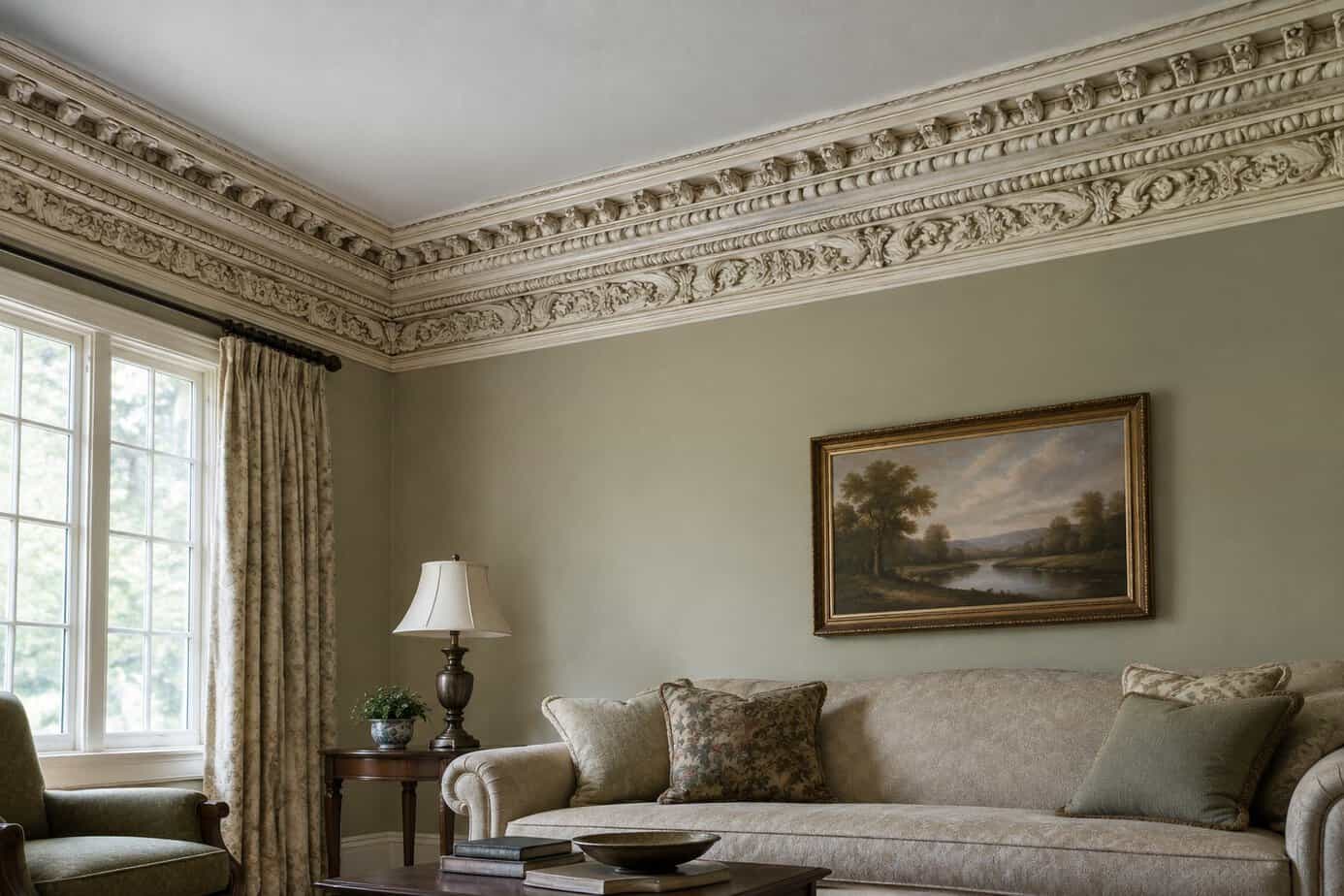
Faux crown molding uses layered trim and paint tricks to mimic expensive, thick architectural detail. The method works by stacking case molding or simple trim pieces, then painting the gap between them the same color to create the illusion of one continuous, chunky profile.
The problem shows up when the technique gets too elaborate. Oversized proportions, multiple layers, and heavy shadow lines can overwhelm a room instead of elevating it.
Rooms with standard eight-foot ceilings especially suffer. Molding scaled for a grand, high-ceilinged space makes a modest room feel cramped and visually busy rather than refined.
Skipping proper primer and semi-gloss paint also gives away the illusion, leaving visible seams between the real trim and the painted gap. This dates the room instantly, signaling a dated DIY trend rather than genuine craftsmanship.
Keep proportions modest and finish details consistent if you want trim to read as timeless rather than trendy.
25. Adding decorative columns without architectural purpose
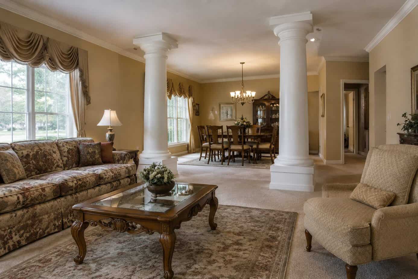
Columns at the entrance of a room or along a porch were a popular way to signal grandeur. Many homes added them purely for decoration, with no structural function at all.
This trend often clashes with simpler architectural styles. A column that doesn’t support anything can look like an afterthought rather than a design choice.
You’ll notice these columns most often in Tuscan-inspired or formal interiors from the 1990s and early 2000s. They tend to bulk up a space and interrupt clean lines, especially in smaller rooms.
If your home has decorative columns, consider whether they add real value to the design. Removing them or replacing them with simpler trim can modernize the space instantly.
A cleaner, more streamlined look tends to age better and suits a wider range of architectural styles.
26. Using popcorn ceilings as a design feature
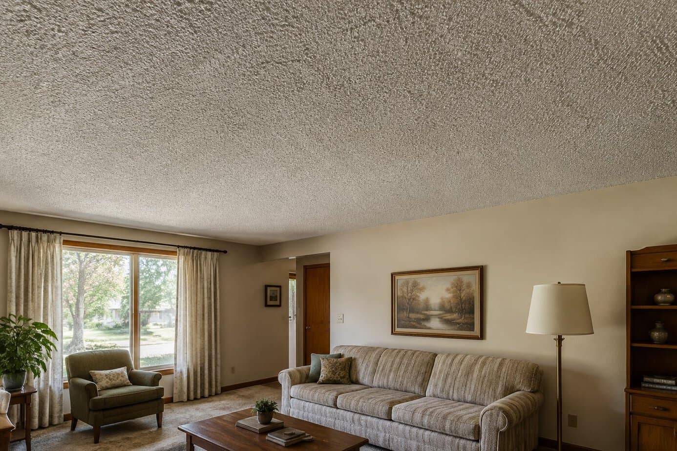
Popcorn ceilings were common in homes built between the 1950s and 1980s. The textured surface was cheap to install and hid imperfections in the drywall underneath.
That practicality came at a cost. The bumpy texture collects dust and cobwebs, and it’s difficult to clean without damaging it.
Many popcorn ceilings installed before 1980 contain asbestos, which means removal requires professional testing and careful handling. This safety concern alone has pushed most homeowners to remove the texture rather than keep it.
Smooth ceilings now dominate modern design because they reflect light more evenly and give rooms a cleaner, more finished look. If your home still has popcorn ceilings, it signals an outdated renovation timeline to buyers and visitors alike.
Removing the texture and repainting with a smooth finish is one of the most effective ways to modernize a room without a full renovation.
27. Covering floors with wall-to-wall shag carpeting
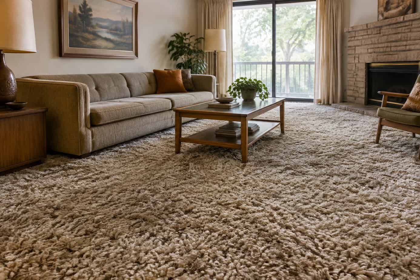
Shag carpet defined 1970s living rooms, with its long, loose fibers covering every inch of floor space. If you still have it, the look signals an outdated era more than any other flooring choice.
The fibers trap dust, pet hair, and allergens deep within their length. Regular vacuuming often fails to remove everything, and the carpet can hold odors for years.
Wall-to-wall installation also limits your design flexibility. You can’t easily update your flooring without replacing the entire surface, unlike rugs that let you swap styles as trends shift.
Buyers and visitors alike tend to associate shag carpeting with homes that haven’t been updated in decades. Replacing it with hardwood, laminate, or low-pile carpet gives your space a cleaner, more current appearance and signals that your home has kept pace with modern standards.
28. Layering shag rugs in every room
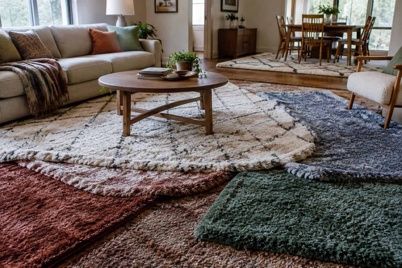
Shag rugs peaked in popularity during the 2010s, and using them as your go-to layering choice in every room now reads as dated. The thick, fuzzy pile that once signaled coziness tends to look cluttered when it shows up in your living room, bedroom, and hallway alike.
Layering a shag rug over a flatweave base also creates practical problems. The high pile shifts underfoot, collects dust and pet hair, and makes vacuuming more difficult than it needs to be.
If you want a layered look in your home, consider pairing a jute or wool base with a low-pile top rug instead. This combination gives you texture and visual interest without the maintenance headaches or the overly plush appearance that dates a space.
Your furniture will also sit more securely on firmer, lower-pile layers.
29. Displaying collections of small decorative objects
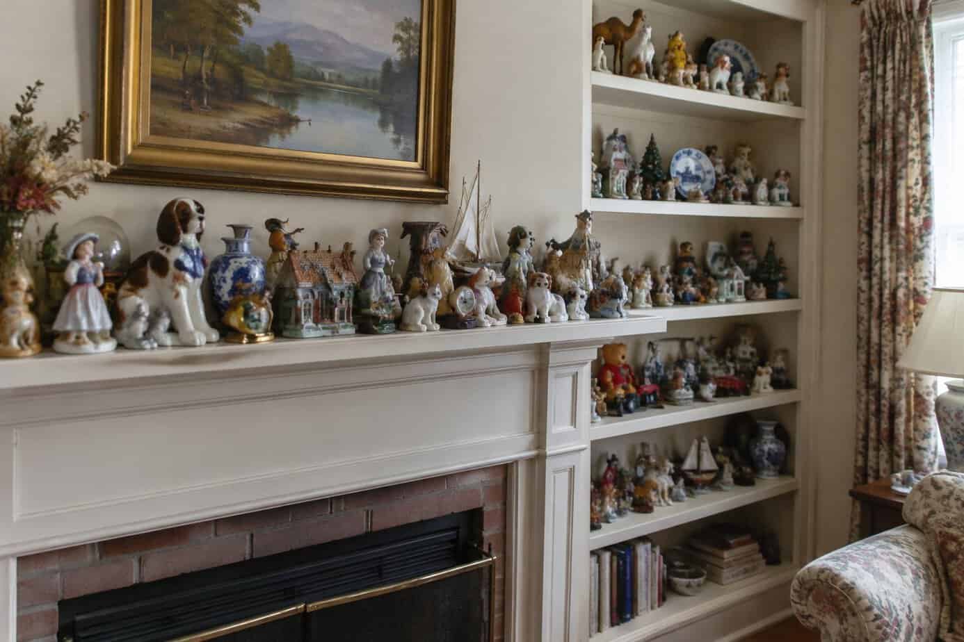
Rows of figurines, porcelain dolls, or miniature trinkets on shelves read as dated rather than curated. These displays were common decades ago, when collecting knick-knacks signaled taste and hospitality.
Today, they tend to make a space feel cluttered and stuck in the past. Dust accumulates between pieces, and the visual noise competes with everything else in the room.
Open shelving works best when it holds fewer, larger items with intentional spacing. A single sculptural piece or a small stack of books says more than a dozen scattered objects.
If you have a meaningful collection, consider rotating pieces seasonally or housing them in a closed cabinet. This keeps sentimental items accessible without turning your living space into a display case.
Editing down what you show at any given time creates a calmer, more current look throughout your home.
30. Filling shelves with artificial plants
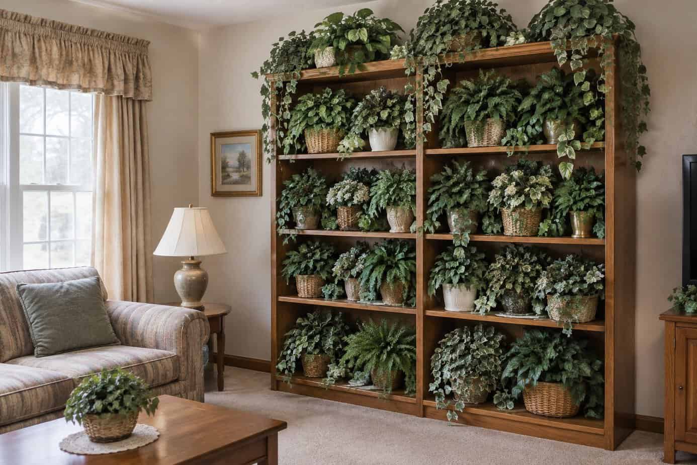
Artificial plants were once a convenient way to add greenery without the maintenance. Now they tend to make shelves look dated and flat, especially when the plastic leaves have a shine that real foliage doesn’t have.
Dust collects on fake plants just like it does on any other surface, except you rarely think to clean them. Over time, this gives them a dull, neglected appearance that works against the fresh look you’re going for.
Real plants, even low-maintenance ones like pothos or snake plants, bring texture and movement that artificial versions can’t match. They also signal that your space is cared for and lived in.
If you’re not confident in your plant care skills, dried or preserved botanicals are a better alternative than plastic greenery. They age naturally and avoid the stiff, uniform look that makes faux plants so easy to spot.
Why a Home Can Look Dated
A home ages visually through three main factors: color choices tied to specific decades, material finishes that fall out of production, and scale proportions that no longer match current furniture and fixture standards. Understanding these factors helps you distinguish between updates that add value and changes that simply follow fleeting trends.
How Color, Finish, and Scale Affect Perception
Color palettes date faster than almost any other design element. Honey oak cabinets, hunter green countertops, and mauve walls immediately signal the 1990s to most viewers.
Finishes carry similar weight. Brushed nickel, oil-rubbed bronze, and polished brass each dominated specific eras, and an entire kitchen outfitted in one finish can pin your home to a particular decade.
Scale matters just as much as color or finish. Oversized crown molding, bulky furniture arms, and low 8-foot ceilings paired with tall cabinetry create visual imbalance that reads as outdated, even when the materials themselves remain in good condition.
The Difference Between Vintage Character and Visual Clutter
Not every older element needs replacing. Original hardwood floors, built-in bookshelves, and well-maintained brick fireplaces often add authentic character that newer homes lack entirely.
The problem arises when multiple competing trends accumulate in one space without editing. A room with floral wallpaper, heavy drapery, carpeted bathrooms, and ornate furniture simultaneously reads as cluttered rather than intentional.
Vintage character works when you isolate one or two strong features and let them stand out. Visual clutter happens when every surface competes for attention, leaving no clear focal point and making the space feel smaller and more chaotic than it actually is.
How to Update Your Decor Thoughtfully
Updating your home doesn’t require a full renovation or a complete style overhaul. The goal is to identify what already works, then make targeted changes that modernize your space without erasing its character.
Decide What to Keep Before Making Changes
Before you replace anything, assess what actually functions well in your space. Some pieces, like a well-built wood dresser or a neutral sofa, hold up regardless of trend cycles.
Ask yourself these questions about each item:
- Does it still serve a practical purpose?
- Would you buy it again today?
- Is it tied to a specific fad, or does it reflect your personal taste?
Items that pass this test are worth keeping, even if they’re not currently “on trend.” You don’t need to discard furniture or decor just because it appeared in outdated design articles.
Focus your energy on pieces that feel tied to a specific moment, like decorative accents that reference a short-lived aesthetic. Everything else can stay.
Make Small Updates Without Losing Your Home’s Character
Small, deliberate changes often make more impact than starting over. Swapping outdated hardware, updating lighting fixtures, or repainting a single accent wall can shift a room’s feel without touching its structure.
Avoid replacing everything at once. Instead, change one element at a time and live with it before moving to the next.
This approach keeps your home from feeling disjointed, and it protects the details that give your space a sense of history and personality.