
35 DIY Decorating Tricks Designers Secretly Use All the Time to Transform Any Space on a Budget
Would you like to save this?
Creating a home that feels polished and professionally designed doesn’t require an unlimited budget or a degree in interior design. The gap between a basic living space and one that looks magazine-worthy often comes down to a handful of strategic choices that professionals use repeatedly.
Interior designers rely on specific, repeatable techniques, from layering rugs and adjusting paint finishes to repositioning furniture and upgrading hardware, that transform ordinary rooms into elevated spaces.
These aren’t complex renovations or expensive purchases. They’re intentional adjustments to lighting, color, texture, and arrangement that work together to create visual interest and functionality.
The following techniques cover everything from quick swaps like changing cabinet pulls to more involved projects like installing dimmer switches or creating gallery walls. You’ll learn how to work with what you already have, where to invest modest effort for maximum impact, and which common decorating mistakes to avoid.
1. Layer a 9×12 wool area rug over an existing 8×10 for depth
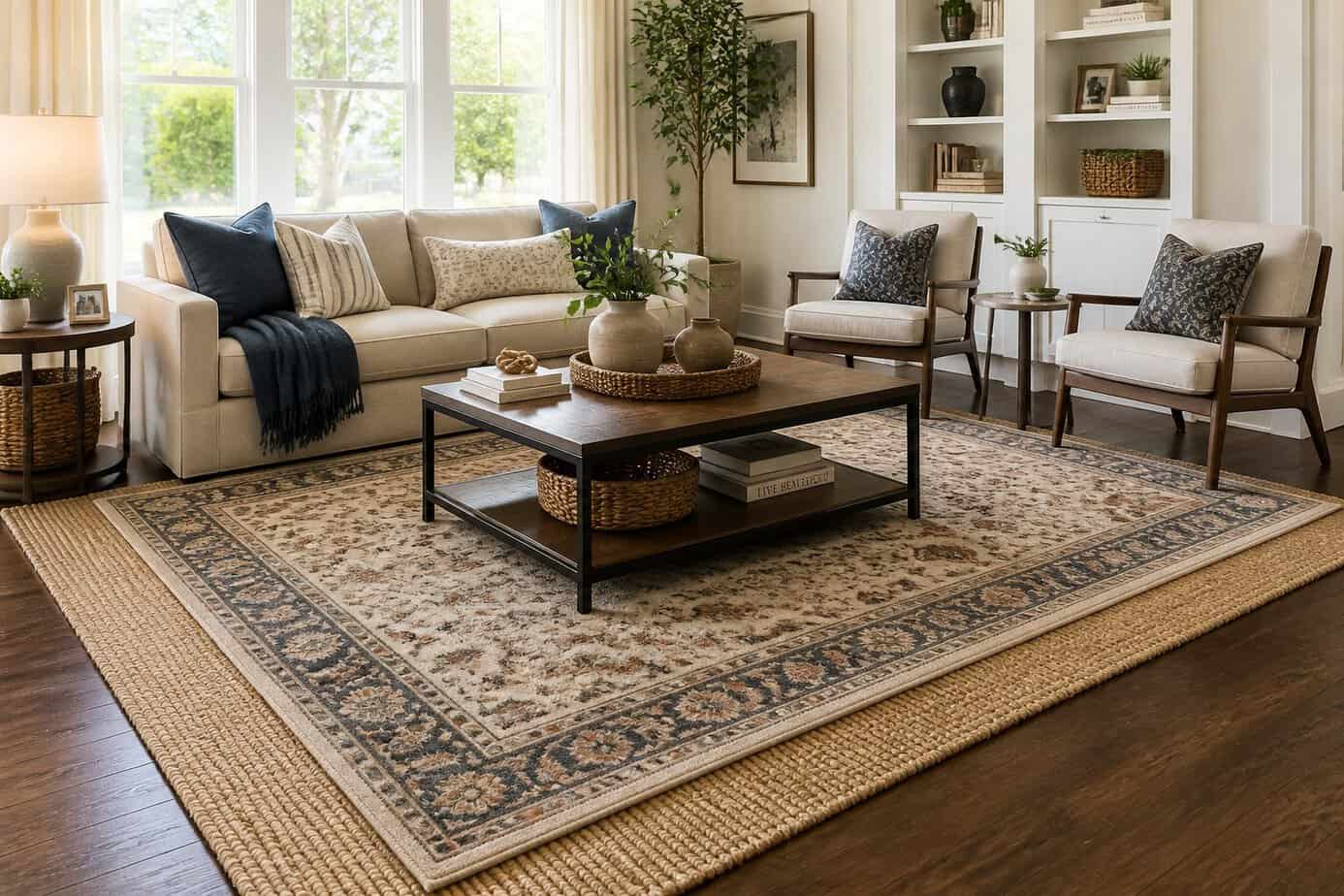
Flip the traditional approach by placing a larger rug underneath your existing smaller one. Position your 8×10 rug on top of a 9×12 wool base to create visual depth and dimension in your space.
This technique follows the one-size-up rule that designers use for successful rug layering. The 9×12 wool foundation provides a neutral, textured border that frames your existing rug while adding warmth to the room.
Choose a low-pile or flat-weave wool rug for the bottom layer to prevent furniture from wobbling. The larger base rug should extend beyond your top rug by approximately 12 inches on each side, creating a subtle border effect.
This layering method works particularly well if your current 8×10 feels too small for your space. You’ll achieve a custom look without replacing your existing rug entirely.
2. Paint ceiling Benjamin Moore Whisper White to lift a room
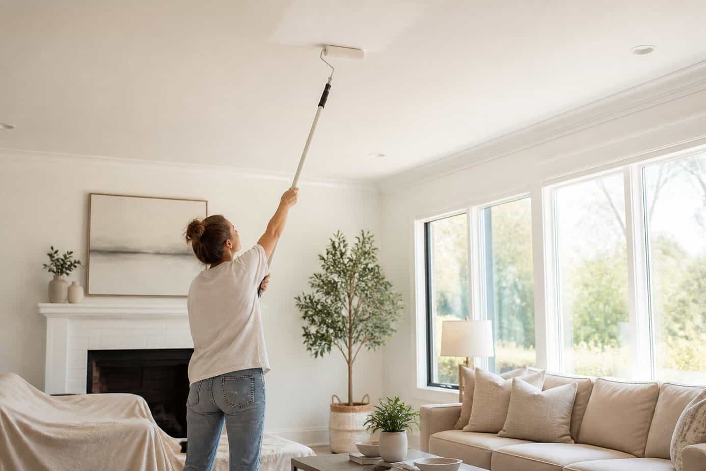
Painting your ceiling in Benjamin Moore Whisper White creates an immediate sense of height in any space. This shade works because lighter ceiling colors bounce more light around the room, which makes the space feel more open and airy.
The soft, neutral undertone of Whisper White pairs well with most wall colors while maintaining a fresh appearance. You don’t need perfect precision when painting the ceiling edge. A slightly uneven transition between wall and ceiling actually adds relaxed character to your space.
This approach works particularly well in rooms with lower ceilings, where darker colors would make the space feel compressed. The light reflectance shifts your eye upward, creating the visual effect of additional height without any structural changes.
3. Arrange seating in a conversational crescent, not rows
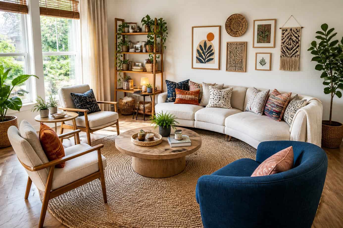
Designers position chairs and sofas in a curved, crescent formation to encourage natural conversation. This layout brings people closer together while avoiding the awkward feeling of sitting directly across from someone.
Instead of lining furniture against walls or in straight rows, pull pieces into the room to form a gentle arc. You can create this shape with a sofa as the anchor and two chairs angled at the ends.
The crescent arrangement ensures everyone can make eye contact without straining. It works particularly well in living rooms where you want guests to interact comfortably.
Leave about 8 to 10 feet of space within the crescent to maintain intimacy without crowding. You can place a coffee table in the center to complete the functional setup.
4. Use IKEA picture ledges to create rotating art displays
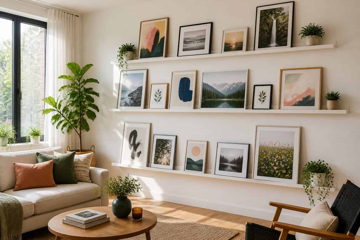
IKEA’s MOSSLANDA and RIBBA picture ledges offer a simple solution for displaying artwork without commitment. The shallow lip holds frames, photos, and canvases securely while making it easy to swap pieces whenever you want a refresh.
You can change your display seasonally or weekly without creating new holes in your walls. Simply lean new artwork against the ledge and remove what you’re ready to rotate out.
Designers appreciate this flexibility because it allows spaces to evolve without permanent modifications. You can layer smaller frames in front of larger pieces to create depth and visual interest.
Install multiple ledges at varying heights to create a gallery wall effect that you can constantly update. This approach works particularly well in living rooms, hallways, and bedrooms where you want your decor to feel current and intentional.
5. Hang curtains to the ceiling with Pottery Barn classic drapery hardware
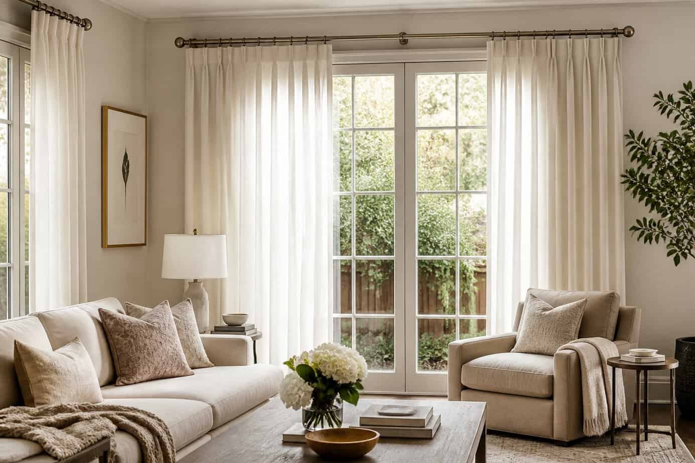
Mounting curtains at ceiling height creates the illusion of taller walls and larger windows. This designer trick works with Pottery Barn’s classic drapery hardware, which includes brackets and rods designed for straightforward installation.
Start by measuring your window frame width and adding 6-12 inches on each side for the rod length. Use a stud finder to locate secure mounting points in your ceiling. Mark the bracket positions with a pencil and level to ensure they’re aligned.
Install the ceiling-mounted brackets using the provided screws and an appropriate drill bit. Once the brackets are secure, insert the rod and arrange your curtain rings or hooks. The extended drop from ceiling to floor makes any room feel more spacious and polished.
This approach works particularly well in rooms with standard 8-foot ceilings where you want to maximize vertical space.
6. Incorporate a 3-color palette: base, accent, and a bold pop
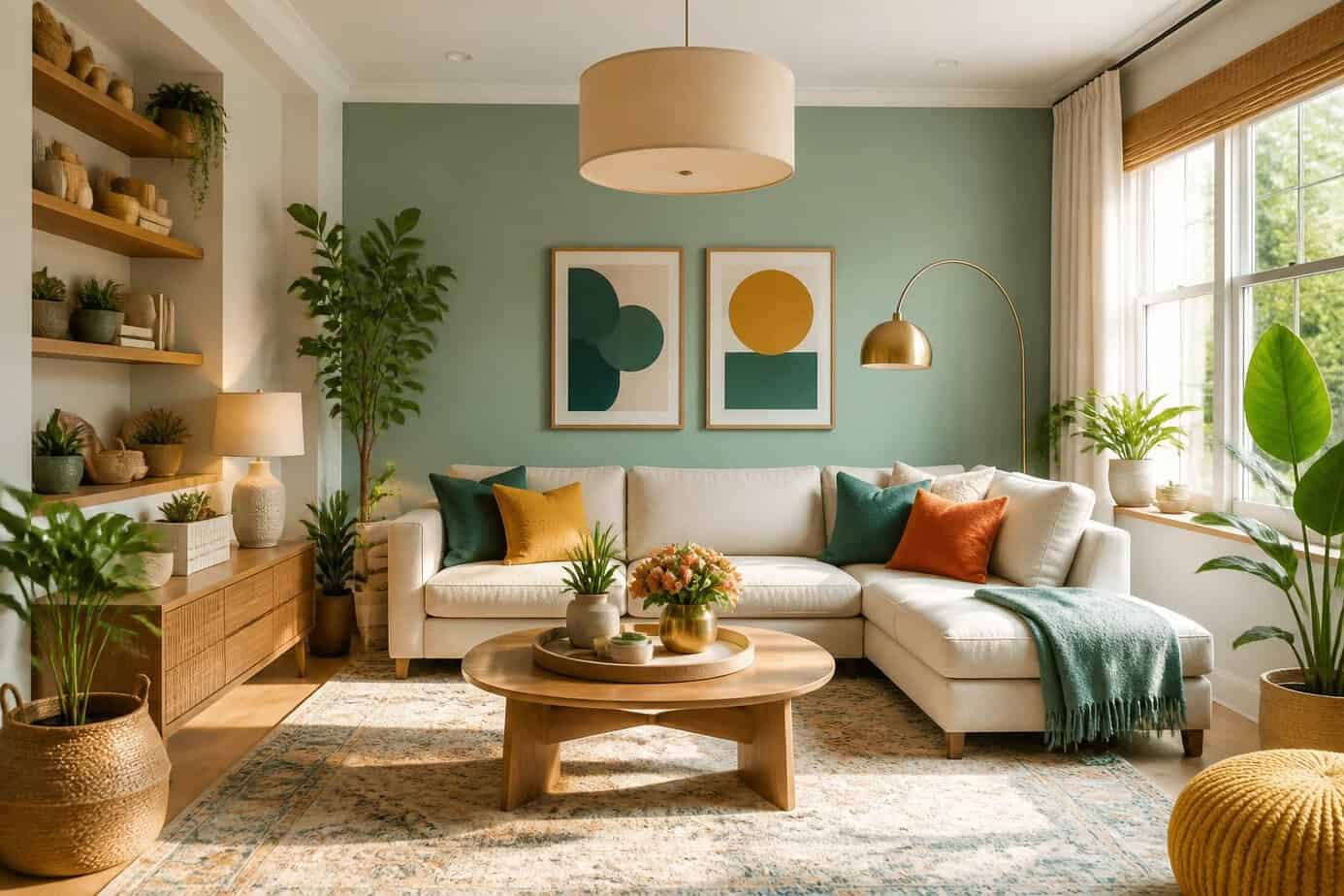
Professional designers rely on a three-color approach to create cohesive, polished rooms. This method simplifies your decorating decisions while maintaining visual interest.
Start by selecting your base color for walls and larger furniture pieces. This dominant shade sets the overall mood of your space. Choose a second accent color for items like curtains, throw pillows, or smaller furniture.
Your third color should be a bold pop that adds energy without overwhelming the room. Use this sparingly on accessories like artwork, vases, or decorative objects.
Test your colors together before committing. Paint samples on walls and gather fabric swatches to see how they interact in your actual lighting conditions. This trio works because it provides enough variety to keep things interesting while maintaining a unified look throughout your space.
7. Create a vignette with a vintage brass tray and two candlesticks
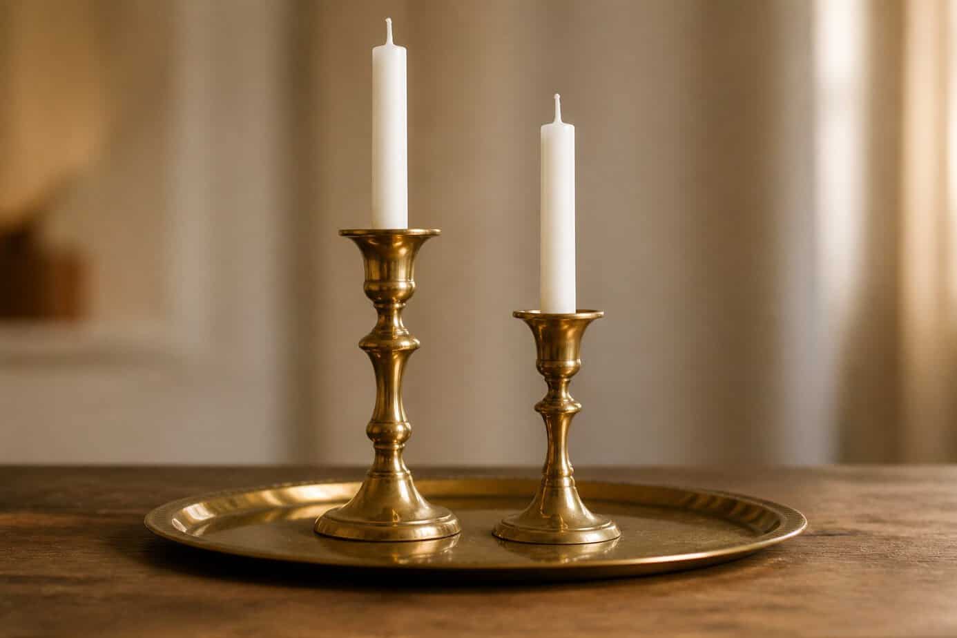
A vintage brass tray paired with two candlesticks creates an instant focal point on any surface. This classic combination works because it establishes clear boundaries for your display while adding warmth and texture.
Start by placing your brass tray on a coffee table, console, or dresser. Position your candlesticks at different heights to create visual interest. You can elevate one candlestick by placing it on a small stack of books.
The tray serves as a container that defines your vignette and prevents the arrangement from looking scattered. Add one or two small objects between the candlesticks, such as a vintage book or a small decorative box.
Keep the arrangement simple and avoid overcrowding the tray. The brass finish ties everything together and gives your space a collected, intentional look without requiring an extensive budget.
8. Mix warm and cool metals: brass lamp plus chrome side table
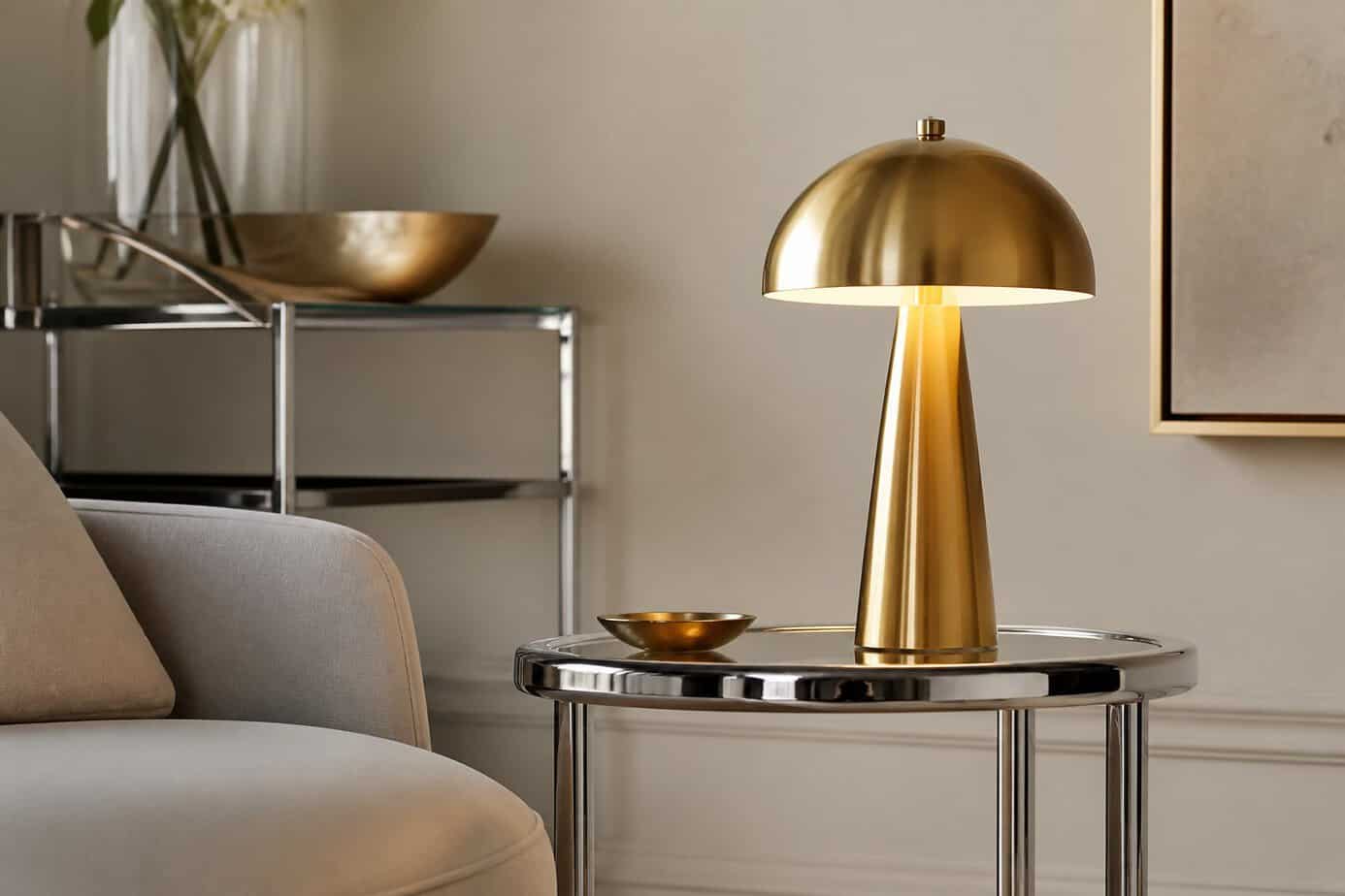
Pairing warm and cool metals creates instant contrast and depth in your space. A brass lamp next to a chrome side table demonstrates this principle perfectly.
The key is making your choices look intentional rather than accidental. Select metals that are distinctly different from each other, not similar shades that might appear as a mistake. Brass and chrome work well together because their temperature difference is obvious.
You can apply this approach throughout a room. Keep one metal as your dominant finish, occupying about 70% of the metallic elements, then use the second metal as an accent at 20-30%. This balance prevents the space from looking chaotic.
Start small if you’re uncertain. Adding a brass lamp to an existing chrome side table requires no commitment and lets you test the combination before expanding it to other areas.
9. Anchor a dining room with a round jute rug beneath the table
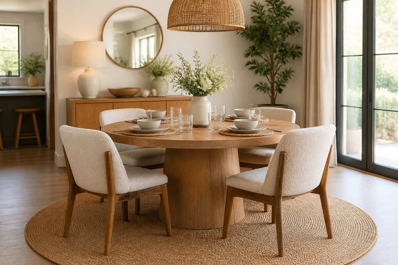
A round jute rug creates a natural foundation for your dining space. Place it beneath your table to define the eating area and add warmth through its textured surface.
The circular shape mirrors a round table, establishing visual balance in the room. This pairing helps your dining area feel cohesive and intentional.
Jute rugs absorb sound and handle heavy foot traffic well. They’re practical choices for dining rooms where chairs constantly move across the floor.
The neutral tone of jute complements most dining furniture and decor styles. You can layer it with existing pieces without worrying about clashing colors or patterns.
Make sure your rug extends beyond the table edge by at least 24 inches. This allows chairs to remain on the rug when pulled out, preventing them from catching on the edge during meals.
10. Install dimmer switches on overhead fixtures for layered lighting

Dimmer switches give you control over light intensity, allowing you to adjust brightness based on the time of day or activity. This simple upgrade transforms static overhead lighting into a flexible design element that professionals use to create atmosphere.
Installing a dimmer switch is a straightforward DIY project. Turn off the power at the breaker and confirm it’s off with a voltage tester. Remove the existing switch plate and disconnect the old switch. Connect your new LED-compatible dimmer using wire connectors, matching the wires according to the manufacturer’s instructions.
Standard dimmers work for most overhead fixtures, but avoid using them on ceiling fans as they can damage the motor. Choose dimmers rated for your specific bulb type, whether LED, CFL, or incandescent, to ensure proper function and longevity.
11. Add peel-and-stick marble backsplash in the kitchen for instant luxe
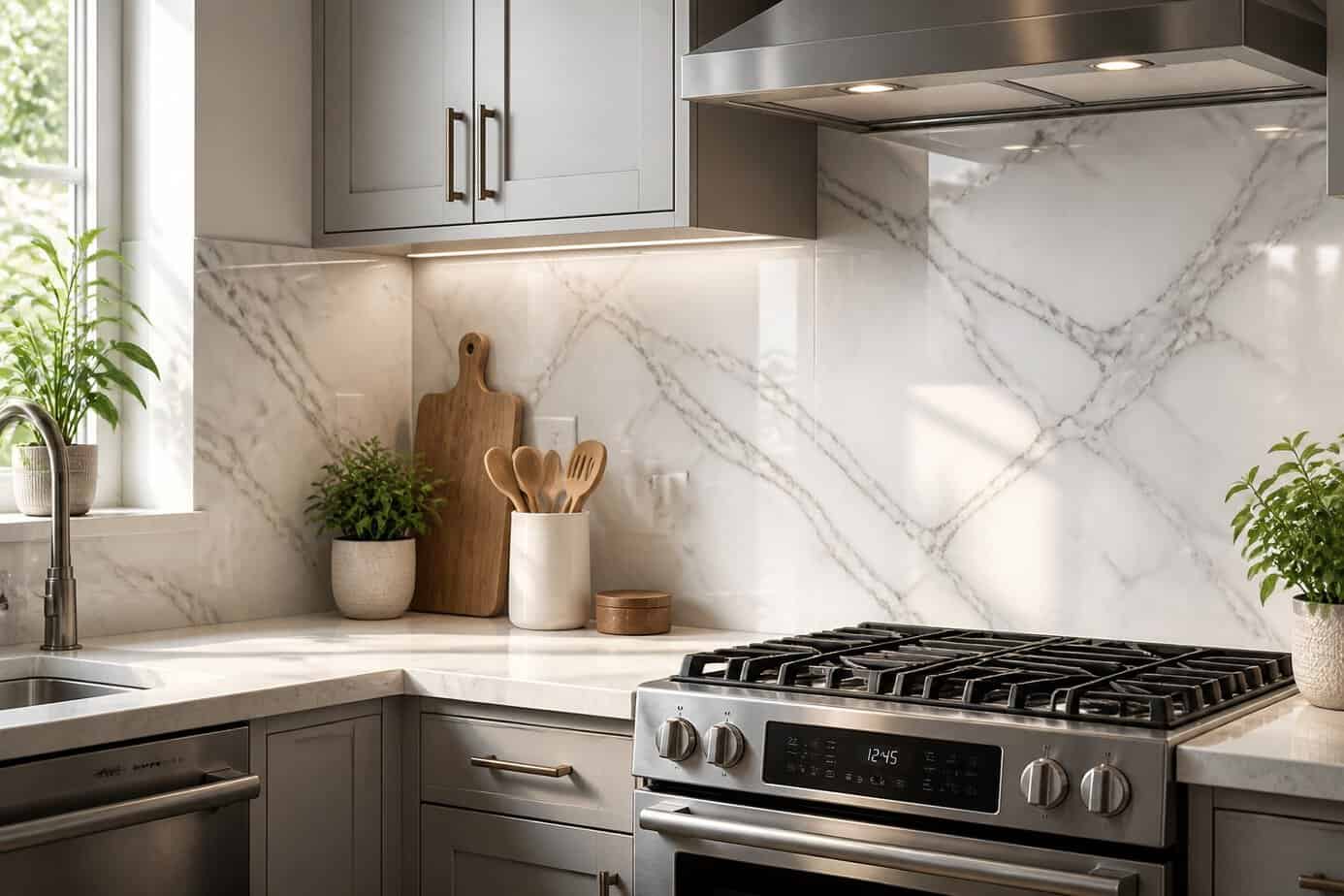
Peel-and-stick marble tiles offer the look of expensive stone without the cost or complexity of traditional installation. You can transform your kitchen backsplash in a single weekend using these adhesive-backed tiles that require no messy thinset or professional help.
The tiles come with pre-applied adhesive, making installation straightforward for DIY beginners. You simply measure your space, cut tiles to fit if needed, and press them into place.
Modern peel-and-stick options include realistic marble patterns that convincingly mimic Carrara and other premium stones. Many products now offer water-resistant properties suitable for kitchen environments.
This approach works well for renters or homeowners planning future renovations, since the tiles can be removed without damaging walls. The budget-friendly price point lets you achieve a high-end aesthetic while keeping renovation costs manageable.
12. Paint trim a slightly darker shade than walls for subtle contrast
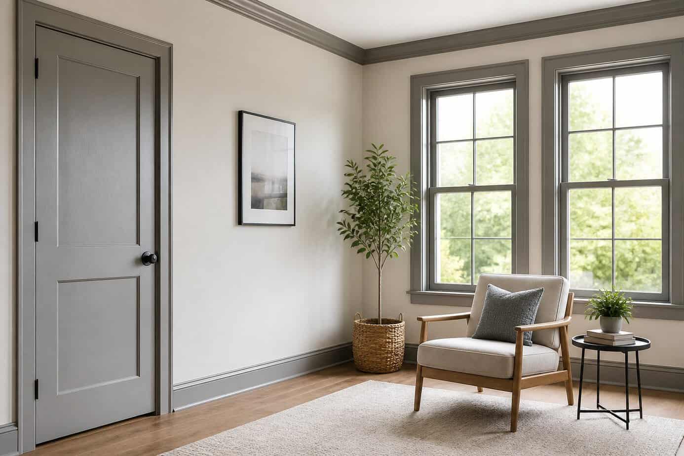
Designers often reverse the traditional white trim approach by painting woodwork two to three shades darker than the walls. This technique adds depth and architectural interest without creating harsh contrast that might overwhelm your space.
Choose a darker tone from the same color family as your walls for a sophisticated, layered effect. If your walls are light gray, try a charcoal trim. For cream walls, consider a warm taupe or greige on baseboards and door frames.
The key is keeping the contrast subtle rather than dramatic. Bold differences like black trim against white walls make strong statements, but gentler transitions create a more forgiving and refined look.
Test your selected colors on large swatches first. Lighting conditions change how contrast appears throughout the day, and what looks perfect in morning light might disappear by evening.
13. Use command hooks to hang lightweight baskets for entry storage
Would you like to save this?
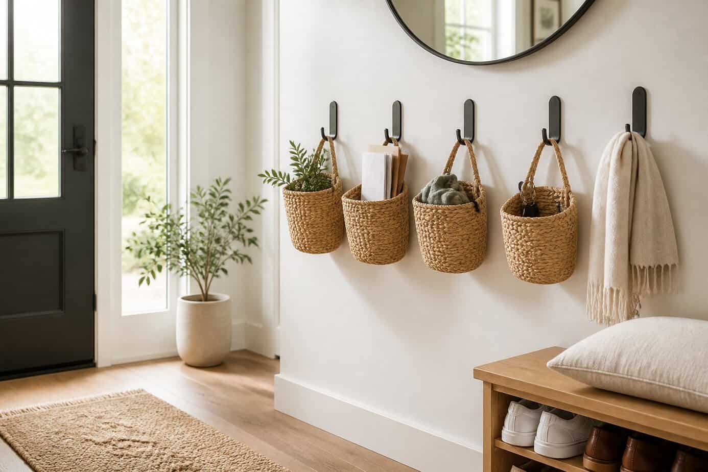
Command hooks offer a damage-free solution for creating functional entryway storage. You can mount them on walls to hold lightweight wire or wicker baskets that store small items like keys, sunglasses, and mail.
Select medium-sized command hooks rated for the combined weight of your basket and its contents. Position them at eye level near your door for easy access. This setup works particularly well in rentals where you can’t drill holes.
Wire baskets with built-in hooks work best since they hang directly on command hooks without additional hardware. You can also attach small woven baskets by threading ribbon through the basket and looping it over the hook.
This organization method keeps daily essentials visible and prevents countertop clutter. The adhesive strips remove cleanly when you’re ready to redecorate or move.
14. Style books by color and height on open shelving for balance
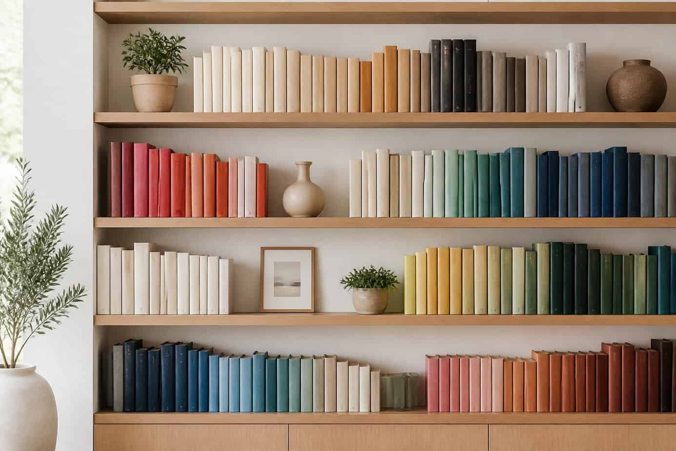
Arranging books by spine color creates instant visual cohesion on open shelves. Start by grouping your books into color families, then arrange them from light to dark or by rainbow order across your shelving unit.
Vary the height of your book stacks to add dimension. Mix horizontal and vertical orientations to break up monotony and create natural resting spots for decorative objects on top of horizontal stacks.
Place taller books on outer edges of shelves and shorter ones toward the center to establish symmetry. This technique draws the eye across the entire shelf rather than creating awkward gaps.
Leave breathing room between book groups. Cramming every inch makes shelves look cluttered rather than curated. A few inches of space between color-blocked sections gives your arrangement a professional, intentional appearance.
15. Float furniture away from walls to improve traffic flow
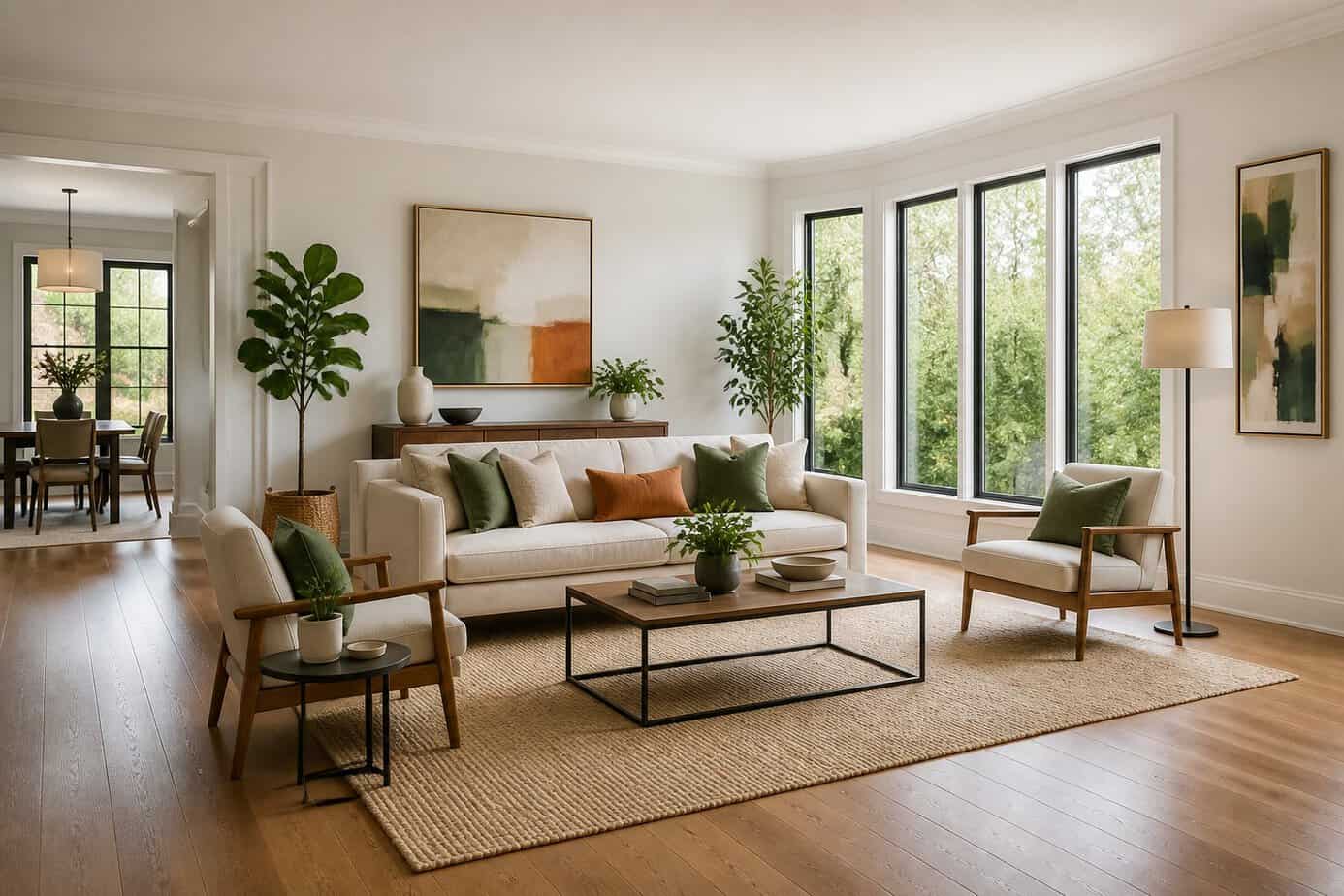
Pulling your furniture a few inches to several feet away from the walls creates natural pathways through your space. This simple shift redirects foot traffic around seating areas rather than through them, making rooms more functional.
The technique works by treating the center of your room as an anchor point. Position your sofa and chairs to form a conversation zone in the middle, leaving clear corridors along the perimeter. This approach defines distinct areas in open-concept spaces where walls are limited.
Floating furniture also adds depth to rooms that otherwise feel flat. When everything sits against the walls, your space loses dimension. By creating layers with furniture placement, you give the room visual interest while simultaneously improving how people move through it.
Start by moving your largest piece first, then arrange supporting furniture around it.
16. Place a full-length mirror opposite a window to amplify light
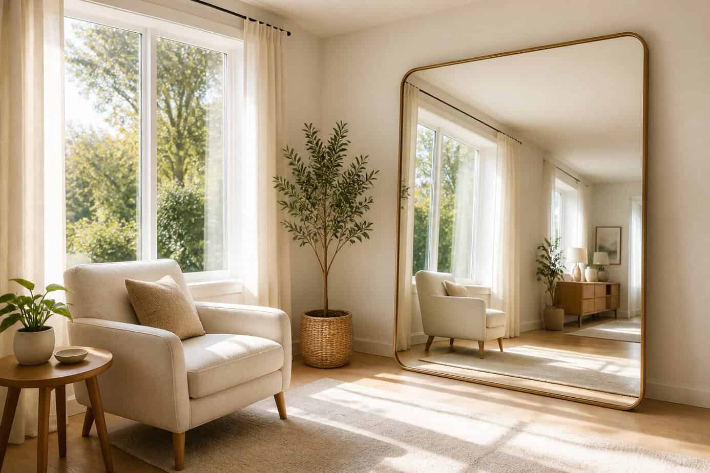
Position a full-length mirror directly across from a window to reflect natural sunlight deeper into your room. The mirror acts as a secondary light source, bouncing daylight into darker corners and shadowed areas.
Hang your mirror at eye level or slightly higher for maximum light reflection. This placement captures both direct sunlight and ambient light from the sky, distributing it throughout the space more evenly.
The technique works particularly well in rooms with limited windows or in spaces that receive indirect sunlight. You’ll notice an immediate difference in brightness without adding any electrical fixtures.
Avoid placing the mirror at angles that reflect the light source directly back at eye level, as this can create uncomfortable glare. Instead, position it to redirect light across walls and into the center of the room.
17. Use indoor fiddle leaf fig or rubber plant for architectural greenery
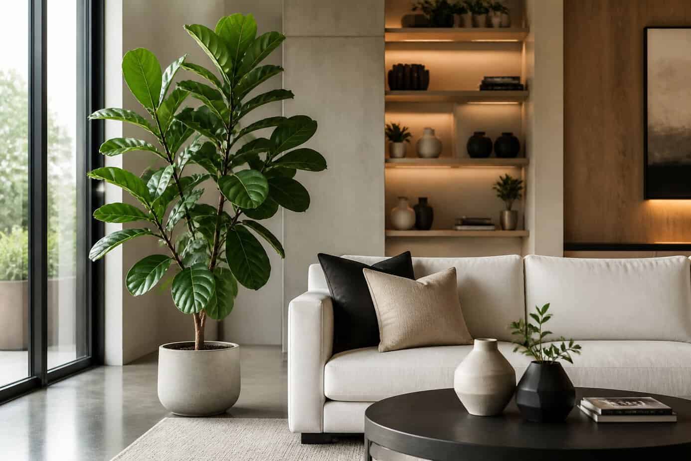
Designers rely on fiddle leaf figs and rubber plants to add instant height and structure to rooms. Both plants from the Ficus family feature bold, sculptural leaves that create vertical interest without taking up much floor space.
Place a tall fiddle leaf fig in a corner or near a window where it receives bright, indirect light. The large violin-shaped leaves naturally draw the eye upward and add depth to neutral color schemes.
Rubber plants offer a similar architectural effect with their thick, glossy foliage and sturdy upright growth. Choose a sleek pot that complements your existing decor to complete the look.
These statement plants work particularly well in minimalist spaces where their strong silhouettes stand out. Position them to anchor furniture arrangements or frame entryways for maximum visual impact.
18. Swap out dated cabinet hardware for matte black pulls
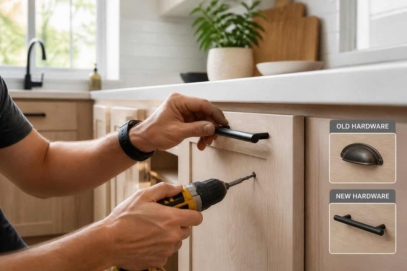
Cabinet hardware functions as the jewelry of your kitchen and bathroom. Swapping old knobs for matte black pulls creates an immediate visual upgrade without requiring a full renovation.
Matte black hardware works with most cabinet colors and design styles. The finish adds a contemporary edge while remaining versatile enough to complement both modern and traditional spaces.
Start by measuring your existing holes to determine if you need matching spacing or will fill old holes and drill new ones. Most standard pulls require drilling two holes, while knobs need only one. Use a template for accurate placement and consistent alignment across all cabinets.
The installation process takes just a few hours for an average kitchen. You’ll need a drill, screwdriver, and the new hardware. This simple change costs significantly less than cabinet replacement while delivering a noticeable transformation.
19. Layer textured throw blankets (chunky knit + linen) on sofas
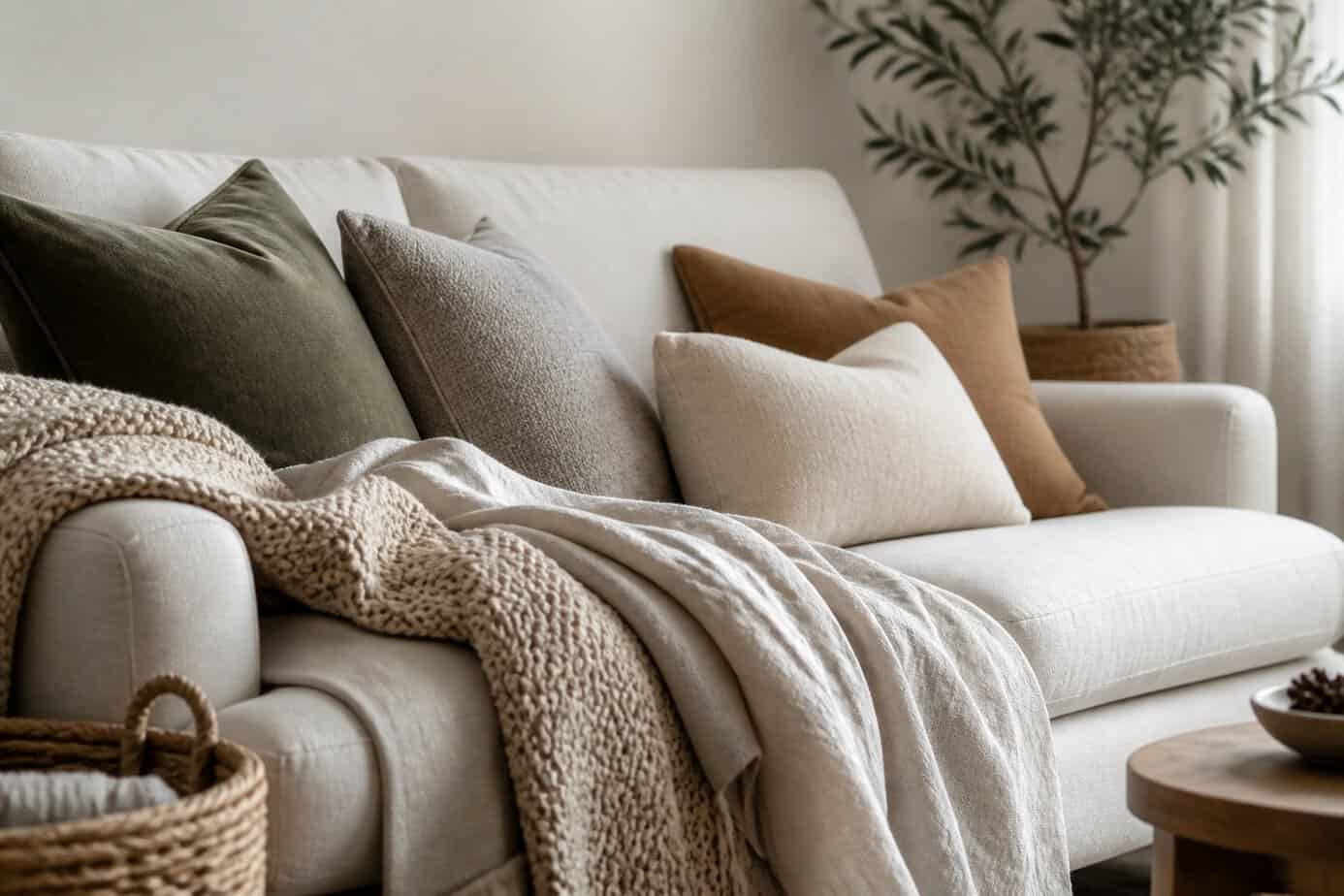
Mixing textures transforms a basic sofa into a designer-worthy focal point. Pair a chunky knit throw with a lightweight linen blanket to create visual contrast and depth.
Drape one blanket across the back of your sofa and casually fold the other over an arm. This layered approach adds dimension while keeping the look intentional rather than messy.
The key is choosing blankets in complementary or contrasting colors that work with your existing decor. A chunky knit provides substantial texture and warmth, while linen adds a relaxed, sophisticated element.
You can also layer both throws in a basket beside your sofa or fold them at opposite ends. This styling technique works particularly well on smooth leather or velvet sofas where the textured blankets create striking contrast against the upholstery.
20. Install under-cabinet LED tape lighting in the kitchen
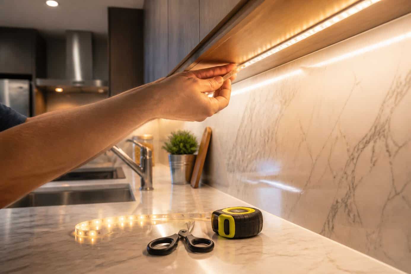
LED tape lighting transforms your kitchen’s functionality and appearance without professional help. These flexible strips provide focused task lighting for food preparation while highlighting your countertops.
Start by measuring the underside of your cabinets to determine how much tape lighting you need. Clean the surface thoroughly before installation to ensure proper adhesion. Most LED strips come with adhesive backing, making installation straightforward.
You’ll need to select the right color temperature for your space. Warm white creates a cozy atmosphere, while cool white offers bright task lighting. Plan your power supply location and consider whether you want dimming capabilities or a controller for adjustable settings.
Run your wiring discreetly along cabinet edges to maintain a clean look. Connect the strips to your power source and test before finalizing the installation.
21. Create scale with an oversized floor lamp in a small corner
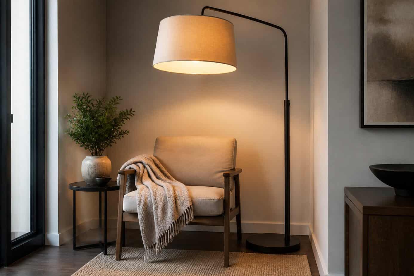
An oversized floor lamp transforms empty corners into focal points while making your space feel more intentional. The large scale draws the eye upward, which creates the illusion of higher ceilings and more room.
Choose a lamp that stands at least 60-70 inches tall with a substantial base or shade. Position it in a corner near seating areas where it can provide functional lighting while anchoring the space.
Balance the lamp’s presence by pairing it with low furniture pieces nearby. This contrast in heights emphasizes the vertical dimension without overwhelming your room. You can also place a small plant or stack of books at the base to ground the lamp visually.
The key is letting the lamp serve dual purposes as both sculpture and light source, creating layered illumination that defines cozy zones in your space.
22. Frame fabric swatches as inexpensive custom art
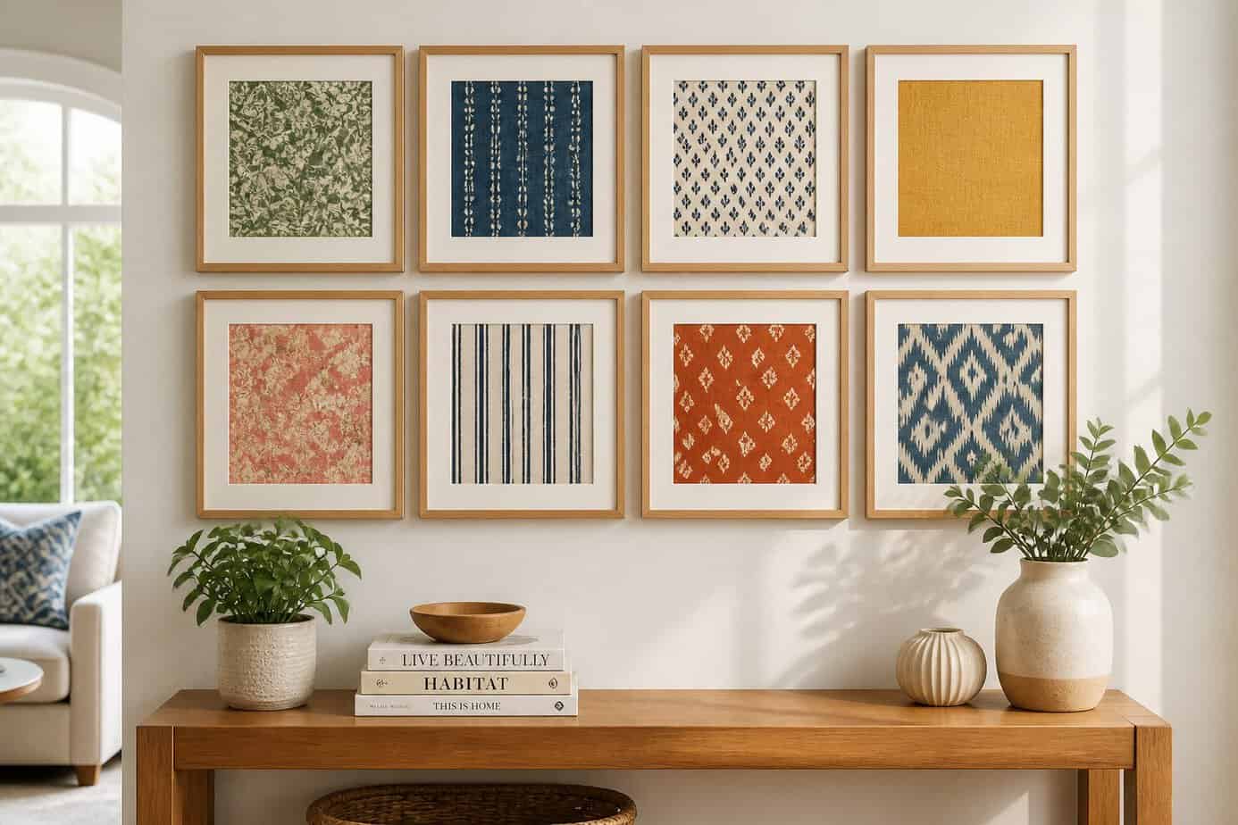
Fabric swatches offer an affordable alternative to traditional artwork. You can source remnants from craft stores, upholstery shops, or even your existing fabric stash to create custom pieces that match your decor perfectly.
Select fabrics with interesting patterns, textures, or colors that complement your room’s palette. Cut them to fit standard frame sizes to avoid custom framing costs.
Mount the fabric by stretching it over cardboard backing or simply taping it inside the frame. This approach works particularly well with vintage textiles, bold geometric prints, or textile samples that add visual interest to your walls.
Group multiple framed swatches together for a gallery wall effect. You can easily swap out the fabric when you want to refresh your space, making this one of the most flexible decorating solutions available.
23. Introduce a statement wallpaper on a single accent wall
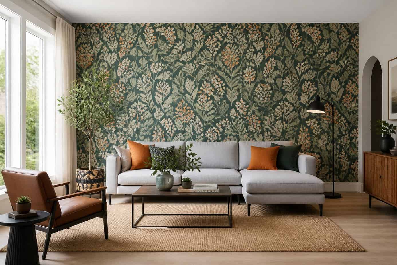
A single accent wall with bold wallpaper transforms a room without overwhelming the entire space. Choose one wall as your focal point—typically the wall behind your bed, sofa, or dining table works best.
Select wallpaper that adds visual interest through pattern, texture, or color. You can use removable peel-and-stick options for an easy installation and future flexibility.
Pull one color from your chosen wallpaper and incorporate it into surrounding walls or decor. This creates cohesion between your statement wall and the rest of the room.
Keep the remaining three walls neutral to let your accent wall stand out. This approach delivers maximum impact while maintaining balance in your space.
24. Use matte spray paint to refresh ceramic planters and lamps
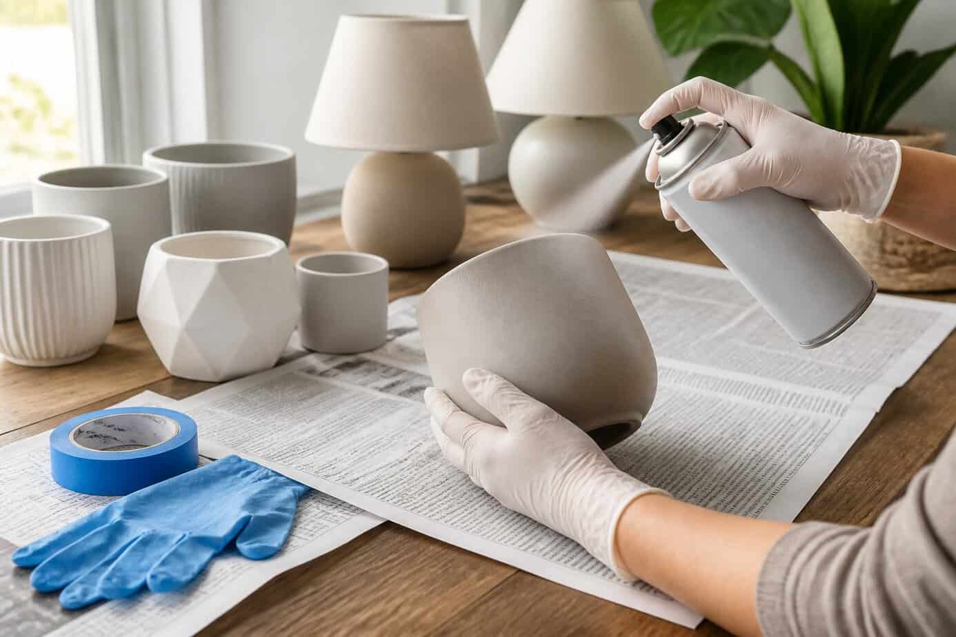
You can transform outdated ceramic planters and lamps with matte spray paint. This simple technique updates old fixtures without the expense of buying new pieces.
Multi-surface spray paints work best for ceramic items. Look for formulas designed to bond with ceramic, glass, and metal surfaces. While some paints don’t require primer, using one improves durability and finish quality.
Clean your ceramic pieces thoroughly before painting. Remove dust, oils, and dirt to ensure proper paint adhesion. Apply thin, even coats from 8-10 inches away to avoid drips and achieve a smooth finish.
Matte finishes provide a modern, sophisticated look that complements various decor styles. The flat sheen hides imperfections better than glossy finishes and creates subtle visual interest in your space.
25. Create cohesion by repeating one accent color across 3 elements
Would you like to save this?
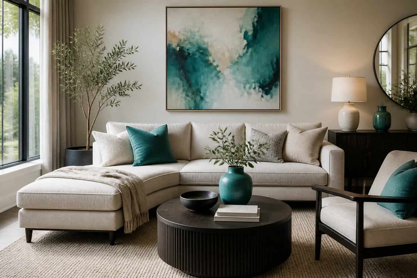
Designers rely on a simple trick to tie a room together: choose one accent color and repeat it in exactly three places. This creates visual rhythm without overwhelming the space.
Pick your accent color first, then identify three different elements to feature it. You might use navy blue in throw pillows, a table lamp, and a piece of wall art. The key is varying the scale and type of items while keeping the color consistent.
This technique works because it guides your eye naturally around the room, creating connection points that feel intentional rather than random. The spacing between these three elements matters too. Distribute them throughout the space instead of clustering them in one corner.
You don’t need expensive purchases to make this work. A painted picture frame, a vase, and a throw blanket can achieve the same cohesive effect as high-end decor.
26. Elevate mantels with an odd-numbered grouping of objects
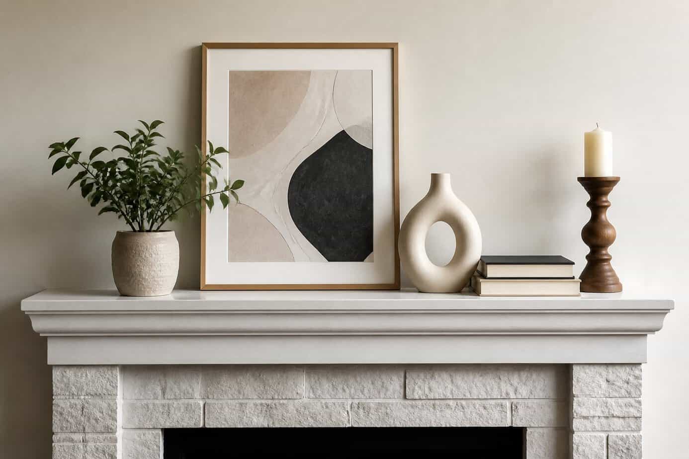
Decorating your mantel becomes easier when you arrange items in groups of three, five, or seven. This approach creates visual balance without appearing overly symmetrical or predictable.
Start by selecting three objects of varying heights for a small mantel. Place the tallest item slightly off-center, then position the medium and shortest pieces to create a triangular arrangement.
For larger mantels, expand to five or seven items while maintaining the odd-number principle. Mix different textures, shapes, and heights to add depth and interest.
The key is avoiding perfect symmetry while still maintaining balance. Odd-numbered groupings feel more organic and draw the eye naturally across the display. You can apply this technique to candlesticks, vases, picture frames, or decorative objects.
27. Use a color card (paint chips) to choose coordinated textiles
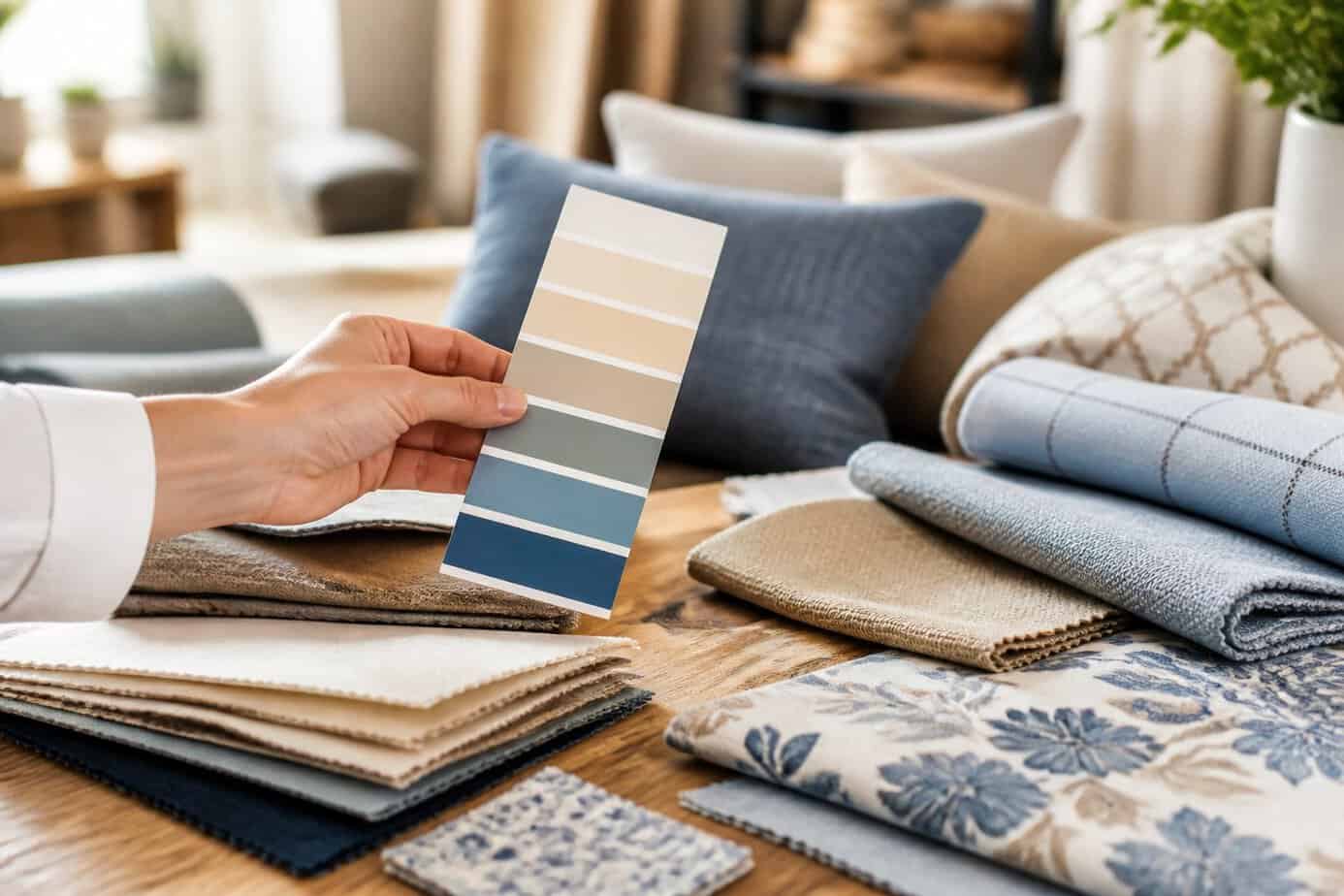
Paint chip cards from hardware stores offer a free solution for coordinating fabrics throughout your home. Each card displays multiple shades of a single color family, arranged from light to dark, giving you a ready-made palette.
Hold paint chips next to your fabrics, pillows, or upholstery to test color compatibility before making purchases. The cards help you identify which values and contrasts work together, eliminating guesswork when shopping for textiles.
You can also use paint chips as a starting point for an entire room scheme. Choose a card you like, then select fabrics that match different shades on that single card for automatic coordination.
Keep several paint chips in your purse or phone case. This makes it easy to match textiles when you’re out shopping, ensuring your new purchases will work with your existing decor.
28. Hide TV cables with a simple cord cover painted to match wall
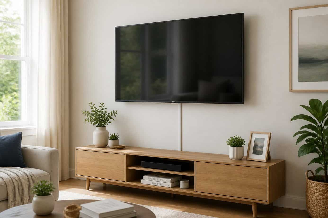
Peel and stick cord covers offer an affordable way to conceal TV cables without cutting into your walls. These hollow channels attach directly to your wall surface and house the wires inside, creating a clean look in minutes.
You can purchase a cord cover kit for around $15 at most home improvement stores. The installation process is straightforward—simply measure your cable run, cut the cover to size, and press it onto the wall.
The real advantage comes from painting the covers to match your wall color. Most cord covers accept standard wall paint, allowing them to blend seamlessly into your room. This simple step makes the covers virtually invisible from a distance.
The covers remain removable if you need to access your cables later, making them a practical choice for renters or anyone who wants flexibility.
29. Add a shallow shelf above doorways for displaying small ceramics
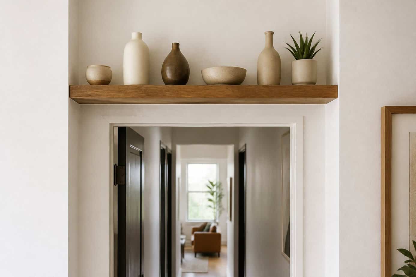
The space above your doorways offers untapped potential for display and storage. A shallow shelf mounted in this location creates an unexpected focal point while keeping your floor and wall space clear.
Choose a shelf depth between 4 to 6 inches to accommodate small ceramics without overwhelming the doorway. This prevents items from appearing too heavy or precarious above the opening.
Small vases, ceramic bowls, and decorative pottery work particularly well in this elevated position. You can arrange these pieces to create visual interest as you move between rooms.
Mount the shelf securely to wall studs for proper support. Position it at least a few inches above the door frame to maintain proper proportions and ensure adequate clearance.
This approach works in any room where you need additional display space without commitment to larger built-ins or furniture pieces.
30. Repurpose vintage suitcases as a layered side table
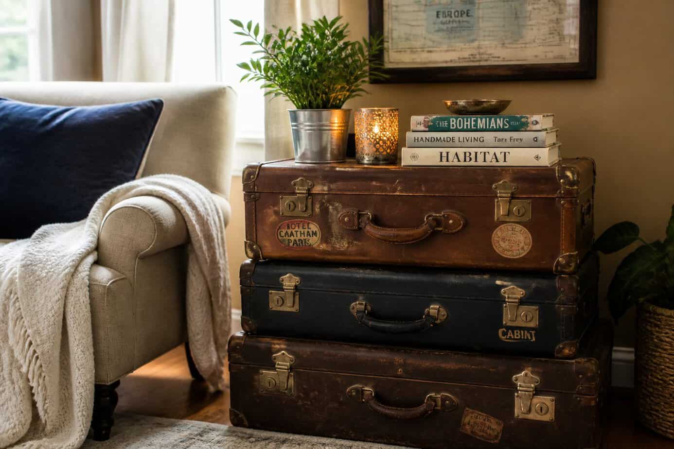
Old suitcases from thrift stores or your attic can become functional furniture with minimal effort. Stack two or three vintage suitcases of different sizes to create a tiered side table that offers both surface space and hidden storage.
You can attach legs to a single suitcase for a raised table, or simply stack multiple pieces directly on the floor for an eclectic look. The compartments inside provide practical storage for blankets, magazines, or remote controls.
This approach works well in living rooms, bedrooms, or entryways. The worn leather or canvas exteriors add texture and character that new furniture can’t replicate. You don’t need advanced DIY skills, most projects only require basic adhesive, legs from a hardware store, or no modifications at all if you’re simply stacking pieces.
31. Use scented soy candles (diptyque Baies) to unify room ambiance
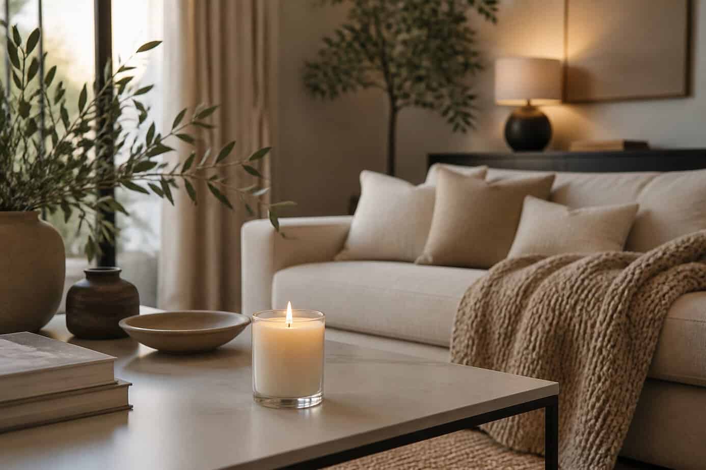
A signature scent creates cohesion across different areas of your home. The Diptyque Baies candle offers a balanced fragrance profile with notes of blackcurrant and rose that works well in various spaces.
Place matching candles in adjacent rooms to create a subtle olfactory thread throughout your home. This technique helps spaces feel connected even when your decor styles vary from room to room.
The consistent scent acts as an invisible design element that ties your interior together. You don’t need to light all candles simultaneously—even unlit candles release subtle fragrance that contributes to the overall ambiance.
Choose candles in matching glass holders to add visual uniformity alongside the scent. This approach works particularly well in open-concept layouts where you want to define zones while maintaining flow.
32. Place a runner rug down the center of a hallway for warmth
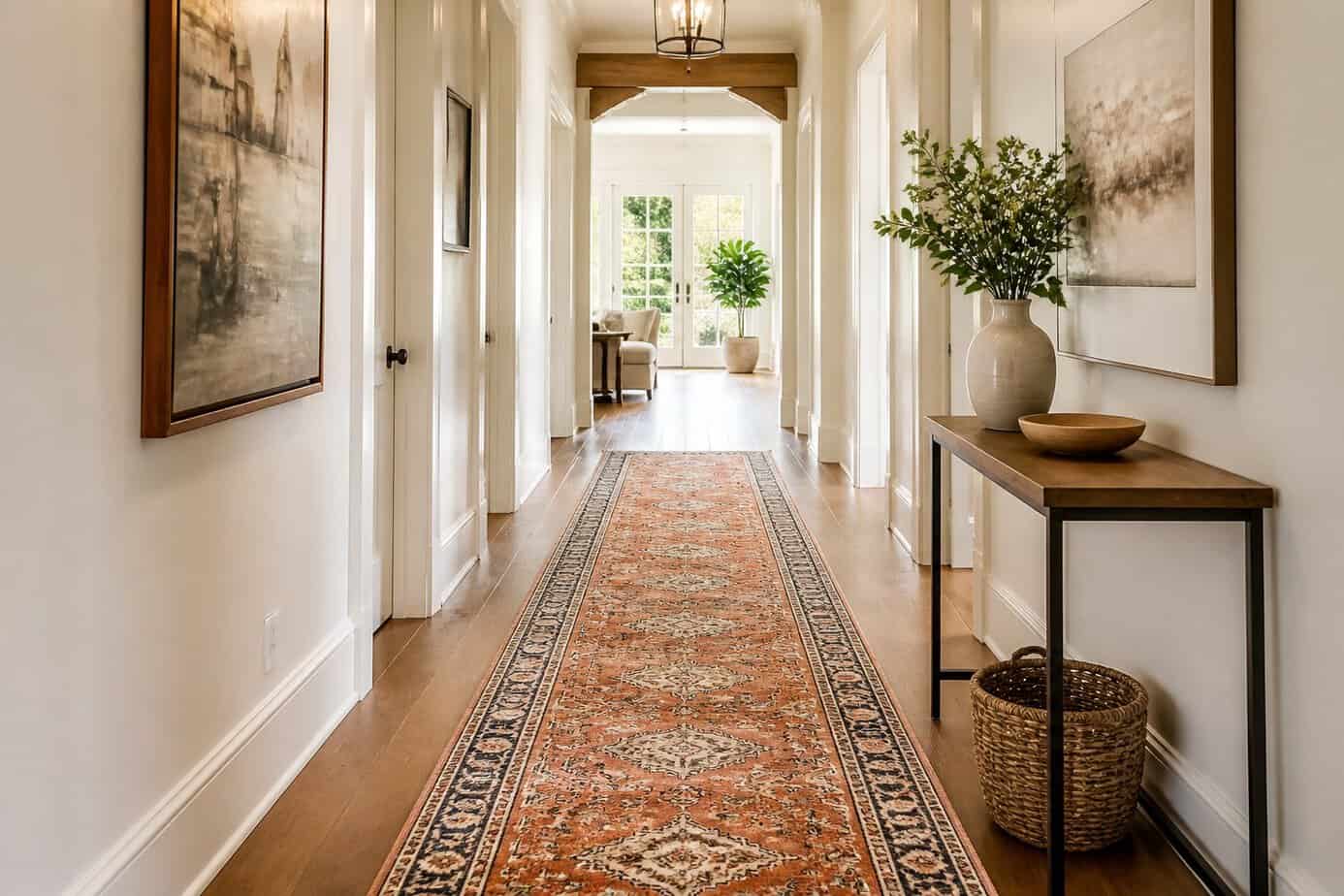
A hallway runner is a long, narrow rug designed specifically for these transitional spaces. Center it in your hallway with equal flooring visible on both sides to create visual balance and symmetry.
This placement guides the eye through the space while adding warmth underfoot. The runner protects your floors in high-traffic areas and reduces noise from footsteps.
Keep furniture like console tables or benches flanking the sides rather than sitting on top of the runner. This maintains clean lines and prevents the rug from bunching.
For safety, secure the runner with rug pads or non-slip backing to prevent slipping and curling at the edges. This simple addition transforms a bare hallway into a more inviting, finished space without requiring permanent changes.
33. Mount a gallery wall with consistent frames (same color/size)
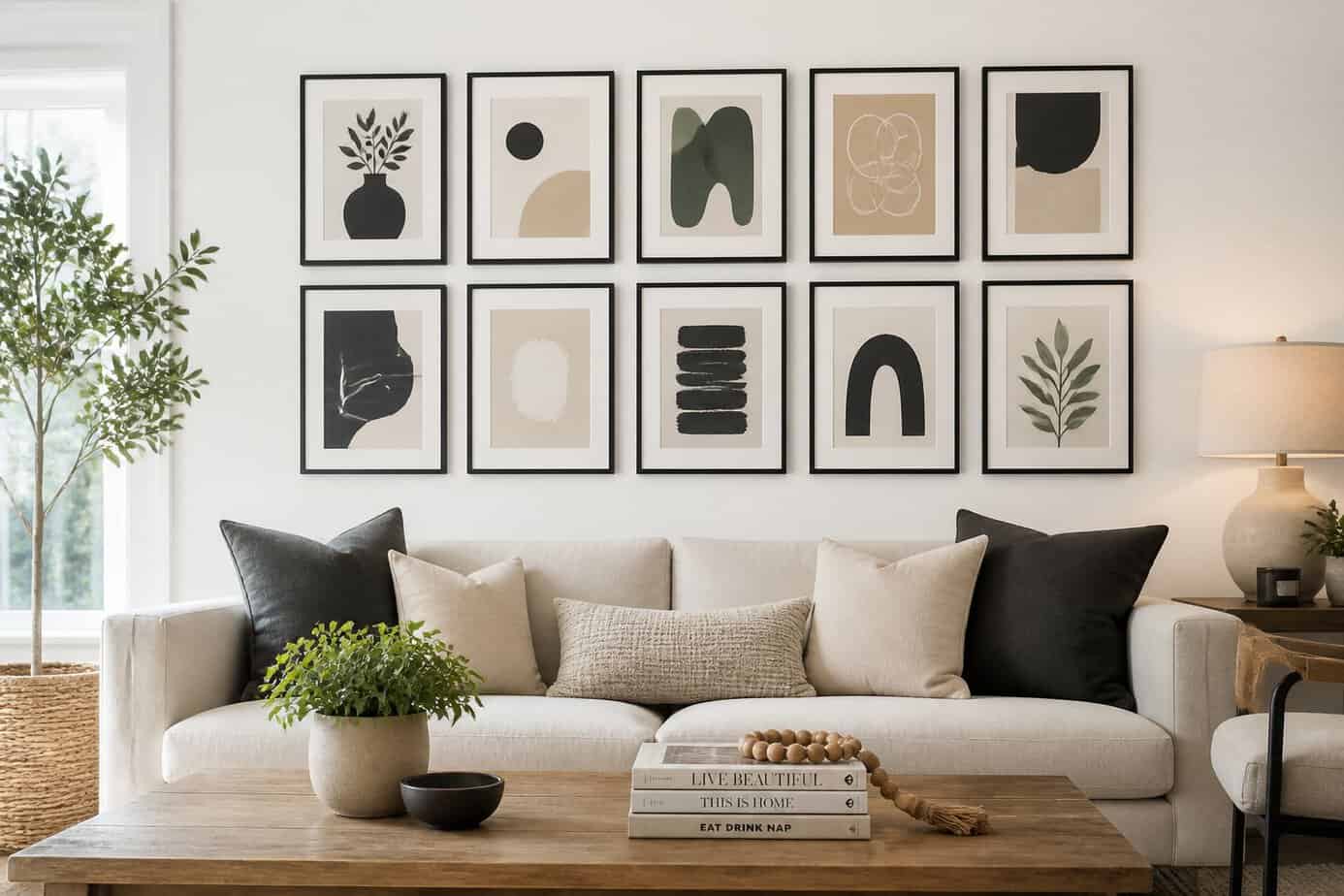
Using matching frames creates an instantly polished gallery wall that looks professionally designed. Choose frames in the same color and size to establish visual harmony across your wall space.
Black frames with white mats deliver high-contrast impact, while uniform white frames create a clean, cohesive look. This approach works particularly well in hallways and living rooms where you want a structured appearance.
Start by arranging your frames on the floor to test different configurations. Measure the spacing between each frame to maintain consistency, typically 2-3 inches apart. Create paper templates of your frames and tape them to the wall before hammering any nails.
This symmetrical method eliminates the guesswork of mixing different frame styles. You’ll avoid unnecessary holes in your walls and achieve balanced results without the trial-and-error of eclectic arrangements.
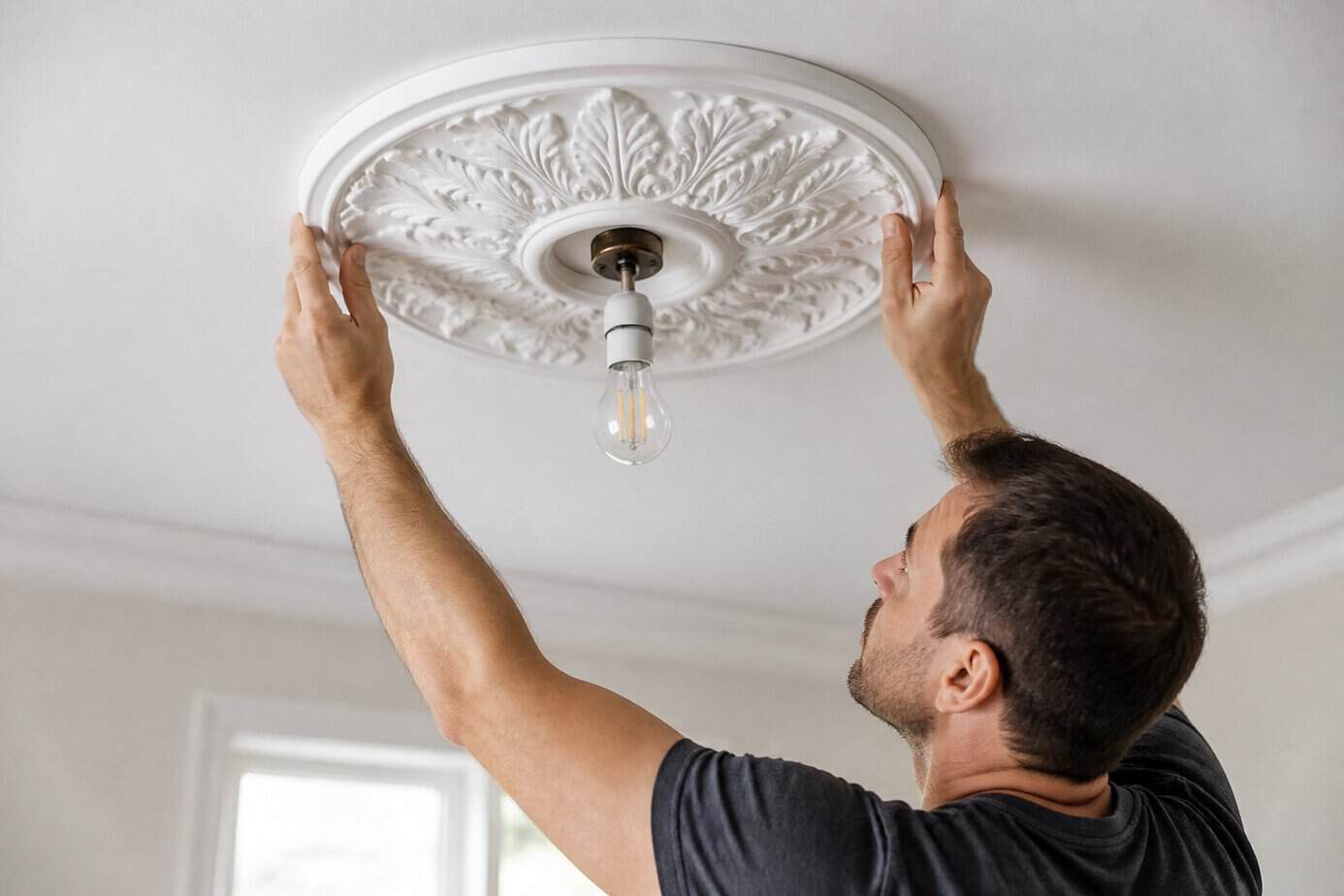
34. Install a ceiling medallion to upgrade a basic light fixture
Would you like to save this?
A ceiling medallion transforms an ordinary light fixture into a polished focal point. These decorative pieces sit between your ceiling and fixture, adding dimension and visual interest to any room.
Installation is straightforward. Turn off the electricity to your fixture first. Remove the existing light, apply adhesive to the back of the medallion, and position it at the ceiling’s center. Once secured, reinstall your light fixture through the medallion’s center opening.
Choose a medallion that complements your room size. For ceilings taller than nine feet, select a diameter wider than your light fixture. Smaller rooms work better with more modest medallions.
You can find options in various styles, from minimal modern designs to ornate traditional patterns. Some medallions even feature peel-and-stick backing for easier installation without adhesive mess.
35. Create depth with matte and gloss paint finishes together
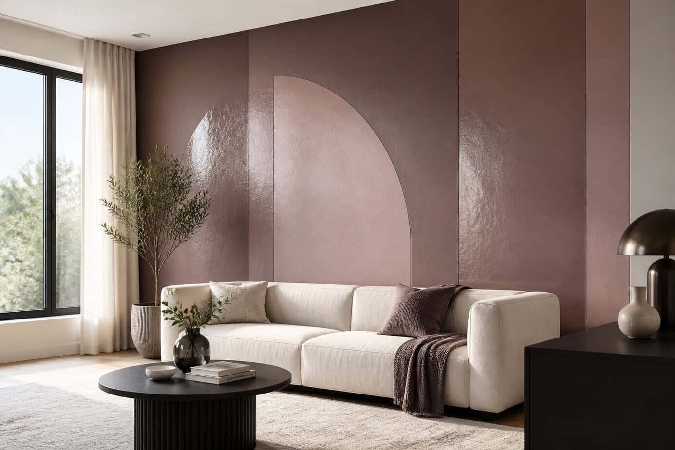
Combining matte and gloss paint finishes in the same room adds visual dimension without requiring additional furniture or expensive renovations. The contrast between finishes creates subtle sophistication that catches the eye.
Try painting your walls in a matte finish, then add the same color in gloss for trim, moldings, or an accent wall. The difference in sheen creates depth even when using identical colors.
Deeper colors in glossy finishes make bold statements, while the same shade in matte appears more subdued. You can use this contrast strategically to highlight architectural features or create focal points.
The technique works particularly well for accent walls where you want to add interest without introducing new colors. The interplay between light-absorbing matte and light-reflecting gloss surfaces gives your space a polished, layered appearance.
Understanding the Principles Behind Interior Design
Professional designers rely on foundational principles that transform spaces from chaotic to cohesive. Color theory guides emotional response and spatial perception, proportion ensures furniture fits the room naturally, and focal points direct attention to create visual hierarchy.
The Role of Color Theory in Home Decor
Color theory forms the backbone of every successful design decision you make. The color wheel divides into three categories: primary colors (red, blue, yellow), secondary colors (green, orange, purple), and tertiary colors that blend primary and secondary hues.
Complementary colors sit opposite each other on the wheel and create vibrant contrast when paired together. Blue and orange or red and green generate energy in a space. Analogous colors sit next to each other and produce harmony—think blue, blue-green, and green for a calming bedroom.
The 60-30-10 rule provides a foolproof formula for color distribution. Dedicate 60% of your room to a dominant color (usually walls), 30% to a secondary color (upholstery, curtains), and 10% to an accent color (pillows, artwork). This ratio prevents color overload while maintaining visual interest.
Warm colors (reds, oranges, yellows) advance visually and make spaces feel smaller and cozier. Cool colors (blues, greens, purples) recede and make rooms appear larger and more open.
Balancing Proportion and Scale
Proportion refers to how objects relate to each other in size, while scale describes how objects relate to the space itself. A large sectional sofa works in a spacious living room but overwhelms a small apartment.
Your furniture should occupy roughly two-thirds of your wall length. A sofa that’s too small makes a room feel disconnected, while one that’s too large crowds the space. Coffee tables should measure about two-thirds the length of your sofa and sit 14-18 inches away from seating.
Vertical proportion matters equally. Hang artwork so the center sits at eye level, typically 57-60 inches from the floor. Mount curtain rods 4-6 inches above window frames to add height, or install them at ceiling height to maximize vertical space.
Layer objects of varying heights to create visual movement. Pair tall floor lamps with medium-height side tables and low seating. This variation guides the eye throughout the room naturally.
Creating Focal Points in Any Room
Every room needs an anchor that draws attention immediately upon entry. Fireplaces, large windows, and architectural features serve as natural focal points that require minimal enhancement.
When natural focal points don’t exist, create them deliberately. Mount a large-scale piece of artwork, install a statement light fixture, or paint an accent wall in a bold color. The focal point should be the first thing you notice but shouldn’t compete with other elements in the space.
Arrange furniture to emphasize your focal point. Position seating to face fireplaces or windows. Place accent chairs at angles that direct sightlines toward featured walls or architectural details.
Avoid these common mistakes:
- Creating multiple competing focal points
- Placing furniture with backs to the main focal point
- Choosing a focal point on a high-traffic wall
- Making the focal point too small for the room
Use lighting to reinforce focal points. Direct spotlights on artwork, add sconces flanking a fireplace, or install dimmers to adjust attention throughout the day.
Common Mistakes to Avoid When Decorating
Two of the most frequent decorating errors involve filling every surface with items and failing to consider how daylight moves through your rooms. Both issues stem from not stepping back to evaluate the space as a whole.
Overcrowding Spaces with Accessories
Buying decorative items without a clear purpose creates visual chaos. When you place too many frames, vases, candles, and trinkets throughout a room, the eye has nowhere to rest.
Key indicators of overcrowding:
- Shelves and tables filled edge to edge
- Multiple competing focal points in one area
- Difficulty cleaning surfaces due to object density
- Inability to see the furniture or architecture itself
Start by removing half of your accessories and placing them in storage. Display only items you genuinely appreciate, not things purchased simply to fill space. Group similar items in odd numbers (three or five) rather than scattering them individually.
Leave negative space on surfaces. Empty areas create breathing room and make your chosen pieces stand out. Rotate accessories seasonally instead of displaying everything simultaneously. This approach keeps your decor fresh while preventing accumulation.
Ignoring Natural Light Sources
Window placement and sunlight patterns should dictate your furniture arrangement and color choices. Positioning a dark sofa directly in front of your brightest window blocks light flow and wastes the room’s best asset.
Observe how light enters at different times of day before finalizing your layout. Place reading chairs and workspaces near windows. Keep window treatments minimal on walls with limited natural light, or choose sheer fabrics that filter rather than block rays.
Paint colors shift dramatically based on light exposure. Test samples on multiple walls and view them in morning, afternoon, and evening light. North-facing rooms receive cooler, indirect light and benefit from warm paint tones. South-facing spaces get intense direct sun that can wash out pale colors. Mirrors positioned opposite windows amplify natural light without requiring electrical fixtures.